Posts for: John N
Apr 6, 2024 06:35:45 #
UTMike wrote:
The UK green is always appreciated. Nice shot.
Looks a lot greener than my part of the U.K., which is looking very pale and washed out at the moment. If the sun comes out today I might be tempted to go and look for some deep, rich, vibrant greens.
Apr 6, 2024 06:28:03 #
Simple way to quell that theory, write the date the same way as most of the rest of the world.
Apr 6, 2024 06:25:54 #
[quote=cyclespeed]Is this a test to see how many of us don't follow directions and post color first then number?[quote]
oops!
oops!
Apr 6, 2024 06:20:35 #
I like it, I think you've got enough contrast in there, but I wonder if a greater depth of field would make a better image. I'd also like to see this head on.
Apr 6, 2024 06:17:29 #
Apr 5, 2024 03:12:28 #
Apr 3, 2024 04:14:54 #
I have had several goes at this and tried the suggestions, along with a few other suggestions made my corespondents on an AFFINITY specific Facebook page. But I'm coming up short. I don't fully understand layers, that is to say I know what the intention is, just that my use and application of them seems to be pretty low down the percentage scale.
As per Rongnongnos' suggestion I have attached the two shots.
So far, I have softened the hat and turned it around (not the attached image), and tried to use perspective tools to get it to lay at an angle on the table but with not much success. I have managed to 'rebuild' the table using selections and reversing them before pasting and merging and I've had some success with this (attached).
If anyone feels like having a go - and is happy for me to use it (if not, show me what you've done and put a watermark on it) please do so.
I feel this is more a direct ascent than a steep learning curve at the moment - and my form of dyslexia isn't making it any easier!
Apr 2, 2024 10:05:45 #
Jimmy T wrote:
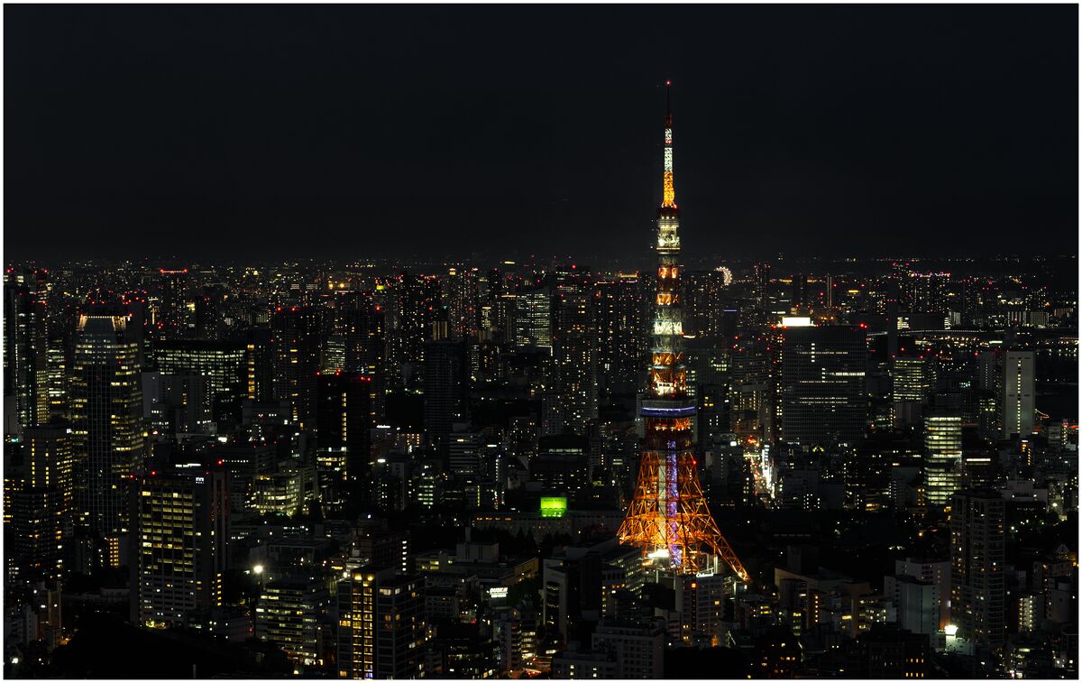
I am going for the "Just Past the Blue Hour"
I cropped to emphasize the Eiffel Tower and show the almost hidden "Eye" to the right of the tower at the skyline.
The smaller buildings around the Eiffel Tower are there to establish scale.
Smile,
JimmyT Sends.
I cropped to emphasize the Eiffel Tower and show the almost hidden "Eye" to the right of the tower at the skyline.
The smaller buildings around the Eiffel Tower are there to establish scale.
Smile,
JimmyT Sends.
Don't what it is - but it's not the EIFFEL Tower. Looks more like something specifically built for Communications to me.
Apr 1, 2024 12:14:00 #
Here's mine. All done in AFFINITY v2.
I tried to take some some of the light reflection in the sky, intensfied the red and took the yellow done a few % to try and acheive a slightly cooler nightime scene. And a little sharpening / clarity over the urban landscape.
I tried to take some some of the light reflection in the sky, intensfied the red and took the yellow done a few % to try and acheive a slightly cooler nightime scene. And a little sharpening / clarity over the urban landscape.
Apr 1, 2024 05:17:33 #
I can remember taking a dynamo of a vehicle in a breakers while two other vehicles on top wobbled about.
Nowadays it's all stripped, cleaned and sometimes boxed. And three times the price.
Nowadays it's all stripped, cleaned and sometimes boxed. And three times the price.
Apr 1, 2024 05:14:13 #
I can't see the joke in no.7. Because I feel pretty sure a fair majority in the current U.K. Conservative would enact this to the letter thereby killing off the homeless - and claiming a victory.
Apr 1, 2024 03:24:19 #
Really enjoyed this 'competition'. Glad I found an image that didn't draw any criticism and one that, hopefully, people enjoyed working worth. My favourite was the 'pencil sketch' but, hey, that's just me.
Also pleased with the previous result which afforded me my first outright win in this competition and looking forward to further practising my editing skills within it.
Also pleased with the previous result which afforded me my first outright win in this competition and looking forward to further practising my editing skills within it.
Mar 30, 2024 11:23:17 #
Still looking for more, if there is more to be had. But I'm liking what I'm seeing so far, so thanks for that.
I'm hoping to replicate what dannac has done, and I'll be very happy to get somewhere near to that.
I'm hoping to replicate what dannac has done, and I'll be very happy to get somewhere near to that.
Mar 30, 2024 05:13:18 #
You probably know Scilily better than Inspector Montalbano by now. Very enjoyable series.
Just so you know (worth watching if you can get it) -
http://en.wikipedia.org/wiki/Inspector_Montalbano_(TV_series)
Just so you know (worth watching if you can get it) -
http://en.wikipedia.org/wiki/Inspector_Montalbano_(TV_series)
Mar 30, 2024 04:30:06 #
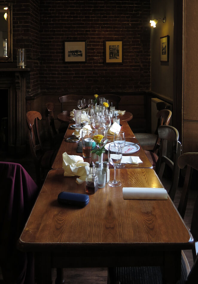
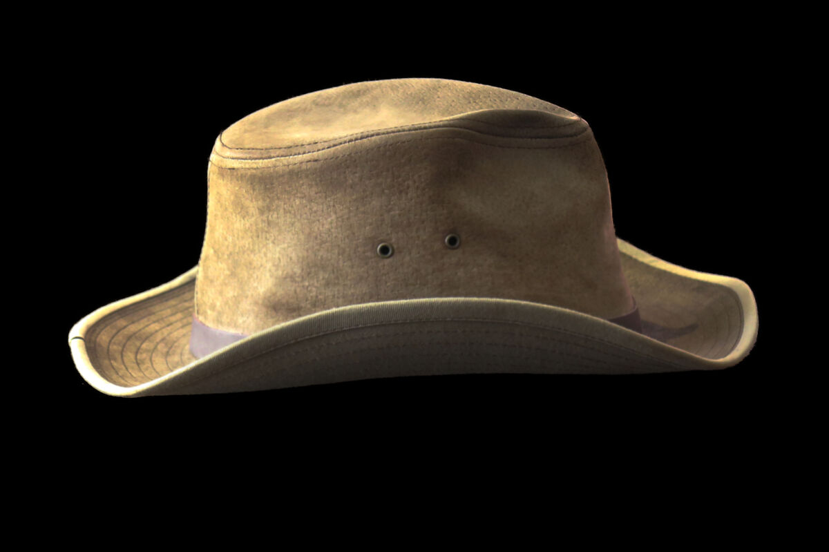
Some years back we had a family dinner on the first anniversary of my B.I.L's passing. I rather liked the light in this after dinner view of the table which had my Tilley hat on it.
It was thought that it could make a more memorable shot if I replaced my hat with the 'Cowboy' hat he was often to be seen wearing. The attached photo is what I've made from the original shot and a separate shot made of his hat at a later date and in a different location.
The room was shot on my Canon G16 point and shoot and the hat on my Canon 60D. I should have paid much more attention to the light and I think the size of the hat in the frame. It is a much more detailed image (which I've softened with a slight blur) but it still looks like it's dropped in.
I'm using AFFINITY v2, and I'm slow picking up pp but if anyone is able to offer some tips to assist in removing the floating appearance of the hat his siblings would appreciate it.
I'm not fully conversant with layers so the 'finished' image is all I have, apart from the originals. I'll be going back to restart this armed with better advice.
