Posts for: Strubbles
Aug 16, 2011 11:42:47 #
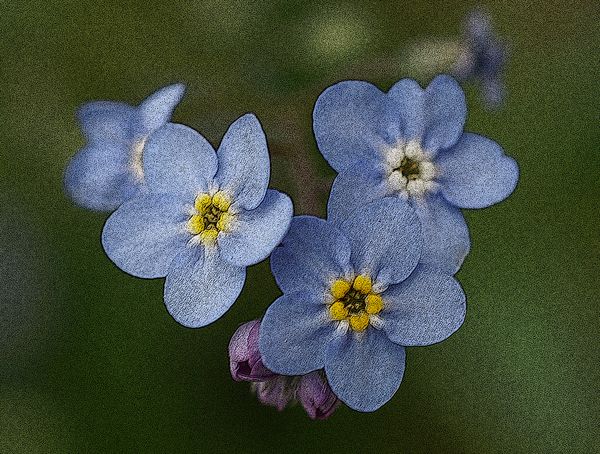
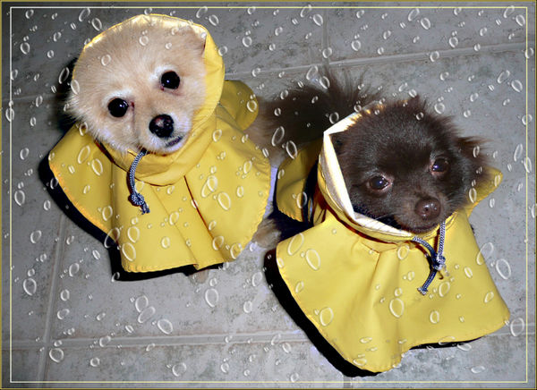
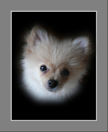
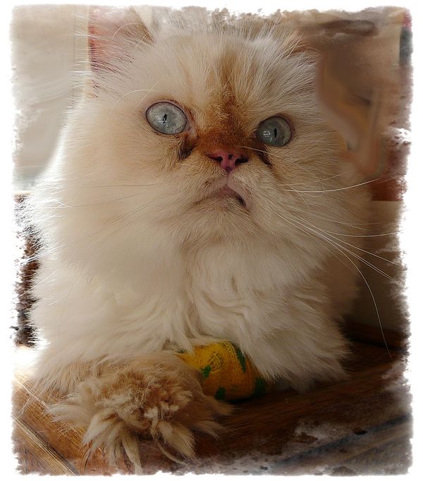
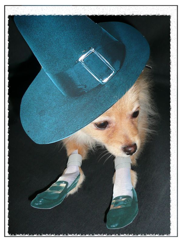
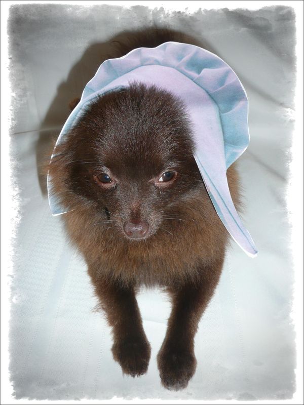
Here are some of our pets. As you can see, we torment them. (Not really!)
Uma and Louie in the Rain
Louie
Mikki
Thanksgiving Louie
Thanksgiving Uma
Aug 16, 2011 11:24:59 #
Aug 16, 2011 11:23:30 #
Welcome.
#1 is good, perhaps too intense a tone for sepia for me, but I like the treatment and the frame.
#2 - you seem to have used an interesting filter, but the center of interest blends into the background and gets lost. I would have liked to see the image before post-processing.
#3 creates some problems for me. The background is out of focus, but not enough to be non obtrusive. Of course, the center of image also needs to be sharper... and more interesting.
Aug 16, 2011 11:15:29 #
Your pets are adorable. Your photos are good and sharp. I would crop the top one differently, as there is too much of the maroon cloth.
Number 3 is adorable, but too many distractions to my taste.
One and two are much better images.
Number 3 is adorable, but too many distractions to my taste.
One and two are much better images.
Aug 16, 2011 11:06:37 #
All your photos are clear and sharp, with great color. Good job on that.
I would have liked a different angle in #1. #2 is better, though the center of interest is "too centered". In #3, I would clone out the snow patch in the lower left hand corner, though the one in the lower right seems to fit better.
I do like your photos.
I would have liked a different angle in #1. #2 is better, though the center of interest is "too centered". In #3, I would clone out the snow patch in the lower left hand corner, though the one in the lower right seems to fit better.
I do like your photos.
Aug 16, 2011 10:58:58 #
Aug 16, 2011 10:58:15 #
Re: taken in Florida
Nice and sharp, good view. Try cropping off the fence and other distractions at the top. Then it will be very good.
Nice and sharp, good view. Try cropping off the fence and other distractions at the top. Then it will be very good.
Aug 14, 2011 16:05:39 #
I like your bike trail photo... crisp and sharp, good composition. I especially like the tall grass in the lower left.
Your swan is too blown out... there are no details in the feathers... You could use a catchlight in the eye unless the swan was sleeping. Hard to tell. The background is nice and sharp. I think it should be the other way around.
Ghent... needs to be much sharper... and there are some exceptionally blurry areas that do not add anything to the image, esp. in the lower right.
Aug 14, 2011 15:56:57 #
I think it would have been better if you moved to your right at a different angle. I find this image to have too much stuff in it... and the center of interest is hard to find.
Aug 11, 2011 16:40:54 #
Welcome.
The only suggestion I have is about your first image, raising the Flag. I think it would have been more interesting if the flag-raisers were looking at the flag, at what they were doing, rather than at you and the camera.
Sarah T.
The only suggestion I have is about your first image, raising the Flag. I think it would have been more interesting if the flag-raisers were looking at the flag, at what they were doing, rather than at you and the camera.
Sarah T.
Aug 11, 2011 11:14:15 #
I like yours, too. Very moody. How did you do the cemetery? It looks moodily awesome.
Aug 10, 2011 16:30:38 #
Aug 8, 2011 22:26:57 #
I am delighted to see some of the work that others have done. I am the president of our community camera club, am an active member of our local camera club, and am a member of PSA, Photographic Society of America... a great place to learn. They run online study groups, you should look into it. I am in several. I am happiest when "photoshopping" and creating new images out of old ones.
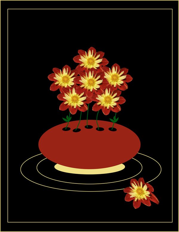
Blue Dahlia

Bowl of Flowers
True Blue