Posts for: icke
May 26, 2014 17:17:35 #
Hello bsmith52 ...not sure if this option has been covered but you may also add a texture layer...the sleeve is left unfinished for comparison...I would opt for the warmer textured look...lots of options here...you could use a written baby shower invitation for example...play with it :{)
Jan 6, 2014 15:42:19 #
lighthouse wrote:
OK, this is a good exercise isn't it?
Many people have edited it.
Why can't anyone get it right on first try?
Many people have edited it.
Why can't anyone get it right on first try?
hello lighthouse...to answer your question one needs to go back to the original request..."My People aren't Popping" ...when dissatisfied with a portrait I quite often turn it into a black and white with the background being white leaving in just enough details for the viewer to fill in the rest ...I like that effect...others might turn their nose up in disgust... so the answer is ...all of the submitters did think they got it right...some did hedge their bets and submitted multiple versions :{)
Jan 6, 2014 14:38:21 #
PS ...this might be a helpful ref. site when working with portraits....http://help.smugmug.com/customer/portal/articles/93363
Jan 6, 2014 14:34:14 #
...Hello OddJobber...I tend to agree with what you said... also went ahead and checked your picture and guess what...the yellow and magenta values have been reversed...so the auto function which you used did a good job on the subject's skin but in the process ( in your case a tiny) trade off appeared...the little blue band on the left background trees ( no big deal can be easily fixed) and the sky...the way I see it you may take out/change the background and or enhance the background and that moves into personal preference...but ultimately it is how the subjects view themselves and it would be interesting which pic they like...and yes it is a good exercise :{)
Jan 6, 2014 05:28:35 #
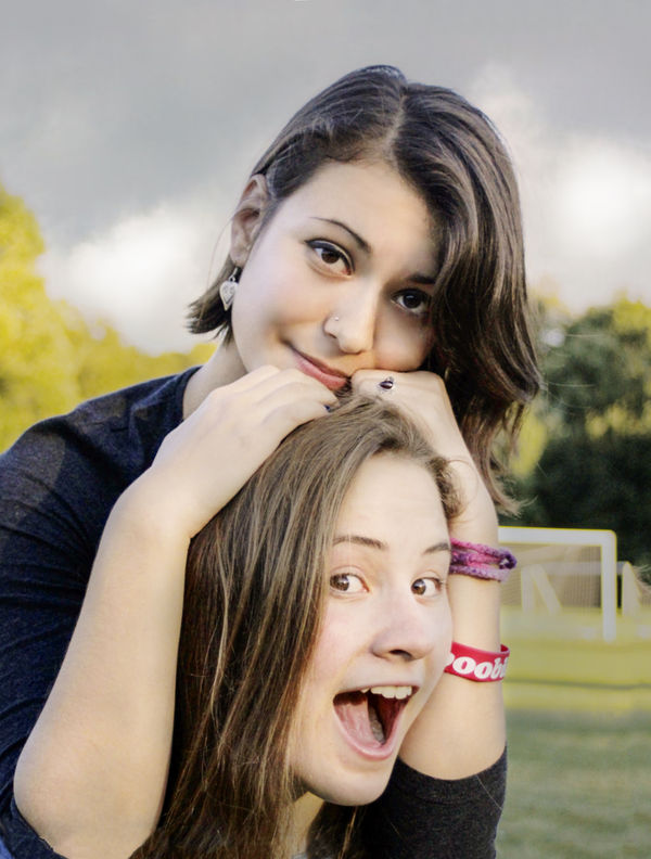
....touch up (only top face) included fill lights for the shadows ...I would be very surprised if the young lady has wrinkles as prominent as shown on the forehead...softening shadows under her right eye (looked like KISS make up)...probably should be softened some more...removed blemishes...tried to raise the yellow and lower the magenta tonal values...added a texture layer for the sky and background...straightened the pic...the goal post were given a less attention getting tone...the picture was cropped on the left as much as possible to have open space on the right...the lower face and hands might need some additional touch up work...
Jan 4, 2014 21:04:19 #
icke wrote:
so this thread has been very helpful to someone.
...that certainly could and hopefully is the case ...
Jan 4, 2014 20:59:47 #
Jan 4, 2014 20:55:36 #
hello marcomarks...don't think it is blue ...if you check the tone value on some of the posted photos you will find that the magenta value is too high for portraits :{)
Jan 4, 2014 20:49:29 #
@ Klaus...large monitor?...sort of (27"), calibrated?... yes but not the way it should be (X Rite or something similar) but not sure that the color is the problem or desired effect to get the photo to "pop"...landscapes yes and no, depending on the photographer's personal taste...with portraits I would say it depends on the taste of the subject ( do they want to see the blemishes, wrinkles etc which will/might be accentuated by some of the "popping" techniques) ...
Jan 4, 2014 17:55:33 #
Hello ronwande...same here (watching)...probably not (your monitor)... the majority of the posted pics created the asked for "pop" by accentuating/improving color, shadows and or sharpness. This in turn also accentuated some of the flaws of the pic (opinion) ... blemishes, wrinkles, shadows and the probable cause of what caught your eye, tonal value. I personally enjoy this section but wish more people would explain their work flow and others would respond with constructive suggestions...I notice that the original poster has not responded as to what he thinks about the majority of attempted touch ups...to find the facial tonal values in photoshop click ...windows >>>>> info (F8) :{)
Jan 2, 2014 00:32:06 #
Hello Ricardo...if you agree with Bram Boy...do look at the link I provided up above... it provides a good tutorial... as far as additional touch ups I would tone down the shadows on the right side a little further, clean up the left eye (outside shadow on lower lid and the white reflection on the inside right)...touch up does take a little bit of time...but like it was suggested up above, ask the girls to choose :{)
PS His evaluation of the submitted pics :{)
PS His evaluation of the submitted pics :{)
Jan 1, 2014 16:28:42 #
hello Ricardo...I checked your pic for skin tone values and the magenta values are to varying degrees higher than the yellow values on both subjects...reversing/adjusting these and other tonal values will probably improve how you react to the picture...here is a nice tutorial source:
http://help.smugmug.com/customer/portal/articles/93363
PS...just checked some of the processed examples ...stopped at MikeIrby's submission...if you like that example (tonal values are adjusted) then the above tutorial will help you...plus he took care of some of the skin imperfections ...probably a must especially for female portraits :{)
Dec 27, 2013 18:30:51 #
Hello Bob...if you are still searching for a solution try this...open your picture in Photoshop raw...change the PS Raw version from current to 2010 (go to Camera Calibration in the raw tool bar)
Make the following slider adjustments:
Basic Tab
Recovery...100
Contrast.....50
Vibrance.....50
Saturation...50
Detail Tab
Luminance...100
Luminance Detail...30
Make the following slider adjustments:
Basic Tab
Recovery...100
Contrast.....50
Vibrance.....50
Saturation...50
Detail Tab
Luminance...100
Luminance Detail...30
Dec 8, 2013 16:05:27 #
Hallo enpaz1...I think your pics are quite nice...you indicated displeasure with the highlights...these are quite normal...you can remove these (even out ) with the Photoshop healing brush tool...these highlights also appear around the eyes and mouth (reflections from moisture) ...it appears that the light source came from above ...some of the resulting shadows were softened (again with the healing brush) keep the brush small...the shadow under the chin was a tad harsh...I hope the tooth fairy was generous...

Nov 29, 2013 17:58:28 #
Hallo Happy Sailor...Quite interesting how individuals view the original and apply different adjustments... if it was my pic I would go a little further and apply some painting adjustments but the majority on this site lean towards being photo purists ( I think)... so my suggestion for your original is to treat it as if it was a raw file (in photoshop) go to "file" "open as" change the extension to "Camera Raw" and open ...have fun :{)