Posts for: Sudique
Jan 15, 2012 10:09:49 #
Thanks for the information. I received the information because I was thinking about trying this myself.
Jan 15, 2012 09:45:27 #
Jan 15, 2012 09:40:13 #
jvandevate wrote:
I would appreciate any plus or minus comments and whether color or Black and White is better.
I'll bet a spring time shot of this would be beautiful in color. I like the B&W.
If you like B&W and aren't already using it, would suggest you look into Nik Corporation's Silver Efex Pro. It's a plug in for Lightroom, Photoshop, or Aperture. You can download a 15 day trial.
Jan 2, 2012 12:54:16 #
I did this a couple of years ago for the Flickr 365 - boy was it a challenge but it was well worth it. The best thing I learned was photographing mundane things that most people don't even notice!
Jan 2, 2012 12:48:57 #
Love both versions of the photo. I especially like how you cropped the Sepia version. And I agree with you; it's fun to try different looks - that's why some of my favorite photos were converted to B&W!
Jan 2, 2012 12:43:55 #
PIXChuck and RMM let's bring this down a bit because you're both are headed in the right direction. PIXChuck, I believe that things of nature are the most wonderful to photograph because Heavenly Father made the colors so beautiful. I also believe that RMM's comment is helpful because you will, one day, be in a situation where you can't capture something exactly as you see it and his advice will come in handy.
Nov 3, 2011 22:43:59 #
Here's a bitter lesson to learn from. Before I got serious about pictures I was in London and thought it would be fun to take a picture of Big Ben in B&W because of detail in the architecture. I forgot to change back and take the picture in color. I'm still kicking myself because I have no picture of the beautiful gold at the top of the tower against a rare, clear February sky.
You might want to consider using Nik Corporation's Silver Efex software. It's specifically designed for mono prints.
You might want to consider using Nik Corporation's Silver Efex software. It's specifically designed for mono prints.
Oct 27, 2011 09:29:12 #
I have PS9 (couldn't afford CS5) and like it however there are other packages that enable you to make some adjustments a lot easier. I'm a big fan of Lightroom and do my initial adjustment in that program but my final refinements I do in PS9.
Oct 27, 2011 09:00:24 #
I'm still pretty knew to photography and found the camera manual a pain to read. (I write training and procedures manuals so I know when something is painful to read! )
I purchased books on my camera to learn it's features and general photography books. (The Peterson books that have already been recommended are excellent.) Then I went back to the manual and read one feature a day and practiced.
I joined a photography MeetUp group and go out with people with more experience with me. Finally, I go out on monthly photography field-trips with a professional photographer.
Oct 26, 2011 20:56:46 #
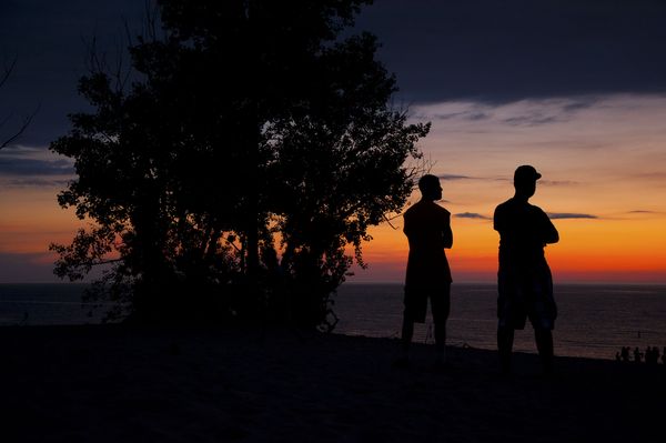
My son sped down the interstate highway in Michigan to get me to a beach in time to take this shot. I'm blessed to have a son that wants to support his old Mom's habit! :-D
The picture doesn't look as vibrant as it did when I printed it out. Any advice?
The picture doesn't look as vibrant as it did when I printed it out. Any advice?
On The Beach
Oct 22, 2011 08:54:51 #
Nice shot. The only other thing you might want to consider trying is cloning out the two bright spots on the left in the background.
Oct 22, 2011 08:52:06 #
Oct 21, 2011 19:58:17 #
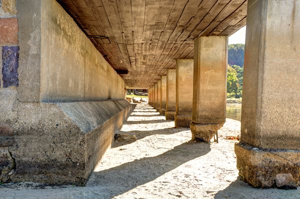
I agree with everyone; HDR can be overdone and it is a new an exciting way to interpret your work.
This was my first attempt at HDR. Even though I didn't know what I was doing, I tried to make it look as natural as possible.
This was my first attempt at HDR. Even though I didn't know what I was doing, I tried to make it look as natural as possible.
Under the Pier
Oct 18, 2011 22:37:58 #
Thanks so much. I'll have to go investigate Lake Forest.
Oct 18, 2011 22:20:39 #
Gizzy - just remembered. The reason the colors look the way they do is because I had the camera set on the wrong white balance. Go figure!