B&Ws Need Critqueing
Nov 2, 2011 17:19:45 #
Just getting into B&W shooting and am finding myself loving it more everday. Most have been converted from color but I plan to start shooting in monochrome to see if I can develope a better B&W eye. Any suggestions are welcome...........

Nov 2, 2011 17:42:03 #

http://www.cambridgeincolour.com/tutorials/color-black-white.htm
Be aware that straight color to B&W = bland (boring)
Be aware that straight color to B&W = bland (boring)
Nov 2, 2011 17:42:14 #
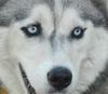
I like #2 the best.
I would recommend not shooting in monochrome but rather keep shooting in colour and converting. You can control your highlights, low lights and mid tones that way. where when shooing in monochrome you are letting the camera make the choices for you. (I don't think this is ever a good idea).
I would recommend not shooting in monochrome but rather keep shooting in colour and converting. You can control your highlights, low lights and mid tones that way. where when shooing in monochrome you are letting the camera make the choices for you. (I don't think this is ever a good idea).
Nov 2, 2011 17:46:43 #

MWAC wrote:
I like #2 the best.
I would recommend not shooting in monochrome but rather keep shooting in colour and converting. You can control your highlights, low lights and mid tones that way. where when shooing in monochrome you are letting the camera make the choices for you. (I don't think this is ever a good idea).
I would recommend not shooting in monochrome but rather keep shooting in colour and converting. You can control your highlights, low lights and mid tones that way. where when shooing in monochrome you are letting the camera make the choices for you. (I don't think this is ever a good idea).
I've heard the same thing, MWAC... but have been tweaking the levels you mention in processing work even when I shoot in B&W, too.
It doesn't make a HUGE difference, but enough of one that I THINK I'm making a difference in them! *snickers*
These aren't bad... however, I'm still learning what makes a great B&W shot and what constitutes bland or mediocre, myself... so no critiquing from me, just opinion! :)
Number two is my fave. of the set as well... enough varying tones to keep things interesting. It's well exposed but not overly so... and the scene is clear.
Nov 2, 2011 17:50:17 #
tilde531 wrote:
quote=MWAC I like #2 the best. br br I would r... (show quote)
somewhere on the board, I posted my CS5 reciepe that I use for B/W conversations. I'll try to find it again later tonight.
To get great results you need to burn and dodge areas that you think need to be highlighted or darkened.
Nov 2, 2011 17:50:48 #
Well now I have 2 posts that seem to contradict each other. In my photo class the instructor agreed that you should always convert from color but on here I have heard some say the opposite. If converting makes the photos look blah what would you change to make them better????
Nov 2, 2011 17:52:51 #
MWAC wrote:
somewhere on the board, I posted my CS5 reciepe that I use for B/W conversations. I'll try to find it again later tonight.
To get great results you need to burn and dodge areas that you think need to be highlighted or darkened.
somewhere on the board, I posted my CS5 reciepe that I use for B/W conversations. I'll try to find it again later tonight.
To get great results you need to burn and dodge areas that you think need to be highlighted or darkened.
I remember reading it and thinking: "You GO girl!" It was very concise and easy to follow.... I was all excited about learning something new, etc.... but alas, I don't HAVE CS5 or Photoshop either. *grumble*
I thought I'd try your recipe using similar tools offered in the other programs I DO have, however.
Now the bad thing: I don't remember which thread it was either *blush * sowwie
Nov 2, 2011 18:04:38 #
Ah yes have seen these and was very impressed with the clarity. Like the lady above I don't have Photoshop but I use Picassa and there should be something I can do with that. What I would like to know is what would you suggest I do to make the pics more appealing if they appear bland---not sure what that means so I can adjust........
Nov 2, 2011 18:08:09 #
coco1964 wrote:
Ah yes have seen these and was very impressed with the clarity. Like the lady above I don't have Photoshop but I use Picassa and there should be something I can do with that. What I would like to know is what would you suggest I do to make the pics more appealing if they appear bland---not sure what that means so I can adjust........
Picasa won't give you these results, sadly.
I have and use it, too... and LightRoom3.
The closest to Photoshop and CS5 for FREE that I've found, is Gimp2.6 (or something like that). It has the same tools she's using HOWEVER... it's very difficult to learn what does what and how... especially with layers (since mine won't show me the layers in one place! grumble* )
Nov 2, 2011 18:10:00 #
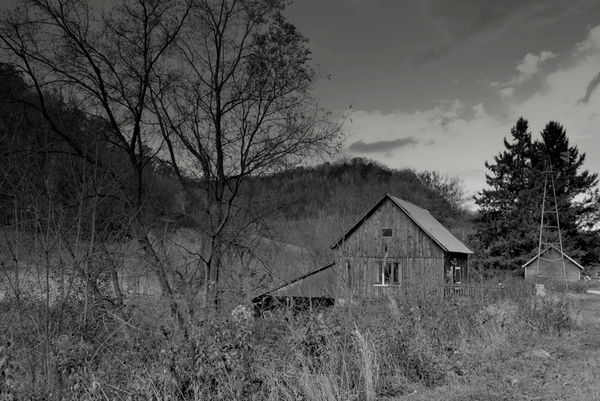
coco: from what I can see, your barn and building shots are underexposed , too dark. They could use some selective lightening and brightening... to bring up the contrast and make the tones pop off one another.
Nov 2, 2011 18:13:05 #
To tweak (as this is what we are speaking of here) a color to a B&W the best but most complex way is to play with the layers.
If picassa is using layers, you are good to go. If not, use GIMP - free software (GNU license) that offers most (and sometime more than PS C5). http://www.gimp.org/
No, I am not working for them but when something is free and good, it is worth publicizing.
Note: learning curve is high.
If picassa is using layers, you are good to go. If not, use GIMP - free software (GNU license) that offers most (and sometime more than PS C5). http://www.gimp.org/
No, I am not working for them but when something is free and good, it is worth publicizing.
Note: learning curve is high.
Nov 2, 2011 18:13:34 #
You can so get these results with LE, my mentor only uses LR3 for his editting. The trick is getting your exposure and W/B spot on. And when you convert that your whites are white and your blacks are a tue black.
Blah b/w are usually are result of the image being more and black/grey conversation.
Blah b/w are usually are result of the image being more and black/grey conversation.
Nov 2, 2011 18:14:07 #
Nov 2, 2011 18:15:11 #
Nov 2, 2011 18:21:54 #

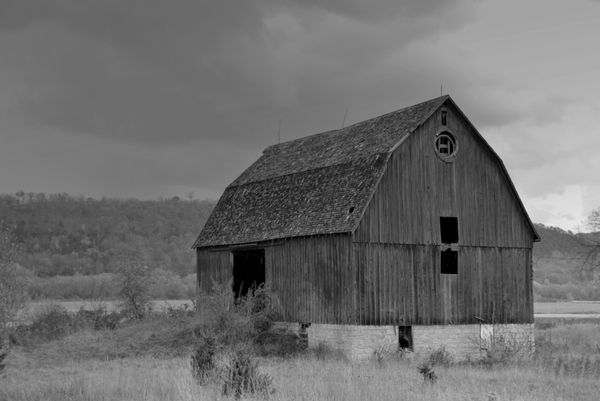
no. 3
I would dodge the clouds directly over the barn "SLIGHTLY".
I would then adjust the contrast over the whol picture.
I would dodge the clouds directly over the barn "SLIGHTLY".
I would then adjust the contrast over the whol picture.
If you want to reply, then register here. Registration is free and your account is created instantly, so you can post right away.