Posts for: R.G.
May 20, 2016 15:05:25 #
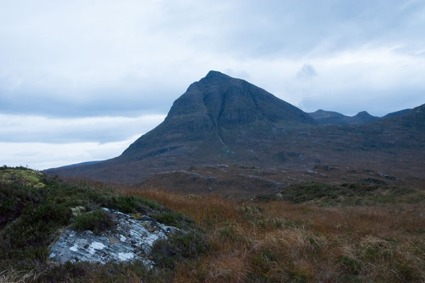
Looking for something to keep you busy for a while? I took this in fading light and the colours came out a bit funny. It reminds me of how the shots from my compact looked like much of the time. So what do you think it needs - normalised? Or do you think a surreal or otherworldly look would suit? Feel free to edit this any way you deem appropriate.
I'll post a link to a DNG version under the JPG image.
-
I'll post a link to a DNG version under the JPG image.
-
May 19, 2016 11:53:49 #
Great shot - not much room for improvement. If it was mine I'd try to lose some of the glare on the wall right in front of his face and on the cowling on the lathe. And I'd try to brighten what he's working on or at the very least brighten that general area. The subject of his concentration deserves a bit of emphasis.
May 18, 2016 14:04:01 #
I don't have On1, but if you want a suggestion to try, have a look in the export section.
May 18, 2016 12:17:30 #
I must have something against glare coming through foliage  .
.
-
.-
May 17, 2016 15:31:42 #
bdk wrote:
.....thanks for those that wrote back......
You're welcome. My only adjustments (in LR) were Vertical minus 22 and Rotate minus 0.8.
May 17, 2016 15:29:10 #
Graham Smith wrote:
.......The vibrancy of the people lifts India.
I think that's what you've succeeded in focusing on.
May 17, 2016 14:59:18 #
The problem is mainly one of perspective distortion, caused by the upward tilt of the camera (I don't have exif data but I suspect the use of a wide angle as well). Rotating on its own won't solve the problem - it needs a perspective correction tool as well. I only have Lightroom so I can't advise on PS.
May 17, 2016 14:51:44 #
Good title for a movie. Good setting for it as well. Your shots seem to do a good job of capturing the lack of glamour without giving an impression of seediness. Life seems to tick away happily without the glamorous trappings of western civilisation.
May 17, 2016 14:41:15 #
I think I might have composed it with the rock nearer the bottom right hand corner. The farther into the frame the rock is placed, the more it competes with the main subject - the bridge. As it is, the bridge isn't very big in the frame and there's a danger that the shot will be seen as a picture of the foreground elements with a bridge in the background. I think it's on the limit as far as the bridge/foreground balance goes. But I commend the obvious thoughtfulness that the shot is evidence of, and the result is beautiful and engaging.
May 16, 2016 14:59:59 #
Great "slice of life" shot. It must be tricky shooting dark-skinned people - their features will disappear into the shadows so easily. You managed to avoid it but I can see how easily that would happen, especially in bright sunshine. I once said jokingly that some HDR processing might be the answer.....
May 16, 2016 12:51:58 #
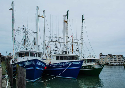
Once again you found yourself facing the sun and shooting the shadow side of things. I can appreciate the difficulty in getting a usable exposure, especially since the movement of the boat would rule out bracketing. However, I think there are still some correctable flaws in an otherwise good shot. For instance, the haze would be barely noticeable if it was more consistent, but its inconsistencies make it look unnatural. And the same thing applies to the haze's inconsistent colouring. You're probably going to say that your processing was minimal and what you see is for the most part what was there, but there's something about the inconsistencies that create an unconvincing look.
I mentioned the haze in your last harbour shot, and I'm still having the same problem here. The golden haze looks fine, but the blue stuff looks out of place - it just doesn't look natural, and I suspect that the shot would be better if it was at least reduced a bit. Sometimes cameras don't do reality any favours and a bit of PP is needed to do justice to the scene.
On a more positive note, excellent subject and a great sky.
May 15, 2016 09:33:57 #
saparoo wrote:
R.G., thanks so much for the information. No, I was not happy with the green/yellows. I don't think I used saturation but I did increase vibrancy, maybe too much. I do have some HDR pre-sets but was trying to do what I could on my own. I thank you for the advice. I'm always open to ways I can improve....
You're welcome, Sylvia. Pre-sets can be good for getting ideas as to how to achieve certain effects, but I found that my learning curve stagnated when I was depending on them. It's better to try to work out how things are done, then use experimentation to find out for yourself how to do them. You'll learn a lot more doing that than learning which pre-set's likely to be best. Having said that, until you know how to do stuff, pre-sets will get you there, especially with the creative sort of editing.
Another possibility that occurred to me regarding the colouring is that maybe the White Balance needed a tweak. If everything in a shot has a yellow tint, it's possible that the WB slider needs a nudge towards the blue end. However, you'll have to be the judge of that, because you're the one who viewed the scene first-hand. If the shot did benefit from a WB correction, it would still be worth giving it a going over with the HSL tool, and you'd find that the individual colours (yellow and green in this case) needed less correcting.
It's also worth remembering that the Tint slider can correct stuff too, but it's not so easy to spot the potential benefits to be gained from a green/purple shift. If your greens were still being elusive after the above adjustments, it would be worth trying a Tint shift towards green to see if that helped. With WB and Tint, it's usually a good idea to exercise restraint and use the HSL tool for the more radical adjustments.
May 14, 2016 04:30:03 #
TheeGambler wrote:
.......I am lucky that I can imagine what I want to accomplish. (Some would call that vision.) But...... if I waited for a "vision" before I took every photo, I would get very little done......
For you (and some others, no doubt), planning has to include organising and logistics, but in a more general sense, planning involves thinking about what you want and how you can go about getting it. In that context I would say that planned shoots are more likely to produce good results.
In the absence of a clear idea of what you anticipate or want to achieve, the best option is, as you say, to "just start throwing things together", because one of the biggest obstacles to having a productive flow is inertia, and very often the process of experimenting will lead to good results, or at the very least give you ideas. But as I stated before, I see proper planning as a vital ingredient in optimising your chances of producing good results, and visualisation is a part of that planning process. For example, in the past I have used maps to give me pointers as to where I'm likely to get the sort of landscape shot I'm after - and it's worked. And that process involved visualising what I wanted.
May 13, 2016 10:54:32 #
May 13, 2016 10:43:01 #
saparoo wrote:
Thank you for looking. I've just started playing with HDR, so do you think I used too much clarity?
I meant glossy and shiny in a good way (unless it's overdone - which you haven't done). If that's an example of your HDR processing, I would say you're on the right track. You only want to use just enough to coax some details out of the shadows and highlights, and also to tone down any glare (especially in the background where it creates an undesirable distraction).
If you're doing your own HDR processing (as opposed to using pre-sets), you need to watch the loss of contrast that it causes. If the first two were mine I'd ease off on the saturation and bump up the Contrast/Clarity a bit. What you'll find is that most times if you increase the contrast it strengthens the colours a bit and you don't need so much saturation (if any). If you ever think your picture looks a bit flat, you should always try extra Contrast/Clarity first, before adding saturation.
Are you happy with the colour of the grass? If the shots were mine I'd use the HSL tool to tint-shift green towards blue a bit, desaturating green if necessary. And if the grass was the only thing in the shot that the yellow slider affected, I'd tint-shift yellow towards green a little to get the grass looking greener (again, desaturating if necessary).