Posts for: Anvil
May 29, 2019 13:44:39 #
photophile wrote:
I prefer 1.
Thanks! I prefer the first, as well, simply because it has more interesting things going on -- rocks, trees, road. The second is, essentially, a valley with natural framing.
May 29, 2019 13:41:54 #
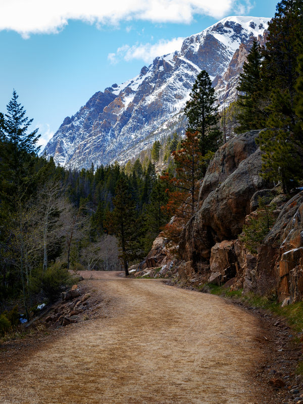
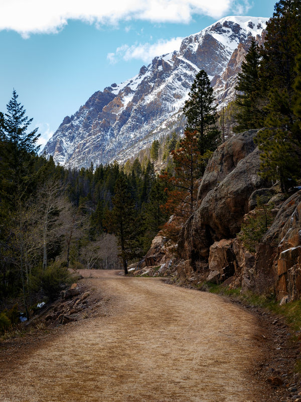
Continued. In the no color grading version, the greens are a little greener, the reds in the trees are a bit redder, and the sky is even a bit bluer. To me, those brighter colors, even though they are subtle, do not convey the mystery mood that I wanted. The color grading tied those colors together, warming them up. Even the road looks warmer. (I admit, it is subtle, but you don't want to be assaulted with color grading.)
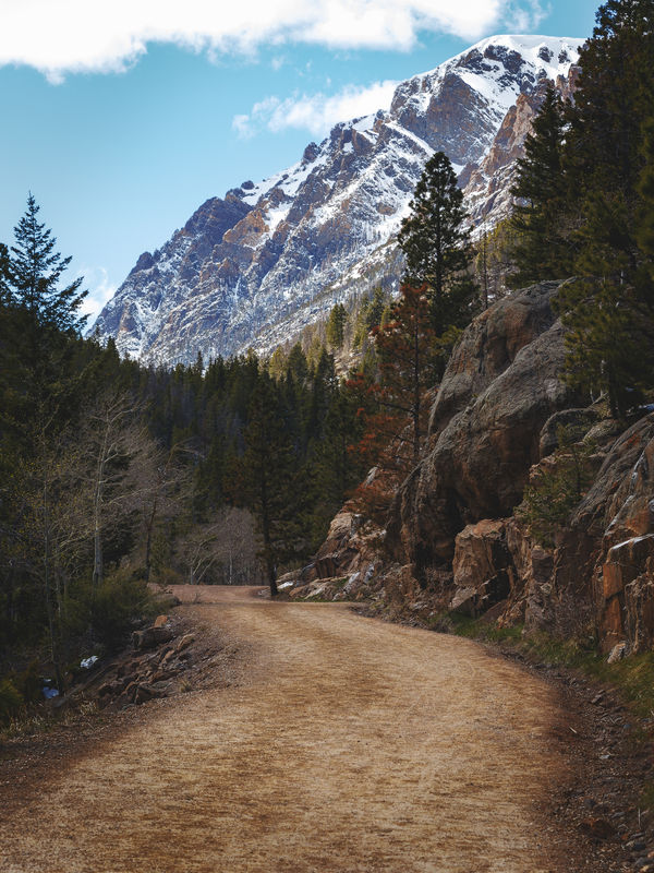
Once the matte is added, the darkest of the colors get a bit more muted.
Once the matte is added, the darkest of the colors get a bit more muted.
May 29, 2019 13:37:59 #
Linda From Maine wrote:
#1 has a great sense of scale and brings back memories of my first up close glimpses of Mt Rainier. Awe inspiring, to say the least. Please explain how you employed "color grading" here. Thanks Jim!
Thanks!
I'll explain the color grading by posting two, additional versions of the shot.
While the color grading, itself, has an effect on the finished product, I think this shot was equally affected by two, different techniques. The first is the color grading, and the second is the application of a matte finish. I'll post the shot without either the color grading or the matte, and then with the color grading, but without the matte.
When I color grade a landscape photo, many, but not all, of the shots receive some variant of a sepia gradient. You can think of the gradient super saturated sepia (nearly black) at one end, and very faint sepia on the other. The super saturated sepia gets applied to the darkest tones of the photo, and the very faint sepia gets applied to the lightest tones of the photo. The gradient layer is blended (many times with blend-if) with the photo layer.
Non-landscape shots don't necessarily get a sepia-based gradient. A recent shot of a Bighorn Sheep ram accepted a color grade with the name "Mixed Bag". That one was very interesting.
Anyway, on to the matte finish. The matte finish, basically, takes the darkest tones of the photo, and brightens them, while leaving the rest untouched.
May 29, 2019 13:20:01 #
May 29, 2019 12:44:40 #
Old Fall River Road, in Rocky Mountain National Park, is currently closed to all but foot traffic. When vehicles are allowed, it is one way, only. It doesn't take much imagination to figure out why it is only one way. We hiked some way up this road, but we really didn't know how far we should go, to see the best views. It seems as if the farther up you go, the better the views.
The first of these shots is facing the road going up. I was struck how the road looks as if it smacks into the side of the mountain. This shot is, to me, an example of how color grading can add to the mood of the photo. I think it gives just a touch of mystery to the road.
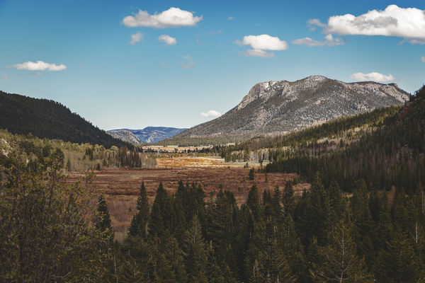
The second shot is looking in the opposite direction, though not from the same spot as the first shot.
The first of these shots is facing the road going up. I was struck how the road looks as if it smacks into the side of the mountain. This shot is, to me, an example of how color grading can add to the mood of the photo. I think it gives just a touch of mystery to the road.
The second shot is looking in the opposite direction, though not from the same spot as the first shot.
May 29, 2019 12:26:54 #
Beautiful colors! I like the group of people on the right, photographing the sunset. It provides some wonderful perspective.
May 29, 2019 12:23:09 #
A very lovely shot. The fact that the stream is, more or less, in the middle, implies that you are standing on a bridge, above the stream. Is that correct, or were you able to frame the shot to appear that way, even though you may have been standing on the (left) shore?
May 26, 2019 10:22:26 #
I think the whole idea is to experiment with any new tool, to see where it might lead. Everything I had read about the texture tool tended to concentrate on static objects, whether that happened to be big boulders or a face. I wanted to see if there was any value in using that tool on moving objects.
May 26, 2019 09:25:25 #
May 25, 2019 14:31:15 #
When I first heard of Lightroom's new "texture" slider, I thought of textures in the same manner as many on this forum use textures -- a subtle blending of layers. Lightroom's "texture" slider has nothing to do with that type of texture. (Lucky us -- a brand new meaning for a term that has been in use for years.)
Lightroom's texture slider can be used as a global adjustment, or a local adjustment, applied by one of the local adjustment tools. Pretty much every one of those who educate the masses in the use of LR and PS has opined that this tool be used as a local adjustment, rather than a global adjustment. In this, I heartily concur. Even if you were to used this tool strictly as a local adjustment, there is still plenty of room for experimentation.
By removing, or decreasing, texture, you can smooth things out. By adding, or increasing, texture, you can bring out detail. Decreasing texture on skin can smooth it out, whereas increasing texture on skin can make it look more gritty. I decided to see what the texture slider could do with moving water. When might I want to increase or decrease the texture of moving water?
My own personal preference for moving water is to allow for some amount of motion blur. I generally don't like my shots to have water frozen in an instant of time, but I also, generally, eschew so much blur that the water looks like a saucer of milk.
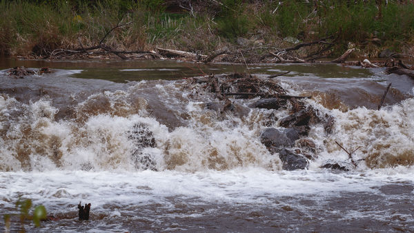
Last week, I took my camera with me on a bike ride. I came across a mini-waterfall on the Big Thompson River. It was a pretty bright day, and I did not bring a tripod with me, so I took the shot at that shutter speed dictated by the conditions. The result, of course, was water frozen in an instant of time. It did not really convey motion, although it was pretty obvious that the water had to be moving. I figured the water might be softened up by decreasing both texture and clarity, just where the water was moving over the logs. This ended up softening the focus of the particularly active parts of the water. It did not mimic a long exposure, but it did seem to make the particularly active parts of the water seem too active for the shutter speed. Thus, the water took on a very subtle explosive quality. It was motion, but that motion was more random than directed along a path.
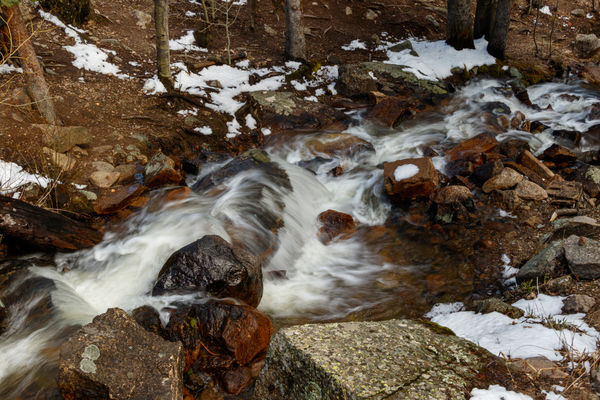
Yesterday, we went to Rocky Mountain National Park. (Fantastic day for wildlife, including a bear.) I came across a stream of water flowing briskly over some rocks. The area was in shade, so I figured I could slow my shutter speed down just enough to get that motion I prefer. 1/6 of a second was all it took. I liked the result, but I decided to experiment with texture and clarity, to see if I could further define the path the water was taking. Once again, the result was subtle, but quite pleasing. Let's say I took a nice, clear photograph, and decided to paint in the flowing water -- real painting, not digital manipulation. If I were to use a very soft paint brush, I'd get something much like I saw in my 1/6 second exposure. If I were to use a somewhat stiffer paint brush, those stiffer bristles might make my brush strokes more visible, and if my technique were good, I'd probably be left with a more definite feeling of motion, in the water. That is what increasing texture and clarity got me. The effect was more noticeable in those areas where the water was flowing across rocks, rather than in free fall.
I'll just include the "after" versions. The purpose of including these shots, at all, is to show the results of the subtle post processing, rather than any attempt to show some fabulous photos.
Lightroom's texture slider can be used as a global adjustment, or a local adjustment, applied by one of the local adjustment tools. Pretty much every one of those who educate the masses in the use of LR and PS has opined that this tool be used as a local adjustment, rather than a global adjustment. In this, I heartily concur. Even if you were to used this tool strictly as a local adjustment, there is still plenty of room for experimentation.
By removing, or decreasing, texture, you can smooth things out. By adding, or increasing, texture, you can bring out detail. Decreasing texture on skin can smooth it out, whereas increasing texture on skin can make it look more gritty. I decided to see what the texture slider could do with moving water. When might I want to increase or decrease the texture of moving water?
My own personal preference for moving water is to allow for some amount of motion blur. I generally don't like my shots to have water frozen in an instant of time, but I also, generally, eschew so much blur that the water looks like a saucer of milk.
Last week, I took my camera with me on a bike ride. I came across a mini-waterfall on the Big Thompson River. It was a pretty bright day, and I did not bring a tripod with me, so I took the shot at that shutter speed dictated by the conditions. The result, of course, was water frozen in an instant of time. It did not really convey motion, although it was pretty obvious that the water had to be moving. I figured the water might be softened up by decreasing both texture and clarity, just where the water was moving over the logs. This ended up softening the focus of the particularly active parts of the water. It did not mimic a long exposure, but it did seem to make the particularly active parts of the water seem too active for the shutter speed. Thus, the water took on a very subtle explosive quality. It was motion, but that motion was more random than directed along a path.
Yesterday, we went to Rocky Mountain National Park. (Fantastic day for wildlife, including a bear.) I came across a stream of water flowing briskly over some rocks. The area was in shade, so I figured I could slow my shutter speed down just enough to get that motion I prefer. 1/6 of a second was all it took. I liked the result, but I decided to experiment with texture and clarity, to see if I could further define the path the water was taking. Once again, the result was subtle, but quite pleasing. Let's say I took a nice, clear photograph, and decided to paint in the flowing water -- real painting, not digital manipulation. If I were to use a very soft paint brush, I'd get something much like I saw in my 1/6 second exposure. If I were to use a somewhat stiffer paint brush, those stiffer bristles might make my brush strokes more visible, and if my technique were good, I'd probably be left with a more definite feeling of motion, in the water. That is what increasing texture and clarity got me. The effect was more noticeable in those areas where the water was flowing across rocks, rather than in free fall.
I'll just include the "after" versions. The purpose of including these shots, at all, is to show the results of the subtle post processing, rather than any attempt to show some fabulous photos.
May 22, 2019 16:20:29 #
That is fun.
What did you use? I've used Abrosoft FantaMorph, to morph from one shot to a second, creating an animated GIF file, in the process. I think one can get an upgrade that would allow the type of multi-step morph you did, but I've never investigated upgrades to that software.
What did you use? I've used Abrosoft FantaMorph, to morph from one shot to a second, creating an animated GIF file, in the process. I think one can get an upgrade that would allow the type of multi-step morph you did, but I've never investigated upgrades to that software.
May 20, 2019 17:15:31 #
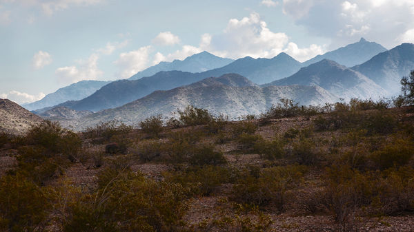
I normally do not try to add things to a photo. Instead, I try to use what is there, to get the point across. In this photo, I wanted to bring the mountains closer to the viewer. A small part of that was a bit of a crop. I just trimmed off the bottom, in order to get it to a 16x9 aspect ratio, which I thought worked well, for this shot. The rest of my attempt to bring the mountains closer had to do with bringing out detail in those mountains, and highlighting them with a subtle, off-center vignette.
May 18, 2019 11:09:48 #
I like this one, a lot! I think the surreal feel is enhanced by the perspective distortion of the watch face.
May 5, 2019 09:42:42 #
I went with Phlearn -- Photoshop 101, 201, and 301. This really opened up Photoshop to me. There are a lot of excellent products that plugin to Photoshop, and once I became familiar with the ways of Photoshop, itself, I could understand what these products were doing, and why and when it made sense for me to use them.
May 2, 2019 09:08:41 #
Easily found on a Google search. The silent shutter is one of the drive mode settings. There are two silent settings: silent single shot, and silent burst shot. The silent single shot is the box with the "S" to the right. Silent burst mode is the multiple boxes with the "S" to the right.
Be warned that the shutter is not silent, just muted. Silent mode will also slow down burst rate.
Be warned that the shutter is not silent, just muted. Silent mode will also slow down burst rate.