Old Fall River Road, RMNP
May 29, 2019 12:44:40 #
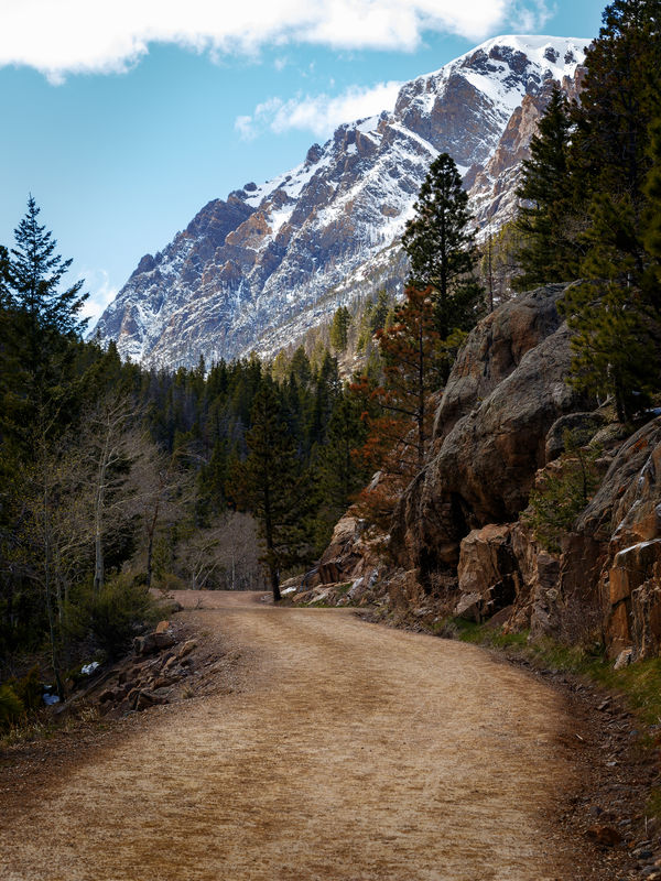
Old Fall River Road, in Rocky Mountain National Park, is currently closed to all but foot traffic. When vehicles are allowed, it is one way, only. It doesn't take much imagination to figure out why it is only one way. We hiked some way up this road, but we really didn't know how far we should go, to see the best views. It seems as if the farther up you go, the better the views.
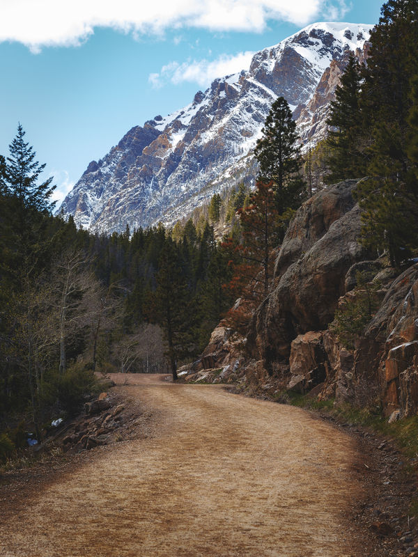
The first of these shots is facing the road going up. I was struck how the road looks as if it smacks into the side of the mountain. This shot is, to me, an example of how color grading can add to the mood of the photo. I think it gives just a touch of mystery to the road.
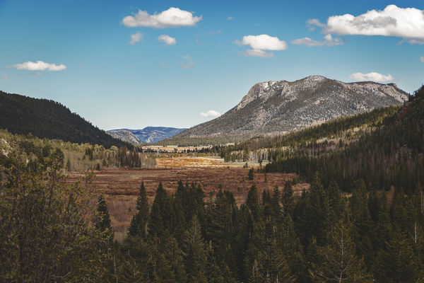
The second shot is looking in the opposite direction, though not from the same spot as the first shot.
The first of these shots is facing the road going up. I was struck how the road looks as if it smacks into the side of the mountain. This shot is, to me, an example of how color grading can add to the mood of the photo. I think it gives just a touch of mystery to the road.
The second shot is looking in the opposite direction, though not from the same spot as the first shot.
May 29, 2019 12:55:26 #

#1 has a great sense of scale and brings back memories of my first up close glimpses of Mt Rainier. Awe inspiring, to say the least. Please explain how you employed "color grading" here. Thanks Jim!
May 29, 2019 12:57:11 #

May 29, 2019 13:20:01 #
May 29, 2019 13:22:10 #

May 29, 2019 13:37:59 #
Linda From Maine wrote:
#1 has a great sense of scale and brings back memories of my first up close glimpses of Mt Rainier. Awe inspiring, to say the least. Please explain how you employed "color grading" here. Thanks Jim!
Thanks!
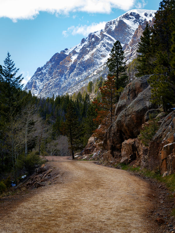
I'll explain the color grading by posting two, additional versions of the shot.
While the color grading, itself, has an effect on the finished product, I think this shot was equally affected by two, different techniques. The first is the color grading, and the second is the application of a matte finish. I'll post the shot without either the color grading or the matte, and then with the color grading, but without the matte.
When I color grade a landscape photo, many, but not all, of the shots receive some variant of a sepia gradient. You can think of the gradient super saturated sepia (nearly black) at one end, and very faint sepia on the other. The super saturated sepia gets applied to the darkest tones of the photo, and the very faint sepia gets applied to the lightest tones of the photo. The gradient layer is blended (many times with blend-if) with the photo layer.
Non-landscape shots don't necessarily get a sepia-based gradient. A recent shot of a Bighorn Sheep ram accepted a color grade with the name "Mixed Bag". That one was very interesting.
Anyway, on to the matte finish. The matte finish, basically, takes the darkest tones of the photo, and brightens them, while leaving the rest untouched.
May 29, 2019 13:41:54 #
Continued. In the no color grading version, the greens are a little greener, the reds in the trees are a bit redder, and the sky is even a bit bluer. To me, those brighter colors, even though they are subtle, do not convey the mystery mood that I wanted. The color grading tied those colors together, warming them up. Even the road looks warmer. (I admit, it is subtle, but you don't want to be assaulted with color grading.)
Once the matte is added, the darkest of the colors get a bit more muted.
Once the matte is added, the darkest of the colors get a bit more muted.
May 29, 2019 13:44:39 #
photophile wrote:
I prefer 1.
Thanks! I prefer the first, as well, simply because it has more interesting things going on -- rocks, trees, road. The second is, essentially, a valley with natural framing.
May 29, 2019 14:33:22 #
May 29, 2019 14:34:55 #
May 29, 2019 14:42:31 #

Anvil wrote:
.....You can think of the gradient super saturated sepia (nearly black) at one end, and very faint sepia on the other.......
It sounds very similar to what split toning does. In many of my landscape shots I add an amber (30-35) to the darks and blue ((215-220) to the highlights. Adding a cool colour to the highlights and a warm colour to the darks keeps things balanced temperature-wise.
May 29, 2019 15:41:45 #
gsmith051 wrote:
Very nice images. Especially like #1. Thanks
/George
/George
Thanks, much!
May 29, 2019 15:44:57 #
R.G. wrote:
It sounds very similar to what split toning does. In many of my landscape shots I add an amber (30-35) to the darks and blue ((215-220) to the highlights. Adding a cool colour to the highlights and a warm colour to the darks keeps things balanced temperature-wise.
That's exactly what color grading is. When you are doing split toning, you are confined to two colors, whereas in Photoshop, you are not so constrained. Of course, that flexibility is a two-edged sword. It's like going to a restaurant that has a fifteen page menu. What do I want to eat?
May 29, 2019 17:03:51 #

Beautiful work, Jim! I appreciate your generosity taking the time to share your work steps and techniques with us.
May 29, 2019 17:10:27 #
UTMike wrote:
Beautiful work, Jim! I appreciate your generosity taking the time to share your work steps and techniques with us.
Thank you!
If you want to reply, then register here. Registration is free and your account is created instantly, so you can post right away.