Posts for: northshore
Jan 29, 2012 13:53:37 #
One quick correction: it's spelled "cupola"-- your version creates an unfortunate image! But the photos are good, and the lift bridge may soon be history.
Jan 28, 2012 01:38:59 #
Lucian wrote:
I think that friends shot is better with the depth of field as is, showing the one in back out of focus. Makes a more interesting shot.
I agree-- for me, it adds an artistry and touch of mystery and wistfulness that would be lacking with deeper depth of field. And it gives me ideas for my next "people" shot-- thanks!
Jan 25, 2012 13:13:35 #
Here's a link to the series Joel Sartore is doing, with his photos and prose, some humorous, some anything but funny. I had the privilege of taking a one-week course with Joel-- one of the highlights of my photography education so far. The series is worth spending some time on, if only to see his amazing photos.
http://ngm.nationalgeographic.com/visions/field-test/sartore-biodiversity/assignment/?source=photographers
http://ngm.nationalgeographic.com/visions/field-test/sartore-biodiversity/assignment/?source=photographers
Jan 25, 2012 08:53:15 #
Minceymomof9 wrote:
My husband and some of the kiddos took a trip with some family to Little Sahara in Waynoka, OK this past May. He took this picture of my son with his iPhone. I am wandering if anyone out there can tell me how the two shadows were cast and why one is color and one is black and white?
How intriguing! I haven't got a clue-- and I'm wondering where the third flag went. I can't wait to see a plausible explanation, and I'd love to be able to replicate the effect.
Jan 25, 2012 08:46:20 #
sarge69 wrote:
From my old eyes
#1 - Nice but seems washed out / flat
Sarge
#1 - Nice but seems washed out / flat
Sarge
#1 looks like my neighborhood turkeys (and my neighborhood a couple of months ago-- now it's all white)-- the washed-out look is reality, and seems much truer color. This is the dull, washed out season, and it depends on whether you're going for truth or fiction. If you go for the fictional look, #2 is a bit too red/yellow, and might be better with just a touch of saturation and contrast boost.
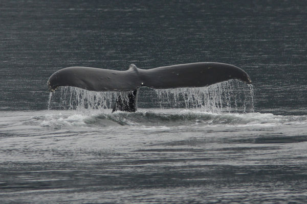
Jan 23, 2012 08:53:22 #
My impression is that you were shooting from shore, not a boat. If that's the case, the much cheaper option for you is to take a whale-watching boat tour. Even hiring a boat for a day would be a lot cheaper than a very long lens. No matter how long your lens, you need to be able to get closer physically to get a good shot.
I was amazed when I first used a 500mm lens that it didn't make distant animals full-frame-- silly me! I had unrealistic expectations. Even with the mega-lenses, you need to get relatively close to get those stunning shots.
This was taken with my Canon 40D, 300mm with 1.4 extender, ISO 400, f/5.6. The boat was probably 100 yds. from the whale. So find yourself a good captain...
whale tail
Jan 21, 2012 12:59:15 #
desert dancer wrote:
#1 gives me a more emotional response - warm and nostalgic
#2 love the B/W
#3 cold - gives me the shivers
I really do like all 3 but my mood right now is #1 But for a contest probably #2
#2 love the B/W
#3 cold - gives me the shivers
I really do like all 3 but my mood right now is #1 But for a contest probably #2
The emotional response is what draws me to #1-- and is part of IMPACT (from the "judging" thread). So I'd strongly consider that in the decision. Of course, it all depends on the judges' emotional response...
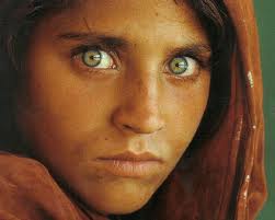
Jan 21, 2012 12:24:36 #
A fascinating topic ! As I think of photos with impact, the two that immediately come to my mind are both portraits-- the iconic Dorothea Lange "Migrant Mother" taken during the depression, and the National Geographic portrait of the Afghan (I think) young woman with mesmerizing green eyes. Naturally lit, one in color, one black and white, and both absolutely compelling.
migrant mother

Afghan woman
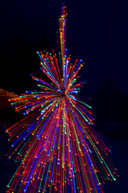
Jan 20, 2012 16:39:15 #
Here's one of the first I tried-- nearly froze as I was figuring it out!
Xmas tree in northern MN
Jan 20, 2012 16:33:06 #
Jan 19, 2012 07:26:36 #
dragonfist wrote:
You did well on all three shots in my book. I love the roses but then I am partial to roses. No offense to vallabh 1 but I liked the original colors better. The edited ones are a bit garish to me. However to each his own.
I agree about the original colors-- there's a delicacy to the roses that gets lost with the punched-up color. The second one could use maybe 10% of the color addition, but more takes you to comic-book unreality.
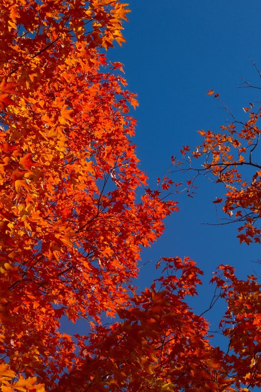
Jan 12, 2012 17:04:29 #
I enjoy it, too-- there can be a vibrancy to them. Here's one I found in a quick search (and it's nice to look at while the wind chill is -20, with gray skies and early darkness here in northern MN).
Jan 7, 2012 17:50:24 #
The photo has the flat look to me of a painting by someone who doesn't understand perspective, with only the side of the building showing. Grandma Moses, perhaps. I agree with snowbear and greymule that you should shoot from closer, and from many different angles. You may find that this flat look really appeals when all's said and done, but I'm not sure it will ever "pop" as much as one taken at a different angle. I actually find it quite interesting once some of the foreground is cropped out.
Jan 7, 2012 14:23:31 #
Since you have to move in and out, is there anything you can use as concealment for your camera up about 10 feet above your head...15-17' off the ground? (Under which you can go without distruption or while the mother bird is out hunting?)
T[/quote]
it would be interesting to see a couple of scene-setting shots of the area-- might give one of the inventive members of UHH an idea for an even better location for you to set up a blind-- though the spot you have is far better than either of my eagle-nest-photo locations (which are much too far away!).
Jan 7, 2012 11:56:50 #
I really like the lighting-- I can see lots more good shots as you sit out every morning! (Nothing else to do, I'm sure.)