Which One?
Jan 24, 2012 18:05:35 #

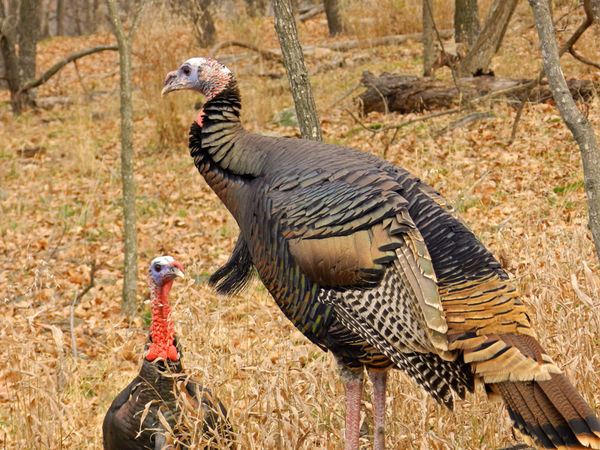
Ok so I am in a debate about which of these looks better. I prefer the one that I enhanced the color on, but someone else at my house prefers the original. So I would like some opinions, comments and critiques on which you all like better.
This is the original straight out of the camera

This is the one I played on the color with
Jan 24, 2012 18:10:06 #

2nd one has my vote. Grass looks more natural & less washed out (drab?)
Jan 24, 2012 18:11:49 #
Jan 24, 2012 18:26:28 #

I would pick the second, except that it looks just a little too enhanced. I like the fact that the head stands out from the background in the second. Maybe try diminishing the vivid setting but then increasing the contrast?
Jan 24, 2012 18:30:03 #
Roy Hakala wrote:
I would pick the second, except that it looks just a little too enhanced. I like the fact that the head stands out from the background in the second. Maybe try diminishing the vivid setting but then increasing the contrast?
Ok I will look into doing something like that. I figured if people liked the natural one better or thought I had enhanced too much I would give enhancing it another go and try things a little differently.
Jan 24, 2012 18:30:45 #
ckcougar wrote:
2nd one has my vote. Grass looks more natural & less washed out (drab?)
Yeah that's what I was afraid of is that the original one was too washed out looking.
Jan 24, 2012 18:31:54 #

Jan 24, 2012 19:07:05 #
Oops I guess I had this posted in the wrong section so it got moved.
Jan 24, 2012 19:14:11 #

while you're re-enhance the color for a second time, do something about the limb coming out of his head.
Jan 24, 2012 19:16:34 #
edwinj wrote:
while you're re-enhance the color for a second time, do something about the limb coming out of his head.
Ah, never really saw that there before. Thanks
Jan 24, 2012 21:29:18 #

Tea8 wrote:
Ok so I am in a debate about which of these looks better. I prefer the one that I enhanced the color on, but someone else at my house prefers the original. So I would like some opinions, comments and critiques on which you all like better.
I think it is great straight out of the camera
Jan 24, 2012 22:39:30 #
Sherrie wrote:
I think it is great straight out of the camera
Tea8 wrote:
Ok so I am in a debate about which of these looks better. I prefer the one that I enhanced the color on, but someone else at my house prefers the original. So I would like some opinions, comments and critiques on which you all like better.
I think it is great straight out of the camera
Thank you. I thought it was pretty good to until I started playing with the color on it. Now I am even more undecided.
Jan 25, 2012 06:10:14 #

Jan 25, 2012 06:11:52 #

The original is a bit washed out but the second one is too enhanced.
I'd say something between them would be good.
I'd say something between them would be good.
Jan 25, 2012 07:58:17 #

From my old eyes
#1 - Nice but seems washed out / flat
#2 - Very nice and you might backtrack a step in the enhancement to lower the impact of the reds.
Sarge
#1 - Nice but seems washed out / flat
#2 - Very nice and you might backtrack a step in the enhancement to lower the impact of the reds.
Sarge
If you want to reply, then register here. Registration is free and your account is created instantly, so you can post right away.