Posts for: abc1234
Nov 28, 2013 11:07:16 #
Bob Yankle wrote:
I borrowed heavily from a previous crop by Linda f... (show quote)
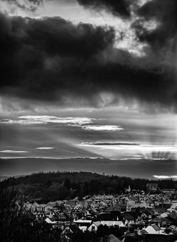
I think there are two major versions based upon how one crops the original. Bob's crop here is certainly reasonable but too conventional for my liking.
I like this sky a lot and think it has a lot of potential. I like big, dramatic, brooding skies and clouds. Here is my take on it. No cropping. In LR, I set the tonal curve to high contrast. I then broke the picture up into four horizontal zones using adjustment brushes with different settings. Probably could have done the same thing with Viveza.
This is just a quick down and dirty edit.
Bob
Nov 28, 2013 09:58:32 #
MyPharo wrote:
OOPS corrected .
Better but you can see the repeating clone pattern. What do you think you could have done to have avoided that?
Nov 28, 2013 07:27:24 #
MyPharo wrote:
Hope you like my view of the photo . Good photo BTW.
I did some photo shop to the photo. I adjusted the level and contrast a little then did s light color correction. then did a High Pass filter at 1.5 with a hard light setting . I then cloned the water to fill in the bright spot . I think if yo clop the photo just dd not look as good to me . Hope you like
I did some photo shop to the photo. I adjusted the level and contrast a little then did s light color correction. then did a High Pass filter at 1.5 with a hard light setting . I then cloned the water to fill in the bright spot . I think if yo clop the photo just dd not look as good to me . Hope you like
Definitely an improvement. Especially the feathers. However, look at the bad masking of the shoreline.
Nov 28, 2013 07:20:48 #
I am going to be odd man out here.
I do not feel comparing the two photos is fair. Going from color to sepia changes the perception considerably and alters how we feel about the crop. The only thing I agree about is getting rid of the grass. The rest is a matter of one's own taste. (A little too tight for me but the uncropped picture is good because it shows the enormity of a "big sky" space.)
However, the real issues with the shot are not the cropping but the unsharpness and uninteresting tonal range. The sky and mountain have such potential. I would fix those before worrying about the cropping.
Nov 28, 2013 07:10:01 #
JKM, I used to do weddings and they are a lot of hard work. Consider very carefully if you really want to do it. The grab shots are the easy ones. The formals take skill and experience. I would not want to learn on the job whether for a friend or paying customer. If you follow everyone's prudent advice, you will spend a lot of time learning skills that you may never use again. Is this a challenge you really want?
Weddings have no margin for error. You must nail the portraits and ceremony; you cannot go back and reshoot them. Furthermore, you are working the event and not enjoying it. And wait until you get back home and have to process all those images.
Meanwhile, no one addressed equipment. Do you have the right stuff?
I know your friend's request is flattering but weigh any disappointment in the results against your future friendship. If your friend and bride have low expectations, then perhaps you can do it. If either is picky, do not risk the relationship.
Nov 27, 2013 11:04:55 #
I think the positive vignette is the wrong way to go. It draws the eye away from the bird. And it is so unsubtle and unpleasing. I have a few suggestions.
1.) Crop tighter.
2.) Print a little darker.
3.) Try perking up the yellow a little.
4.) Add a very subtle negative vignette. In LR and ACR, that would be about -10. The idea is to focus attention on the bird without the viewer realizing it.
Good luck and happy Thanksgiving.
1.) Crop tighter.
2.) Print a little darker.
3.) Try perking up the yellow a little.
4.) Add a very subtle negative vignette. In LR and ACR, that would be about -10. The idea is to focus attention on the bird without the viewer realizing it.
Good luck and happy Thanksgiving.
Nov 24, 2013 10:03:22 #
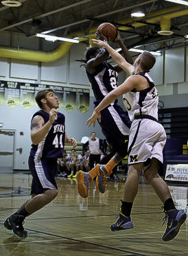
Here is my take. The obvious crop to focus attention on the action. Could have cropped out the guy on left but the resulting crop would have been too tight. Used the gradient tool in LightRoom to darken the floor. Reduced the exposure a bit. The final step was to add a little vignetting.
Nov 24, 2013 08:56:58 #
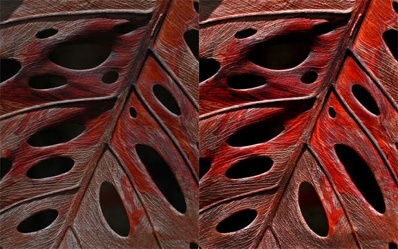
I think the original post is very good but for me, I would have worked it to be between that and Mike's interpretation. That is, I would brighten a little and bring out the oranges a bit. This is not a technical adjustment but an artistic one. I like the quiet, subdued mood of the original but it would benefit from standing out a little bit more. I want to preserve the mood while emphasizing the inherent beauty of the leaf.
PS I gave in and edited it. I adjusted the RGB and R levels, burned in the mid-tones, mainly toward the bottom, and removed a little white in the lower right corner. Excuse the pixelization.
PS I gave in and edited it. I adjusted the RGB and R levels, burned in the mid-tones, mainly toward the bottom, and removed a little white in the lower right corner. Excuse the pixelization.
Nov 17, 2013 10:36:48 #
russelray wrote:
Totally agree with that, although I am finding that, so far, everything that I've been doing for 20 years in CorelDraw, I can do in Photoshop. Sometimes not as easily, but Actions and templates can make the ease much, much easier.
Illustrator/CorelDraw and Photoshop/PhotoPaint are not interchangeable although people think the are. The former create images out of vector and the latter, out of bitmaps. When one understands the differences, then one can pick the right tool.
EPS/AI/CDR files are much smaller than the corresponding bitmap files and so much easier to work with. The illustration programs have superior tools for those kinds of files.
Nov 17, 2013 10:10:54 #
People say that PSE is a cut-down version of PS. It is not. It takes most of the photo-editing tools from PS and then adds a host of new ones specific for photos. I recommend both because PSE is easier to use but PS has a few unique tools that you turn to every so often. Regardless, LR is my point of entry.
Regarding price, PSE is a great buy. You cannot beat what you get for the money. This is probably because the consumer market is so much larger than the professional one and leads people to buy other Adobe products. A loss-leader.
Regarding price, PSE is a great buy. You cannot beat what you get for the money. This is probably because the consumer market is so much larger than the professional one and leads people to buy other Adobe products. A loss-leader.
Nov 17, 2013 10:04:54 #
russelray wrote:
Bridge quite possibly is the best organizer on the planet, far outstripping Elements.
When I was biased and prejudiced, I was an Elements and Lightroom organizer.
When I was biased and prejudiced, I was an Elements and Lightroom organizer.
How is Bridge better than LR?
Nov 17, 2013 10:00:26 #
I have my own take on these programs.
LR is your entry point into post-processing. It has two main functions: cataloging and developing (post-processing). Although Elements has some cataloging capability, LR is much more powerful. Without going in to details, you can find any photo by many different criteria. This is very powerful. Too bad it does not have the face recognition that PSE has.
LR has powerful but limited editing functions. As a practical matter, I do 90% of my editing in LR. Depending upon what I want to do, the rest of my editing is in Viveza, PSE, or PS in that order.
PSE is a great program. It has many of the features of LR and PS but is far easier to use than PS. PS is not just for photography but for working with bitmaps in general. It has some features that LR and PSE do not have but also has many that you will never use. And it is a devil to learn.
My advice is to start with LR but be prepared to buy PSE once you find out that LR cannot do all you want. PSE has great wizards and features that make outputting photos a lot of fun. You may never need PS.
Regarding other products, none of them really do all that the market leaders, LR and PSE, do. Another extremely significant advantage of the Adobe products is the copious online tutorials and demos. Well worth the money.
PS I am not a fan of Adobe but have to admit their products are the best except CorelDraw beats Illustrator by far.
Nov 15, 2013 11:09:32 #
Perhaps I should not answer because I have a Canon but....
I have the 18-200 and love it. So versatile and convenient. Be open about the 200. You may wind up loving it as much as I do. It opens up new worlds.
I have the 18-200 and love it. So versatile and convenient. Be open about the 200. You may wind up loving it as much as I do. It opens up new worlds.
Nov 15, 2013 11:05:24 #
ronwande wrote:
I just upgraded from a 40D to a T3i. I was considering the 60D and then found that the two have the same sensor and processor in them, both 18 Megapixel....
Some Rebels give you only the 18 M raw while the 60D give you the sizes with 18 M being the biggest. Unless you are making large prints, the 10 M file is more than enough.
Even though the two bodies have the same sensor and processor, the 60D does, for some unknown reason, give far more accurate exposures. Much less post-processing.
A friend of mine recently upgraded from a Rebel to the 60D and is wondering why she waited so long to do it. Much better picture quality, better grip for her small hands, very much easier controls on the back and top, and the articulated screen.
I have the 60D and think it is a great camera. The price is great now but for the extra money I would go for the 70D. I prefer to newest technology because I keep equipment at least five years, I know it will be the newest for only a few years. However, that is more than the 60D will be the newest because it is not anymore. The difference in price spread out over the next five years and the future trade-in value are worth it to me. Plus having the improved features. My vote: 70D if you can afford it. Otherwise, the 60D. You have outgrown the Rebels.
Nov 14, 2013 09:08:59 #
jerryc41 wrote:
I had a Yashica, too, and I always tried to get the 220 film. I had no idea it was improvised by Calumet.
I did not know either about Calumet. Along with Central Camera, Helix, Altman's, Reed, Standard Photo, Darkroom Aids and others, it anchored the retail camera business in Chicago. Only Calumet and Central are left. How many hours I spent in those stores when photography had an excitement and thrill of discovery that today's digital lacks.
I used only Kodak 220 and they may have solved some of Calumet's problems.