Which one
Nov 5, 2018 08:28:49 #

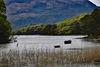
If I was forced to choose one, it would be no. 1. However, there is something about the tonality of both that is rather odd.
--Bob
--Bob
donroe wrote:
Which one
Nov 5, 2018 08:45:24 #

I like #1 the best. There are several angles of lines, and combined they keep your eyes moving around the image. In #2, the lines lead the viewer straight up (and out) of the image. I think both are a tad dark, but that may be my computer screen.
Nov 5, 2018 08:48:11 #

donroe wrote:
Which one
The first one is first rate. It's a real beauty!! No. 2 is muddy.
Nov 5, 2018 09:21:32 #
Nov 5, 2018 09:41:36 #

Nov 5, 2018 09:43:44 #

Nov 5, 2018 09:46:12 #

Nov 5, 2018 09:50:27 #
Nov 5, 2018 09:55:10 #

Nov 5, 2018 09:58:33 #

Nov 5, 2018 10:08:05 #

Nov 5, 2018 10:13:42 #
Cany143
Loc: SE Utah
Either has possibilities, but its difficult for me to get past processing problems to prefer one over the other. Haloing around the trees is a problem, but its much less a problem than the blank, white, unaddressed spaces between tree boughs that could have been burned down so they're equal in tonality to the rest of the sky. Its more apparent in the first image than the second, but --for me-- its jarring. Apart from that issue, I'll echo what Bob said above: the tonality is rather odd. My guess would be that --among other things-- both have been over-clarified.
A radical alteration of tonality is one way of abstracting a scene or a subject without altering its form. If abstraction was your goal, then that goal has been achieved.
A radical alteration of tonality is one way of abstracting a scene or a subject without altering its form. If abstraction was your goal, then that goal has been achieved.
Nov 5, 2018 10:31:27 #
I'm not a fan of black and white photography, but feel both shots are relying too heavily on developing technique rather than on the beauty of the scene. I would have to choose the first shot just because it shows more but yearn to see it's color.
Nov 5, 2018 10:32:52 #

donroe wrote:
Which one
the second one if it was lighter.
first one is nice too, though.
Nov 5, 2018 10:35:18 #

I have to follow suit with Bob and Cany143. Without knowing what your objective is they both seem to be, in my opinion, over processed. However, if you forced me to make a choice it would be #1.
If you want to reply, then register here. Registration is free and your account is created instantly, so you can post right away.