Exploring non-literal landscapes via the digital darkroom. Discuss and share your photos!
Jan 12, 2019 07:47:21 #

Linda From Maine wrote:
Were these looks achieved in pp or exposure at time of shooting, or a combination?
I think that #2 was a combination of underexposing and PP. The exif data says EC=0, but my memory of it is that I used negative EC. #1 is pure PP. #3 is an edited merge from exposure bracketing. I used a combination of negative EC (-0.7) and bracketing (+2,0,-2) to ensure that I got the highlights (which I knew would be ultra-bright), so there is no neutral exposure to post. The last image is the bright exposure which comes out as EC=+1.3.
Jan 12, 2019 08:03:27 #

jaymatt wrote:
A highly engaging portrait, well worth working to perfection. Just a head's up (no pun intended), John: this topic is in Landscape Forum Here’s one that I’m still working on, but not there yet. So far, all the work has been done in Lightroom 5.7. At this point, I am concerned with the hotspots on the face and am open to suggestions, as portraits of any kind are not my forte.

Jan 12, 2019 08:42:31 #

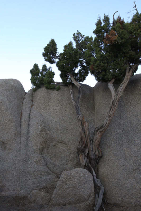
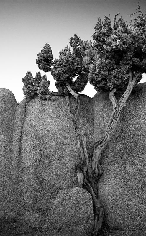
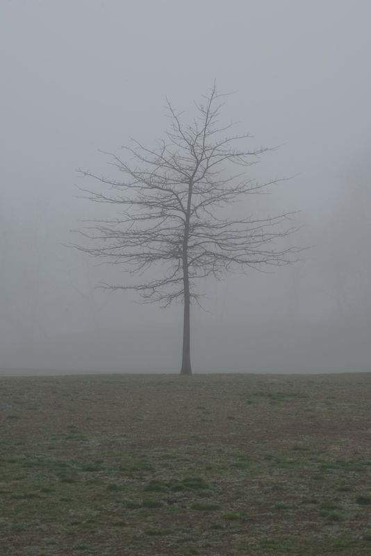
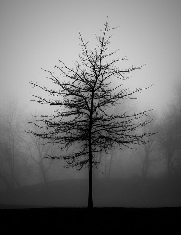
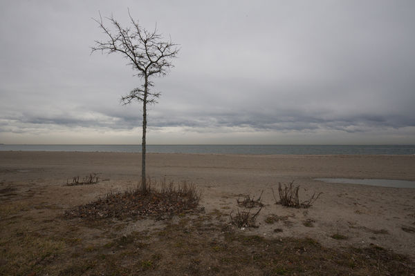
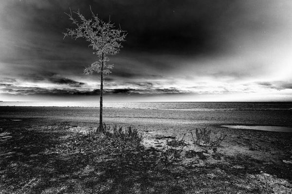
I have several with the "lone tree" theme I thought I would enter here. I have included the sooc versions. The first one, I wanted to overcome the flatness of the image as it was taken in the shade, and after injecting some texture contrast with photoshop, I spent quite a bit of time with burning and dodging within the tree trunk to give it more dimensionality. The second I just wanted to make the most of the tree figure silhouette, and enhance the interest within the foggy background. In the third shot I set out to give it some impact through high contrast and texture. Photoshop gradient map conversion to b/w.
Jan 12, 2019 08:55:56 #
fergmark wrote:
Fantastic examples, thanks so much for participating, Mark. I'm very glad you mentioned the value of dodging and burning as those are tools many monochrome novices are not familiar with. Of course similar goal and result can be achieved in color (I learned on UHH!), but there's something extra-special about a b&w image that has been carefully worked to either lead our eye through the scene or to provide - in your term - dimensionality. I have several with the "lone tree" them... (show quote)
Many thanks!
Jan 12, 2019 08:56:35 #

RichardTaylor wrote:
Just an experiment, a single shot "HDR" from a dawn shoot.
Location:Newport rock pool, Sydney (Australia) northern beaches.
Location:Newport rock pool, Sydney (Australia) northern beaches.
Turned out well. Have you ever compared a single shot HDR to a traditional 3-5 shot HDR to see what the differences are? That's an experiment I keep meaning to do.
Jan 12, 2019 08:58:43 #
R.G. wrote:
I did experiment with presets, filters and various... (show quote)
I fully agree with you that the presets and filters are usually only as good as the work we are willing to put into their use - to modify their effects through settings, opacity, blending modes, masking, brushwork to get the look we're after. I usually want an outcome far more subtle than the one-click version will give me.
Jan 12, 2019 09:00:18 #
R.G. wrote:
Most of my landscapes are straight edits so it took me a while to think of these. The three shots below were all taken in broad daylight. I thought they suited the silhouetted twilight look. The last one is the only one where I have a non-edited version for comparison.
-
-
Day-Into-Night. Interesting results, and I really like that second one a lot.
Somewhere in the annals of FYC there is an excellent video tutorial by Dave Chinn on a fairly complex but effective way to do such a switch.
Jan 12, 2019 09:01:13 #
Linda From Maine wrote:
Here is one of my favorite early explorations with using textures (and more than one). This image is an example of how a texture works more like a composite in that its colors or design are integral to the scene, not an enhancement of what is already there.
At the time of posting, I also did a "how I achieved" topic:
https://www.uglyhedgehog.com/t-450078-1.html
.
At the time of posting, I also did a "how I achieved" topic:
https://www.uglyhedgehog.com/t-450078-1.html
.
That's just beautiful. Great example of using a texture to help create a scene rather than just enhance it.
Jan 12, 2019 09:01:59 #

Linda From Maine wrote:
MinnieV and I will be co-hosting this thread. She ... (show quote)
Thank you Linda and Minniev!
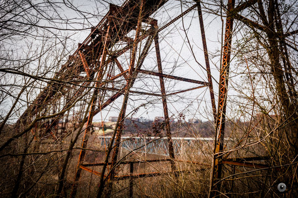
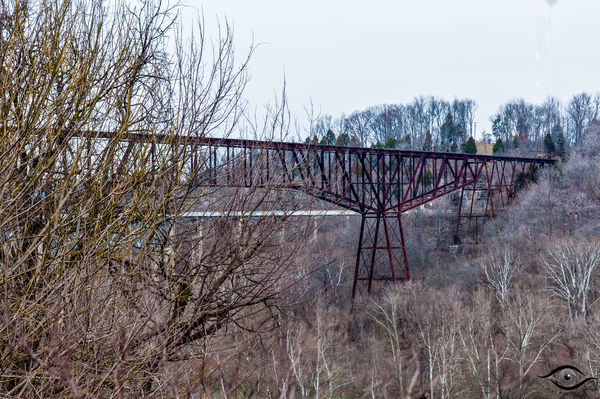
I've attached before and after images of the Tyrone Bridge in central Kentucky (across the Kentucky River), near Lawrenceburg. The bridge is a rail bridge and quite old. In fact, it is no longer used for train traffic. (Some group has leased the bridge to hold organized bungee jumping events now.) I wanted an image of it but there are scant locations from which to get a good shot. I chose a position under the bridge on its eastern end. The third image (which is unfinished) gives some scale to the bridge.
I chose to enhance the rust of the old bridge, which I thought brought considerable color to it. Incidentally, those buildings on the hill in the far background house the Wild Turkey bourbon distillery.
Jan 12, 2019 09:03:39 #
jaymatt wrote:
Here’s one that I’m still working on, but not there yet. So far, all the work has been done in Lightroom 5.7. At this point, I am concerned with the hotspots on the face and am open to suggestions, as portraits of any kind are not my forte.
Yes, this is going to be a good one! Great work so far. I agree the hotspots are what's holding you back at this point.
I'd just borrow pixels from elsewhere on his face and paint them in at a reduced opacity, then fiddle with the coloring until satisfied. You will need a layering program of some kind - PS, Paintshop, On1, etc to manage the layers though.
Jan 12, 2019 09:12:13 #
brucewells wrote:
Thanks very much for your post, Bruce! You've achieved quite a transformation. I see a subtle vignette that helps keep our eye in the frame. Can you provide a little information on how you brought out the color and details?Thank you Linda and Minniev! br br I've attached ... (show quote)
Jan 12, 2019 09:15:09 #
rborud
Loc: Minnesota
RichardTaylor wrote:
Just an experiment, a single shot "HDR" from a dawn shoot.
Location:Newport rock pool, Sydney (Australia) northern beaches.
Location:Newport rock pool, Sydney (Australia) northern beaches.
Richard The shot is inviting and simply a walk into and beguiling image. I truly think this is a quit while you are far ahead image. RBorud
Jan 12, 2019 09:20:45 #
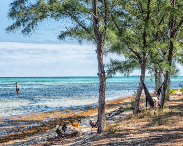
Sometimes, the 'scape simply needs some of its furniture re-arranged. This image is not literal but not fantasy either, it is meant to be fairly realistic. I walked up onto a beach in the Cayman Islands in November and spotted: a flock of colorful chickens who scattered to my left, a woman directly ahead of me in the water trying to get a large sting ray off her fishing line, a beachy horizon that was too bright to capture even with a polarizer, and a portly man in a hammock to my immediate right. No more than two elements would fit in the frame at a time, so I captured all of them separately. This was one of those places where the guide tells you to have fun and be back at the vehicle in 5 minutes, so I was a bit impulsive.
The horizon and the man had to be seriously underexposed to hold the highlights. Still, the underexposed shot of the hammock potato provided the better scene, so I used it for the base and processed a layer of it in Aurora to introduce a touch of HDR. I had several shots of the fleeing chickens and chose one that I thought I could meld into the tricky blotchy sunlight where I wanted to place them. I processed the woman and the chickens each separately, also with a touch of Aurora but dialed it down more since they were more properly exposed. I had to scale the woman a bit to bring her close enough to the shore to put her where I wanted. Then I set about extracting the chunks of the image I wanted to move, and blending them into their new places. I used a texture painted over the water and another on the beach to help pull those pieces together.
The horizon and the man had to be seriously underexposed to hold the highlights. Still, the underexposed shot of the hammock potato provided the better scene, so I used it for the base and processed a layer of it in Aurora to introduce a touch of HDR. I had several shots of the fleeing chickens and chose one that I thought I could meld into the tricky blotchy sunlight where I wanted to place them. I processed the woman and the chickens each separately, also with a touch of Aurora but dialed it down more since they were more properly exposed. I had to scale the woman a bit to bring her close enough to the shore to put her where I wanted. Then I set about extracting the chunks of the image I wanted to move, and blending them into their new places. I used a texture painted over the water and another on the beach to help pull those pieces together.
Jan 12, 2019 09:24:11 #
minniev wrote:
Truly magical. Your vision and technical expertise are awe-inspiring, Minnie, and your result utterly delightful. Who could not smile at this charming work of art?Sometimes, the 'scape simply needs some of its fur... (show quote)
Jan 12, 2019 09:25:45 #
fergmark wrote:
I have several with the "lone tree" them... (show quote)
Thank you Mark for bringing the traditional tools of dodging and burning to the discussion. Anyone who's admired Ansel Adams is probably familiar with Moonrise and the drastic changes he made using darkroom tools. They are still powerful tools for artistic expression in the Photoshop era, as you've demonstrated here with these elegant images.
Gradient maps are fairly amazing tools that can be used in a variety of ways that I'm only just scratching the surface of. My computer play this week has been invested in applying color toning using gradient maps, with intriguing results.
If you want to reply, then register here. Registration is free and your account is created instantly, so you can post right away.