Exploring non-literal landscapes via the digital darkroom. Discuss and share your photos!
Jan 12, 2019 09:29:48 #
Thank you Linda and Minniev for starting this thread. It is helpful to have detailed explanations of how one arrives the final image, making the explanation into a learning process for each of us!
Minniev, it's amazing to see how the above image came into being. Thank you for your explanation.
Minniev, it's amazing to see how the above image came into being. Thank you for your explanation.
Jan 12, 2019 09:31:36 #

brucewells wrote:
Thank you Linda and Minniev! br br I've attached ... (show quote)
Very nice result consistent with your intent and consistent with our visual expectation of an old metal bridge. So it "feels" very authentic. You've avoided the common problems of halos we often encounter in this type of project. I hope you'll tell us more about your processing and how you accomplished this.
Jan 12, 2019 09:38:56 #
If I deem a photo worthy of bringing into Photoshop, the odds are extremely good that I'll do some color toning with gradient maps. I prefer gradients to color lookup tables, because I know what the gradient is doing. The color lookup tables are more of a mystery.
Jan 12, 2019 09:44:52 #

Linda From Maine wrote:
Can you provide a little information on how you brought out the color and details?
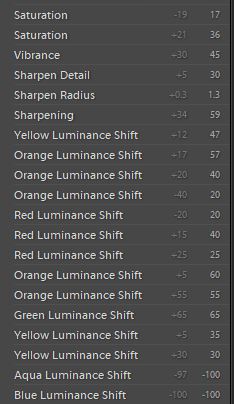
:-/ Took that image 7 years ago. I truly don't recall everything I did, but I know I was using LR to do it. I recall I employed a preset to help me along, then worked on enhancing the rust color to get some color into the image. Since that time, I've incorporated some standards to my efforts that allow me to understand what I did to an image. Sorry!
I used a preset named 'Edge Effects', which is no longer available, that I can find. But below are some of the adjustments from the History.
Jan 12, 2019 09:52:31 #

brucewells wrote:
:-/ Took that image 7 years ago. I truly don't recall everything I did...... worked on enhancing the rust color.....
I think I detect some lightening of the rust colours - orange and yellow.
Jan 12, 2019 09:56:50 #
R.G. wrote:
I think I detect some lightening of the rust colours - orange and yellow.
Yes. The History indicates Luminance adjustments for those colors.
Jan 12, 2019 09:58:09 #
kenievans wrote:
Thank you Linda. I feel much like you, my work is still in the kindergarten stage compared to the subtle complexity of the artistry I see here on UHH. But I have many great teachers here and someday I might get there.
Keni, I don’t think I’ve ever seen a photographer grow their skills as quickly as you have, both in the camera and digital “darkroom”. Is there a preset to color me “impressed”?
Andy
Jan 12, 2019 10:02:09 #

minniev wrote:
Thank you Mark for bringing the traditional tools ... (show quote)
At first glance gradient maps can appear to be a selection of interesting and horrid presets, but with experimentation they are far more than meets the eye. One of the most expansive tools available in PS. They easily produce extreme results that feel out of control. I have often used that product as a layer to blend back into the original and use the fill slider to fine tune the impact. Adding paint buckets beyond the two makes things more interesting. Glad to know you are giving it a good scratching
Jan 12, 2019 10:12:59 #

brucewells wrote:
No worries, I have worse horror stories (like deleting my entire 2015 collection of photos). Appreciate your time!...Since that time, I've incorporated some standards to my efforts that allow me to understand what I did to an image. Sorry!
Jan 12, 2019 10:15:00 #
Wanda Krack wrote:
Thank you Linda and Minniev for starting this thread. It is helpful to have detailed explanations of how one arrives the final image, making the explanation into a learning process for each of us!
Minniev, it's amazing to see how the above image came into being. Thank you for your explanation.
Minniev, it's amazing to see how the above image came into being. Thank you for your explanation.
So glad you're enjoying!
Jan 12, 2019 10:34:04 #
kenievans
Loc: Dallas
AndyH wrote:
Keni, I don’t think I’ve ever seen a photographer grow their skills as quickly as you have, both in the camera and digital “darkroom”. Is there a preset to color me “impressed”?
Andy
Andy
Thank you so much Andy! It has been a labor of love learning and growing these past two years. My wonderful wife who knows me so well surprised me with my camera for Christmas. It wasnt something I asked for or even knew I wanted but she has given me a gift of joy that I dont think I will ever grow bored with and will continue to learn from. Then to stumble upon UHH and the wonderful folks here who have been so kind and helpful. I am inspired every day to be better.
Jan 12, 2019 10:44:57 #
THINKING ABOUT PRINTING?
Some of the processing decisions I make when creating a non-literal landscape image depend on how, in the end, I think I may want to display it. For instance, if I want to print something on rough canvas I do not add a rough canvas texture because the two would fight each other; however, if I mainly want to display that same image online, I would add the canvas to emulate the look of printing on that surface.
I'm attaching a few images that illustrate this way of working.
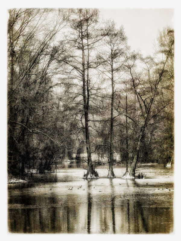
1.Ducks in Cypress Swamp - Meant for printing on aluminum, I emphasized the shiny aspects and delicate branches. The actual scene was very gloomy as it was snowing, and way too dark. Layer of Topaz Detail among other things.
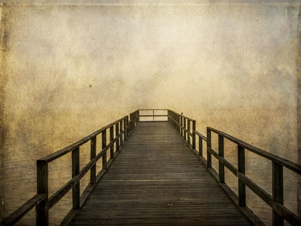
2. Pier in Morning Fog - Meant for printing on canvas. I added rough textures that the texture of the canvas would work well with and add a border vignette that I extended to account for the folding of the canvas.
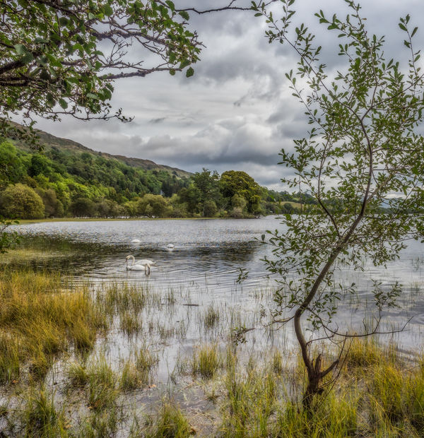
3. Scottish Swans - Meant for printing on Red River Polar Pearl, a shiny metallic paper that I like to use at home. Again, I enhanced the shiny aspects that I knew the paper would look good for, but not as much as with the one meant for real metal.
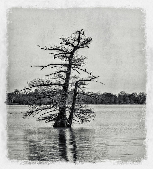
4. Delta Bayou - meant for printing at home on Red River Aurora Art paper, a cold press type paper that has a sculpted look. I picked a texture and edge approach that I knew would make the lumps and bumps of that paper even more arty.
Some of the processing decisions I make when creating a non-literal landscape image depend on how, in the end, I think I may want to display it. For instance, if I want to print something on rough canvas I do not add a rough canvas texture because the two would fight each other; however, if I mainly want to display that same image online, I would add the canvas to emulate the look of printing on that surface.
I'm attaching a few images that illustrate this way of working.
1.Ducks in Cypress Swamp - Meant for printing on aluminum, I emphasized the shiny aspects and delicate branches. The actual scene was very gloomy as it was snowing, and way too dark. Layer of Topaz Detail among other things.
2. Pier in Morning Fog - Meant for printing on canvas. I added rough textures that the texture of the canvas would work well with and add a border vignette that I extended to account for the folding of the canvas.
3. Scottish Swans - Meant for printing on Red River Polar Pearl, a shiny metallic paper that I like to use at home. Again, I enhanced the shiny aspects that I knew the paper would look good for, but not as much as with the one meant for real metal.
4. Delta Bayou - meant for printing at home on Red River Aurora Art paper, a cold press type paper that has a sculpted look. I picked a texture and edge approach that I knew would make the lumps and bumps of that paper even more arty.
Jan 12, 2019 10:59:26 #
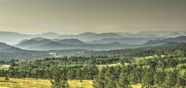
About a year ago, I drove to St Elmo's Fire to catch some ghost town shots. That part was a disappointment, mainly due to too many cars and people making the images I wanted almost impossible to get without spending more time than I wanted in PP'ing. I decided to return home via Colo Rte 77 where I caught this image. It's a three bracketed shot with a slightly offset image of the same spot processed in HDR with the original three.
Jan 12, 2019 11:00:58 #
minniev wrote:
All stunning art, Minnie, and fantastic information. THINKING ABOUT PRINTING? br br Some of the proces... (show quote)
I was asked not too long ago how my texture-pp'd photos looked printed. I have only printed about five. Three I was very happy with and one I didn't even bother hanging on the wall. Your information will save many of us time, frustration and $$
Jan 12, 2019 11:02:44 #
47greyfox wrote:
Ohhhh, "slightly offset" - a new one for me! Thanks so much, this is beautiful.About a year ago, I drove to St Elmo's Fire to catch some ghost town shots. That part was a disappointment, mainly due to too many cars and people making the images I wanted almost impossible to get without spending more time than I wanted in PP'ing. I decided to return home via Colo Rte 77 where I caught this image. It's a three bracketed shot with a slightly offset image of the same spot processed in HDR with the original three.
If you want to reply, then register here. Registration is free and your account is created instantly, so you can post right away.