Check out Infrared Photography section of our forum.
Posts for: bbrowner
Jan 29, 2021 10:43:40 #
Jan 21, 2021 12:36:53 #
It's not a lot... but it does lean backwards just enough to (maybe) notice. That adjustment will cut out just as bit of the sides. But nothing significant.
I've learned that when taking pics of buildings, I try to get as far back as I can for the exposure and then crop in during PP. That helps avoid leaning buildings. Of course often you can't get back enough. Then it's... the best you can.
I know Whippany. I was a teacher in Madison for 35 years and lived 22 years in Livingston... with some in Madison. But never saw that little church.
Barry
Jan 21, 2021 11:12:08 #
This is a very charming little church and a very nice photo of it.
May I just suggest... it seems to be leaning back a little. If you use Lightroom... a little vertical adjustment in the Transform module will straighten it up nicely.
As a former NJ resident.... where is it located?
Barry
May I just suggest... it seems to be leaning back a little. If you use Lightroom... a little vertical adjustment in the Transform module will straighten it up nicely.
As a former NJ resident.... where is it located?
Barry
Check out Printers and Color Printing Forum section of our forum.
Dec 27, 2020 14:22:23 #
Dec 26, 2020 12:35:03 #
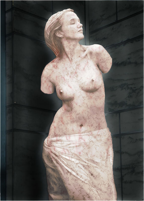
If you blow it up enough... you'll see that her hair is blowing across into her face... looks like from behind. Maybe suddenly, if you see how it is blowing. May have taken her by surprise. So she's probably not tortured or contemplating suicide... or anything worth all this time.
Dec 26, 2020 11:12:07 #
rlynes wrote:
Great images tell stories. There are a few in this one.
Excellent composition. Thank you for sharing.
Excellent composition. Thank you for sharing.
And when interpreting the photo, the story could change with every tick of the clock... or every press of the shutter.
Dec 26, 2020 09:56:06 #
... or maybe that woman in black was just about to break into a smile... a half-second later.
One tiny slice of time does not necessarily tell the story.
Barry
One tiny slice of time does not necessarily tell the story.
Barry
Check out Sports Photography section of our forum.
Nov 16, 2020 14:32:06 #
I'm not suggestion that this is the solution to the background issue. But it's just one of many possible steps in that direction.
Nov 10, 2020 08:34:31 #
She may be looking up on all of them. But the looking up in #2 is perfect... maybe not on 1, 3 & 4... but definitely good on #2.
I agree with the others about the background.
Barry
I agree with the others about the background.
Barry
Nov 3, 2020 14:53:10 #
Foto Jo wrote:
I would appreciate input on what Mac laptop to purchase. I have always shied away from them but after my last Dell purchase less than 2 yrs ago and output of $1100.00 for upgrade of storage ect., I have decided not to get another as I have had it crash and repaired too many times this year.
Being a large frame camera photographer, I am interested in what model Mac you use or suggest.
Thanks for the input.
Being a large frame camera photographer, I am interested in what model Mac you use or suggest.
Thanks for the input.
I would get a 27" Mac desktop. I have an old (and no longer in use) 13" macBook. But have also always had the 21"Mac desktop. But in this past year moved on to the 27" Mac desktop. Will never look back. That size is great for processing my pictures.
Barry
Nov 1, 2020 11:30:18 #
oakvillebob wrote:
This is a rhetorical question I like # 1 better #2 is the blue moon guess I got lucky earlier this nonth
Here's the Blue Moon!!
Couldn't resist this. Just for a laugh. Not serious.
I used Lightroom's new Color Blending module on #2.

Check out Drone Video and Photography Forum section of our forum.
Oct 9, 2020 08:49:44 #
A very pleasing photo.
The only thing that has me puzzled is that the sky has so much going on there... so many different tones... and the reflection reflects none of it. Maybe just the angle.
Barry
The only thing that has me puzzled is that the sky has so much going on there... so many different tones... and the reflection reflects none of it. Maybe just the angle.
Barry
Sep 23, 2020 15:09:45 #
Curmudgeon wrote:
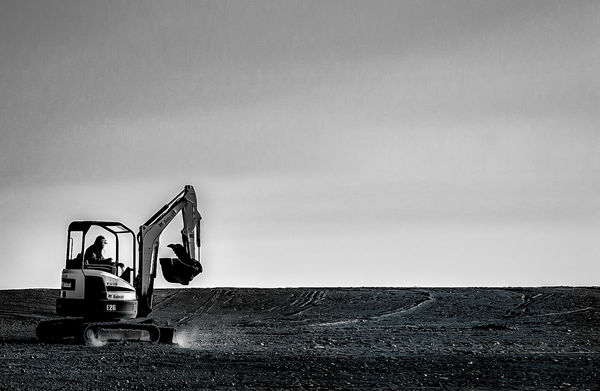
Wow I feel like I'm jumping into the deep end of t... (show quote)

----------------------
You're right. It's partially a back-hoe on dirt. Beyond that... it's photograph of a back-hoe on dirt. Just a photograph. It doesn't have to be anything profound beyond a photo of what it is. Need not tell a story. Need not be anything beyond what you see. What puts this photo in the "interesting" category is how it is handled.
It's kinda like the never-ending necessity to put a catchy caption (sometimes stupid) on every photo. We should not be told what to think. We should be allowed to see (or hear, in case of music) it for what it s. To let it stand on its own two feet. Don't you all want to be allowed to think, see, and feel for yourself ?
Barry
Sep 23, 2020 13:24:00 #
Linda From Maine wrote:
Attempting to tell stories with minimal elements, ... (show quote)
 I've covered up a lot of sunlit dust specks. Will do more if I keep this. Would you crop? In what way?


-------------------------------------
Linda
I’m here to comment on the first image only.
I would do nothing to it. Cropping it in from the right, in my estimation, removes the expansive feel that it has as posted. I tried that crop and didn’t like it one bit. As is… you feel what the worker is up against.
The only thing I don’t like about it… and I don’t believe you could have done anything about it… is the (what must be) buildings on the right where the ground meets the sky. But over all, I thing the uncropped simplicity of the image isoutstantding.
You did not suggest this… but I’d like to add a new dimension to it. That would be black and white. I have my feelings about many of the b&w postings we see here.
Many people seem to love black and white. I do and I don’t. I believe that too many post images transformed to b&w… because that can with the touch of a button. Some are good and some are bad. I have come to the conclusion that the more there is to see in an image… the less satisfactory that image will finally be as a b&w. THAT IS A GENERALITY AND NOT ALWAYS TRUE.
Images that do not have much contrasting tonal elements… to my mind… often fail in b&w. The image that you posted… in its simplicity, absence of a lot of ‘stuff’ to look at, and sharp tonal contrasts… it becomes a first class candidate for b&w. (my B&W try… posted below.)
Again… I’m generalizing. That is the conclusion I have come to. Many may differ. And sometimes I will differ with myself. And that’s fine. IMHO
Barry
Sep 22, 2020 15:31:23 #
The second photo... with the entire leaf in focus is, to my mind, clearly superior. That is if sharpness is the point of your post.
Check out People Photography section of our forum.