Posts for: Herbie1924
Aug 15, 2022 07:32:09 #
If the bridge wasn't the center of interest, your "negative" space doesn't cut the mustard - valueless.
Aug 14, 2022 09:04:08 #
A cropped version would have deleted much of the negative space.

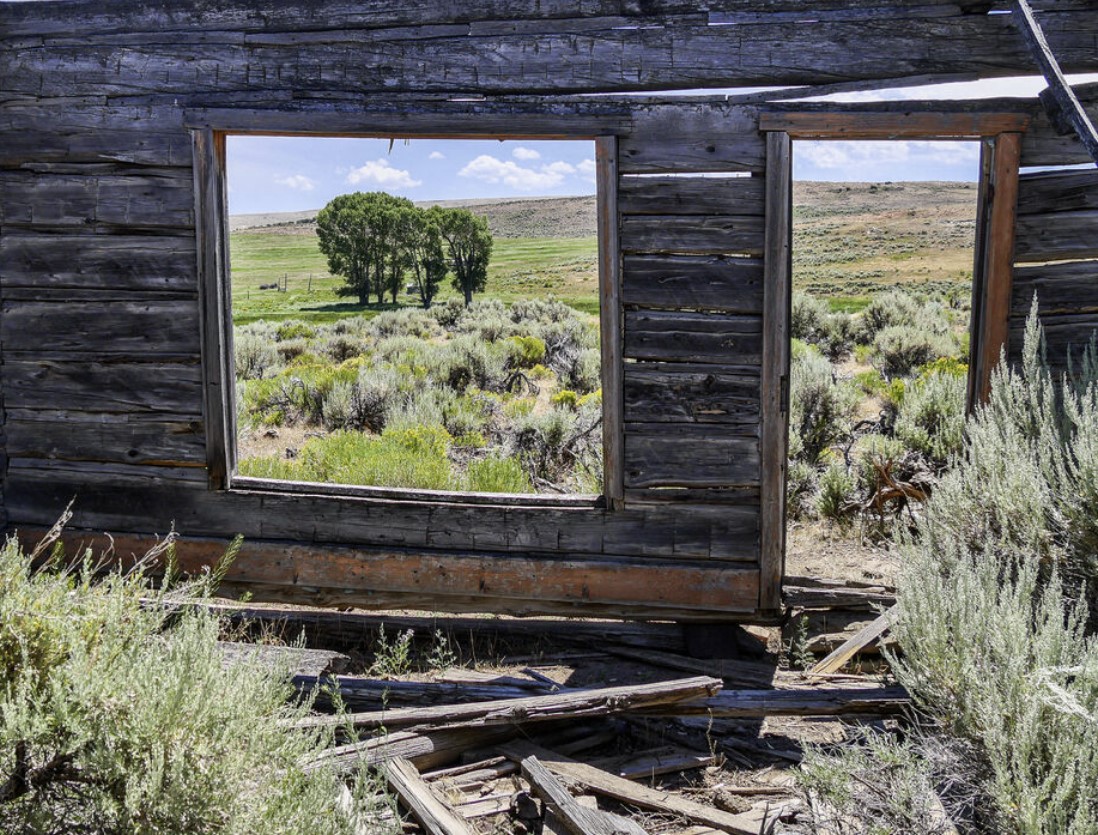
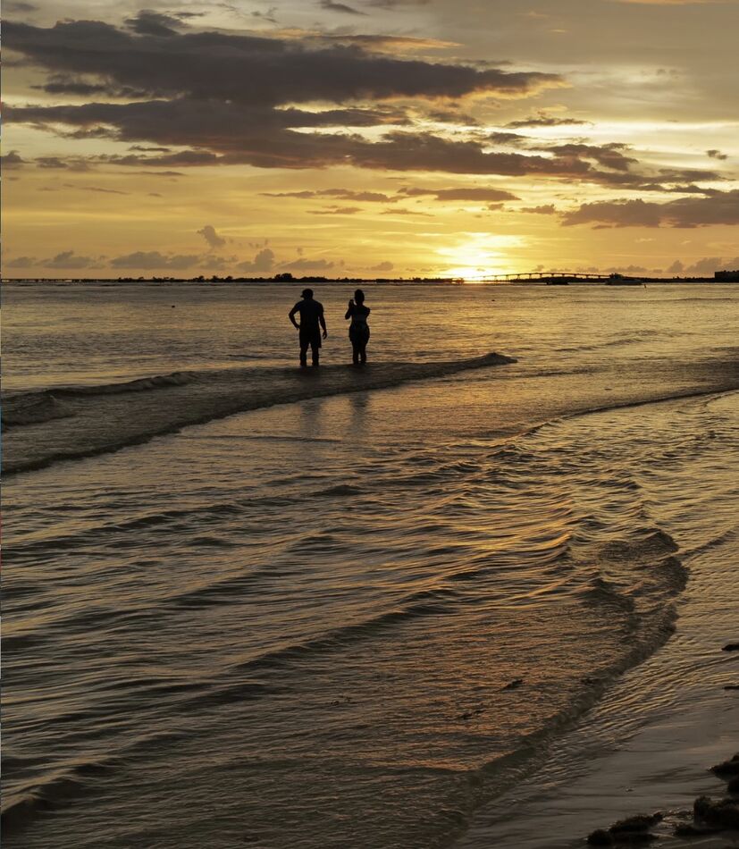
Aug 10, 2022 16:56:31 #
From an exhibitor's point of view, cropping off the distracting sky area & left side would have enhanced the center
of interest.
of interest.
Aug 1, 2022 07:48:06 #
Re: 2 & 3 - Cropping would have reduced negative space improving the composition.

Jul 24, 2022 11:34:23 #
Yet another poor example of "thirds" plus a lack of subject interest - even when properly cropped & you now also
claim to teach photography - unbelieveable!!!!!!!!!!!!!!!!!!!!!!!!!!!!!!!
claim to teach photography - unbelieveable!!!!!!!!!!!!!!!!!!!!!!!!!!!!!!!
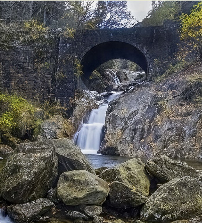
Jul 24, 2022 11:19:15 #
Although your 2nd pic reduces the large rocky base, so of it is still needed that provides better emphasis to the falls
Jul 22, 2022 16:09:25 #
Since my pic examples didn't get thru for some reason, here they are again. As for your first pic winning a contest, it would have been interesting to see what the other entries looked like & Tracy's pic would have been better in a square format.

Jul 22, 2022 13:01:48 #
I must side with micolh, because there are many other things that must be considered & taken into account prior to shutter release when looking in the cameras viewfinder at your subject. The best place to obtain continual evaluations of your efforts is thru affiliation with a camera club or PSA, a national/international organization that
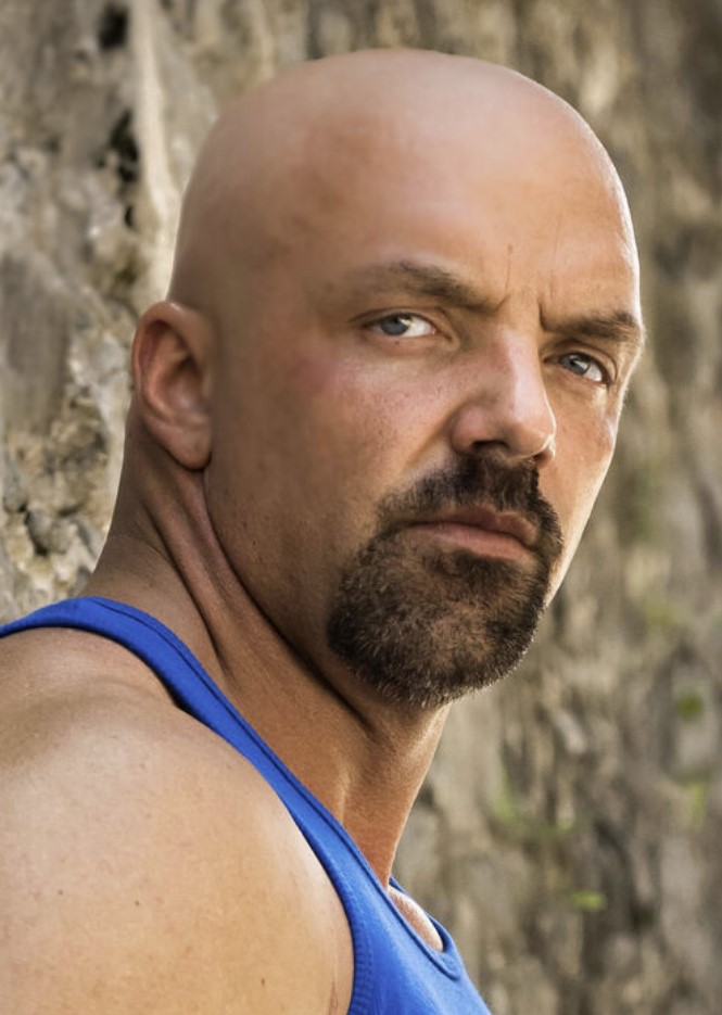
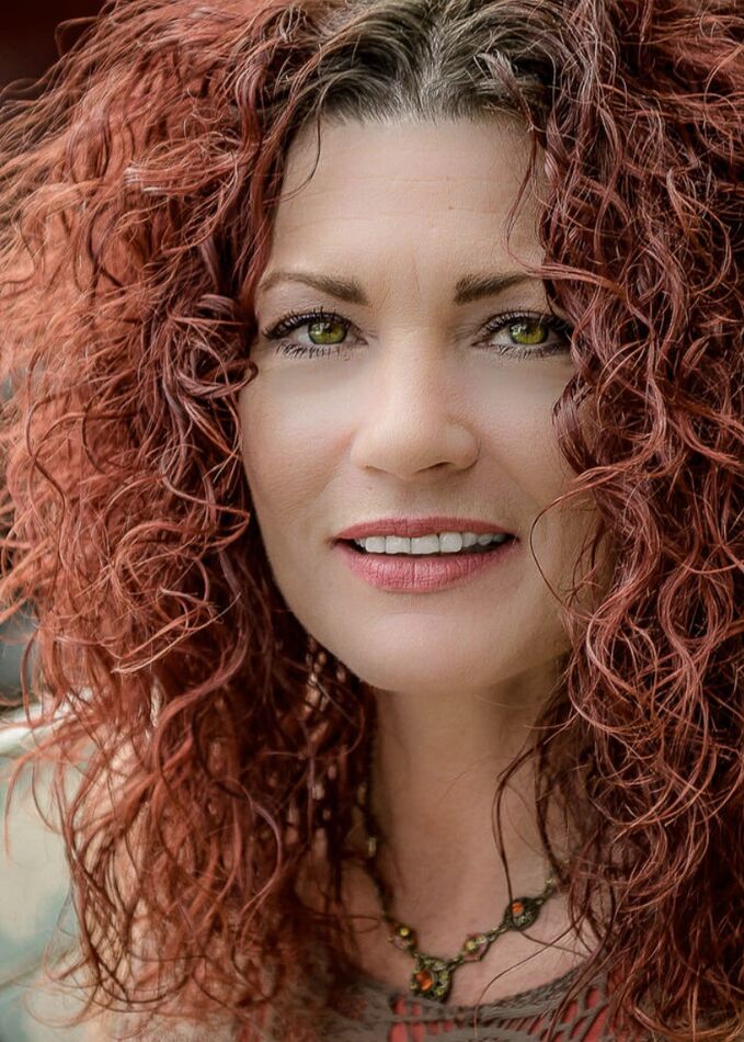
offers training in the photo arts. Re:1 - Though creative, it's too tightly cropped all 4 sides. #2 - The arm & white colored blouse are major distractions to the model's facial features. #3 - The large shoulder area overpowers the man's head, but cropping improves picture interest & also reduces distracting background. #4 - Another good model shot that needs to be cropped to better emphasize her facial features by deleting a distracting background.
#5 - More of the man's head is required, with a little dropping, would have produced a memorable image.
Now as for Tracy's "rules" pic - there's just too much negative space.
Jul 17, 2022 07:27:07 #
Re: pic #3 - too much negative space. Here's the crop for best subject interest.
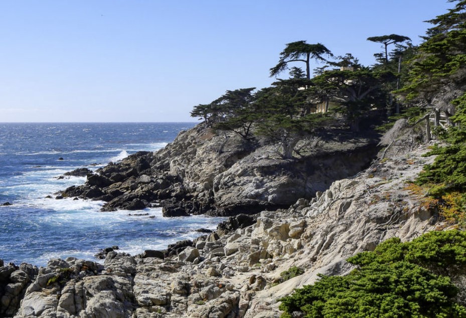
Jul 16, 2022 08:03:43 #
Of the three pics, #2 is preferred - but in a tighter crop to enhance wave action.

Jul 14, 2022 11:50:17 #
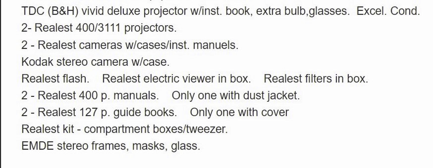
Here is the list of stereo cameras & equipment that I have available for best offers + shipping costs.
Jul 4, 2022 09:35:02 #
The best presentation of the center of interest would have been a vertical format of the subject. Depending on your
location in MN, you should consider camera club membership.
location in MN, you should consider camera club membership.
May 10, 2022 08:54:07 #
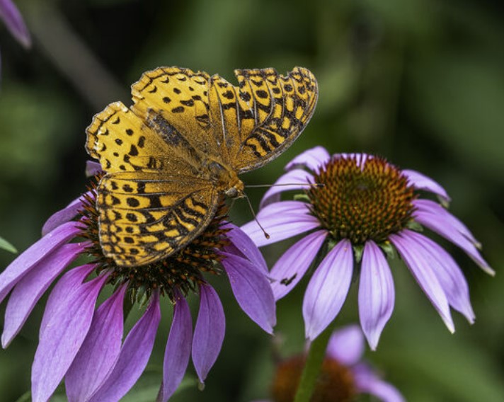
Nice bird pic, but since it seems a little centered, suggest a tighter crop.

May 9, 2022 15:29:04 #
May 9, 2022 15:19:16 #
Good pic interest, but suggest a tighter crop to reduce negative space - darken bright distracting rock area &
replace the blah sky with appropriate cloud mass.
replace the blah sky with appropriate cloud mass.