Posts for: Erdos2
Oct 1, 2017 20:37:47 #
minniev wrote:
Another wonderful image of these industrial sites few people would normally consider beautiful. Yet, you have transformed them, using their strengths and your own vision. Just a great artistic series.
I love railroad images. Normally I prefer more realistic photos of railroad scenes, however, if I ever got back into model-railroading, I would want a photo like this hanging in the railroad room. It is excellent.
Jerry
Oct 1, 2017 13:02:38 #
Billyspad wrote:
If you wanted an artsy look to your image you have... (show quote)
My response is sort of a "ditto" of this one. The photo is overcooked. It looks a lot like older color postcards. I then looked at the gallery of images and they all have that feel. It appears to be your style just as different artists each have their own style. If I was you I would continue to do what you are doing ecause it is consistent and appears to be what your clients desire.
Jerry
Sep 30, 2017 22:59:06 #
You can add to the list that appliances (kitchen ones, tvs, radios, etc) were repaired rather than just replaced. Of course economics plays a part in this, but repair is more "green" than replace.
Sep 30, 2017 22:45:41 #
R.G. wrote:
... the difference in zoom is quite extreme, almost to the point where they're fundamentally different photos - which would be the case with most scenes.
I think this is true to some extent with both sets of images. With the boat photos, when zoomed out the overall scene becomes the subject and the boats become an accessory to the overall scene. With the bridge photos, the same is true or approaching that situation.
More content does not necessarily indicate more context. I think for added context, the additional content needs to enhance the subject more than the zooming out reduces the importance of the subject. If the added content does not enhance the subject enough, then the photo is not as strong due to the subject getting smaller. If the subject diminishes enough, then it becomes a different photo and has different merits to consider.
Jerry
Sep 29, 2017 22:02:47 #
For 2 reasons I prefer image 1.
1. There is plenty of context in picture 1 and the additional volume of context in pictures 2 and 3 do not add anything of interest.
2. As an engineer, I like the structure of the bridge, which is much more interesting.
Jerry
1. There is plenty of context in picture 1 and the additional volume of context in pictures 2 and 3 do not add anything of interest.
2. As an engineer, I like the structure of the bridge, which is much more interesting.
Jerry
Sep 28, 2017 23:40:49 #
Sep 22, 2017 01:48:27 #
This image puts me in a strange position that appears to be contrary to most of the opinions in this thread. Generally I prefer Color over BW or Sepia, but I like the Sepia a lot in this case. I usually dislike vignetting, but also like it a lot in this image because it goes well with the Sepia coloring and makes it look like a legitimate older image. The photo is all about the building and its windows. I do not have at problem with the railing that fades off into the background. In fact, I would be distracted if the railing took me to something away from the building, which is the main subject.
I think it is an excellent piece of work in post processing and would not change it at all.
Jerry
I think it is an excellent piece of work in post processing and would not change it at all.
Jerry
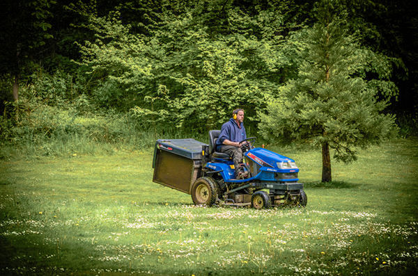
Sep 20, 2017 22:55:34 #
Heather Iles wrote:
Can this photo be improved considering that it was taken in JPEG. It was processed in Lightroom 5? Any help in reducing the intensity of the green would be appreciated and please explain why green is so difficult to get right. Please feel free to show me and others what you can do, together with your critique.
Another option to lowering the saturation is to lower the vibrance, which is very similar and works well with greens. I used LightZone to edit the image which also allows to apply the changes to a color spectrum (so I chose the greens). This way the saturation of the mower is not affected by the edit.
Personally, I prefer less vignetting, but that is an opinion decision.
I probably would have lowered the saturation as my first choice, but since that was already presented, I wanted to show something slightly different.
Jerry
Sep 20, 2017 22:26:37 #
R.G. wrote:
This may be the first shot I've taken with B&W in mind when I shot it. I invite you to try your hand at a B&W conversion....
....or you might want to prove me wrong and show that the colour version is the more worthy.
(There is a link to a DNG version underneath the JPG).
-
....or you might want to prove me wrong and show that the colour version is the more worthy.
(There is a link to a DNG version underneath the JPG).
-
I love a challenge so here are my efforts using LightZone. The color image might be a little over-processed partly because I am partial to lush green landscapes.
Jerry

Sep 18, 2017 15:43:29 #
kymarto wrote:
With contrast as limited as this there is really no reason at all to do exposure bracketing. HDR is necessary only when the brightness of the scene exceeds that of which the sensor can capture. Otherwise you are really just spinning your wheels. If you like the way the HDR programs map the tones that can be done easily in any decent image editing program, and you won't have to deal with deghosting.
While I am not an expert and do not use Lightroom or PhotoShop, my experience mirrors kymarto's comments pretty closely. Unless dynamic range is a problem that HDR solves or someone is trying to do something more "artistic", I have not seen an image that has been all that difficult to bring out the local contrasts. (including the images present in this topic.)
Jerry
Sep 18, 2017 15:35:47 #
Frank2013 wrote:
FYC.....
It is a great shot that is well composed with the subject just off-center enough to make it interesting. While it makes a very nice BW image, I often wonder what the colors were. If her bathing suit, or her "board", had some bright colors they would might have been a perfect compliment for the beach, ocean, and sky.
Jerry
Sep 18, 2017 15:29:13 #
You sure got a balance of thoughts on these photos. While both are wonderful in their own ways, I prefer the color for the green on the ground and the blue in the sky. Those areas just about disappear in the BW image, maybe because there are so many different shades of gray in the BW image
Jerry
Jerry
Sep 16, 2017 01:30:47 #
A couple years ago, I personally tried all the free programs I could to see what I wanted to use. I had a few requirements (including but limited to be able to edit raw files, ease of use, a good range of tools, non-destructive regarding original files, etc.). The one I prefer by a long shot was LightZone (http://www.lightzoneproject.org/). It is similar to LightRoom in looks and the way many of the tools work and far easier to use than programs like Gimp. There are also some tutorials on YouTube that help with the learning curve which is not all that difficult to begin with. I have never regretted this choice.
Jerry (well over 55 years old)
Jerry (well over 55 years old)
Sep 8, 2017 22:44:14 #
Sep 2, 2017 16:18:24 #