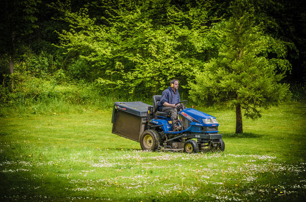
"Alone"
Sep 20, 2017 16:37:28 #
Heather Iles
Loc: UK, Somerset
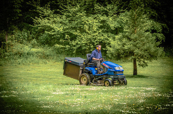
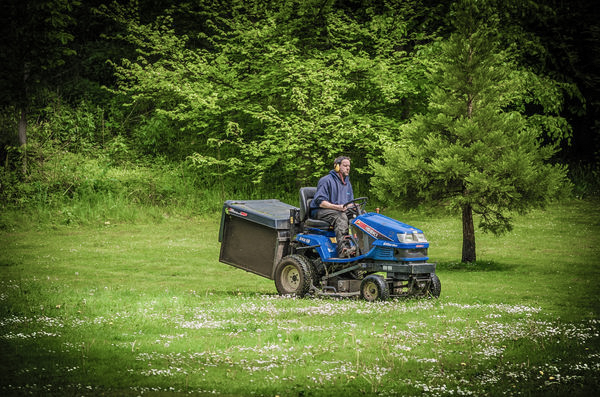
Can this photo be improved considering that it was taken in JPEG. It was processed in Lightroom 5? Any help in reducing the intensity of the green would be appreciated and please explain why green is so difficult to get right. Please feel free to show me and others what you can do, together with your critique.
Sep 20, 2017 16:49:05 #
I'd reduce your color saturation in the photo. I think that would normalize the colors. Better if you had uploaded a larger photo rather than the downsized image UHH converts to.
Not sure if Lightroom allows you to load the jpg as camera raw format. Elements does, and lets you treat the image as a raw photo.
This is just loading the image into Elements 15 (FILE - Open In Camera RAW), then sliding the Saturation bar to the left.
Not sure if Lightroom allows you to load the jpg as camera raw format. Elements does, and lets you treat the image as a raw photo.
This is just loading the image into Elements 15 (FILE - Open In Camera RAW), then sliding the Saturation bar to the left.
Sep 20, 2017 18:52:27 #
Heather Iles
Loc: UK, Somerset
Spider223 wrote:
I'd reduce your color saturation in the photo. I think that would normalize the colors. Better if you had uploaded a larger photo rather than the downsized image UHH converts to.
Not sure if Lightroom allows you to load the jpg as camera raw format. Elements does, and lets you treat the image as a raw photo.
This is just loading the image into Elements 15 (FILE - Open In Camera RAW), then sliding the Saturation bar to the left.
Not sure if Lightroom allows you to load the jpg as camera raw format. Elements does, and lets you treat the image as a raw photo.
This is just loading the image into Elements 15 (FILE - Open In Camera RAW), then sliding the Saturation bar to the left.
Thanks for your suggestion. I have got Elements 11, so will have a play with that and see how I get on Thanks for your time. H
Sep 20, 2017 22:55:34 #
Heather Iles wrote:
Can this photo be improved considering that it was taken in JPEG. It was processed in Lightroom 5? Any help in reducing the intensity of the green would be appreciated and please explain why green is so difficult to get right. Please feel free to show me and others what you can do, together with your critique.
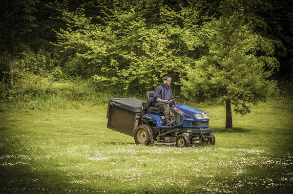
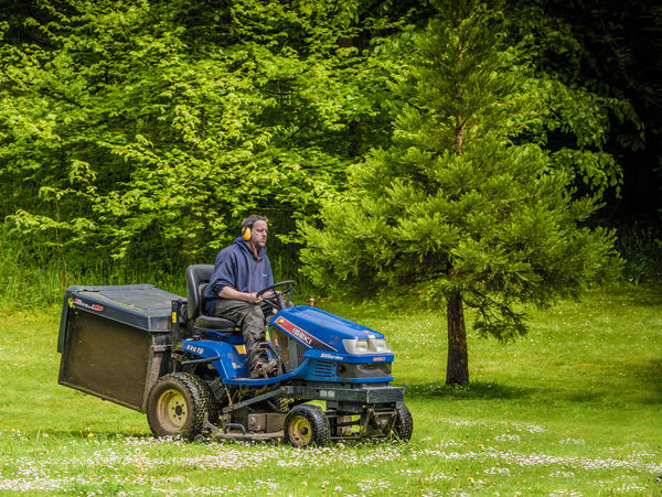
Another option to lowering the saturation is to lower the vibrance, which is very similar and works well with greens. I used LightZone to edit the image which also allows to apply the changes to a color spectrum (so I chose the greens). This way the saturation of the mower is not affected by the edit.
Personally, I prefer less vignetting, but that is an opinion decision.
I probably would have lowered the saturation as my first choice, but since that was already presented, I wanted to show something slightly different.
Jerry
Sep 20, 2017 23:01:30 #

You will find that the yellow control has more authority on grass than green. That may help. Also, I think the vignette is too heavy-handed. Using a vignette to direct the viewer's eyes is a great technique, but it is best when the transition is very gradual and not so defined.
Sep 21, 2017 07:03:36 #

CaptainC wrote:
You will find that the yellow control has more authority on grass than green. That may help. Also, I think the vignette is too heavy-handed. Using a vignette to direct the viewer's eyes is a great technique, but it is best when the transition is very gradual and not so defined.
To me the vignetting in the upper area is OK... in the upper implying that the woods are dark.. we even see a little tree in the vignetting. But no rational reason for the grass to be vignetted.
Cropping left side and bottom puts the "story" the guy, in the famous 1/3 1/3 lower area. We see his future and not where he has already cut... the past... future is always more important.... Where a bird is flying is always more important than where he is flying from.. [usually] Head beautifully framed between branches... Luck?
Sep 21, 2017 07:26:12 #

Heather Iles wrote:
Can this photo be improved considering that it was taken in JPEG. It was processed in Lightroom 5? Any help in reducing the intensity of the green would be appreciated and please explain why green is so difficult to get right. Please feel free to show me and others what you can do, together with your critique.
JPEGs can be edited in LR but the results are often a little more limited, especially if you're really pushing the image. Lightroom is the same as ACR, just set in a different interface, so the results should be the same. The limitations of jpeg editing are the same in either program, as there is no program which could change a jpeg into a raw file.
As for your image, it's a nice family shot of the master of the lawn hard at work. I am not a fan of the extreme vignette, I would back off on it a bit. Captain C gave you good advice about using the yellows to attend to the greens. For me, it usually takes tinkering with both to get greens at the hue/intensity I want them. I am waging war as we speak with the greens in my Scotland shots, which all needed a little something, though not exactly the same thing. I do have an import preset that I use for most of my incoming shots into LR, and one of its components is a few tweaks of the color sliders designed to give me a good starting point for greens. That does not address all things, though, and I'm still seeking the right tweak for the soft greens I brought back from Scotland.
Sep 21, 2017 10:18:35 #
Heather Iles
Loc: UK, Somerset
Erdos2 wrote:
Another option to lowering the saturation is to lo... (show quote)
Thanks Jerry for taking the time to respond and for showing me your version which is an improvement on mine. I have made a note of your suggestions. H
Sep 21, 2017 10:23:24 #
Heather Iles
Loc: UK, Somerset
CaptainC wrote:
You will find that the yellow control has more authority on grass than green. That may help. Also, I think the vignette is too heavy-handed. Using a vignette to direct the viewer's eyes is a great technique, but it is best when the transition is very gradual and not so defined.
Thanks Cliff. What a good tip! You are right regarding the vignette, but I couldn't get the slider to "do as it was told". Yes, I am blaming my tools, so back to the drawing board. Much obliged. H
Sep 21, 2017 10:27:22 #
Heather Iles
Loc: UK, Somerset
dpullum wrote:
To me the vignetting in the upper area is OK... i... (show quote)
Thanks D for your input. I am glad you passed by, as you are a master at cropping and yes, less is better. You saw things that I didn't, so thanks for the critique. H
Sep 21, 2017 10:32:34 #
Heather Iles
Loc: UK, Somerset
minniev wrote:
JPEGs can be edited in LR but the results are ofte... (show quote)
Thanks Minni for your input. Perhaps our greens in the UK are harder to deal with than the ones you are used to. Perhaps it is our climate - always raining, hence the intensity of the green. Now I know that it is not only me who struggles with this colour. Your input is much appreciated. H
Sep 21, 2017 13:23:43 #

Heather Iles wrote:
Can this photo be improved considering that it was taken in JPEG. It was processed in Lightroom 5? Any help in reducing the intensity of the green would be appreciated and please explain why green is so difficult to get right. Please feel free to show me and others what you can do, together with your critique.
I think one reason why greens can be difficult is that cameras tend to emphasise the warm, bright colours (red, orange, yellow, yellow/green).
My usual workflow is to go to the HSL section and darken yellow a bit and then experiment with tint-shifting yellow to see what works. There's no universal answer because greens vary, as does ambient light. Usually I find that tint-shifting yellow towards orange a bit and desaturating a bit will take the edge off of any garishness in grass/foliage. Usually I follow that up with selecting green, darkening it a bit and seeing which tint-shift works for green. Sometimes a small tint-shift towards blue helps to restore what taming the yellows takes away. Sometimes desaturating green helps but sometimes it's the opposite.
In the edit below I found that after darkening yellow, tint-shifting it towards green helped, followed by a fair bit of desaturating. I also tint-shifted green towards blue a bit and darkened it a little. After all that darkening I found that Brightness in the main edit needed lifting a bit.
You are the only one that can decide what looks properly green to your eye. This edit is my idea of normalisation (all I did was adjust yellow, green and brightness and add a small amount of sharpening/denoise).
-
Sep 21, 2017 14:18:11 #
Heather Iles
Loc: UK, Somerset
R.G. wrote:
I think one reason why greens can be difficult is ... (show quote)
Thank you R.G. for taking the time and to explain your work flow in regards to the colour green. You have enlighten me and I have made notes. I like your improvement of the photo and wonder what camera settings I should bear in mind when taking landscapes such as white balance, brightness etc. All I do is to select either P Aperture Priority and just shoot. What are your thoughts? H
Sep 21, 2017 14:31:32 #
Heather Iles wrote:
.....wonder what camera settings I should bear in mind when taking landscapes such as white balance, brightness etc......
The best option is to shoot raw and learn the basic editing needed to apply the sharpening, contrast etc that jpegs get in-camera. Raw files can take noticeably more pushing and pulling than jpegs and don't suffer from the same artefacts.
The main thing with landscapes is to avoid blown highlights in bright skies. It's easy to underestimate how bright clouds can be. Ideally use a tripod or monopod, but if hand-held is the only practical option, keep your shutter speed up and learn how to squeeze the shutter release without causing camera shake. Up to about ISO 3200 (or thereabouts, depending on the camera), ISO noise is potentially less damaging than camera shake caused by too slow a shutter speed. Exposure bracketing gives a lot of protection from blown highlights, and if your software has auto align, hand-held bracketing is a possibility.
Sep 21, 2017 16:30:53 #
Heather Iles
Loc: UK, Somerset
R.G. wrote:
The best option is to shoot raw and learn the basi... (show quote)
Thanks RG. You have given me a lot of information which I will take on board. I am much obliged. H
If you want to reply, then register here. Registration is free and your account is created instantly, so you can post right away.