new Affinity user
Sep 21, 2017 13:22:27 #
GeorgeK
Loc: NNJ
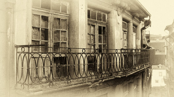
I dug up an old photo I took several years ago in Porto, Portugal. It was a view from the window of an apartment I rented. I am looking for feedback on my post processing. The first is the original followed by my PP efforts. Appreciate any comments.

Sep 21, 2017 13:35:38 #
cyclespeed
Loc: Calgary, Alberta Canada
I find PP a very personal thing. I try to get a landscape / architecture shot like this to reflect how I felt when I was there living breathing and experiencing that time in my life.
So all I could suggest is the time must have been a somber time. From a technical point, the side of the house, between the two tall buildings is too bright so I'd darken it as it does not convey any part of the story and now it draws the viewer's eyes especially since the balcony railing line directs us there as well.
So all I could suggest is the time must have been a somber time. From a technical point, the side of the house, between the two tall buildings is too bright so I'd darken it as it does not convey any part of the story and now it draws the viewer's eyes especially since the balcony railing line directs us there as well.
Sep 21, 2017 13:42:21 #
I like the sepia tone look, but I think ya went just a tad iverbiard on the vignette.
IMHO, of course
IMHO, of course
Sep 21, 2017 14:06:50 #
GeorgeK
Loc: NNJ
cyclespeed wrote:
I find PP a very personal thing. I try to get a la... (show quote)
Actually, it was a wonderful time vacationing with family but the state of the building shown was indeed somber. Thanks for looking and I appreciate the suggestion re darkening the area between the buildings.
Sep 21, 2017 14:08:04 #

The railings provide a leading line, but when the eye follows it, the part that it leads to is weakened by the vignette. The railings should be strong right to the end (the eye's destination) IMO.
Sep 21, 2017 14:08:18 #
GeorgeK
Loc: NNJ
twowindsbear wrote:
I like the sepia tone look, but I think ya went just a tad iverbiard on the vignette.
IMHO, of course
IMHO, of course
Thanks for looking and your comment. I still consider it a work in progress. Will revisit the vignette.
Sep 21, 2017 14:09:51 #
GeorgeK
Loc: NNJ
R.G. wrote:
The railings provide a leading line, but when the eye follows it, the part that it leads to is weakened by the vignette. The railings should be strong right to the end (the eye's destination).
Agree. Thanks for the comment.
Sep 22, 2017 01:48:27 #

This image puts me in a strange position that appears to be contrary to most of the opinions in this thread. Generally I prefer Color over BW or Sepia, but I like the Sepia a lot in this case. I usually dislike vignetting, but also like it a lot in this image because it goes well with the Sepia coloring and makes it look like a legitimate older image. The photo is all about the building and its windows. I do not have at problem with the railing that fades off into the background. In fact, I would be distracted if the railing took me to something away from the building, which is the main subject.
I think it is an excellent piece of work in post processing and would not change it at all.
Jerry
I think it is an excellent piece of work in post processing and would not change it at all.
Jerry
Sep 22, 2017 05:16:21 #
Sep 22, 2017 06:22:35 #

Sep 22, 2017 07:45:18 #
Sep 22, 2017 07:56:40 #

Theoretically, the suggestions make sense to me, but when I looked at your work before reading the suggestions, I simply liked it very much and found your processing just right for the image. Nice work!
Sep 22, 2017 09:03:13 #
GeorgeK
Loc: NNJ
Rab-Eye wrote:
Theoretically, the suggestions make sense to me, but when I looked at your work before reading the suggestions, I simply liked it very much and found your processing just right for the image. Nice work!
Thank you for looking and the kind words.
Sep 22, 2017 12:49:25 #
I share Rab-Eye's opinion; also, the vignette you used goes hand-in-hand with the vintage sepia tone and is additive to the era photo you have produced. In addition, darkening the background building would detract from your photo since it would then blend in too much with the railing. To my eye the lighter background further isolates it from the main subject, which is, the foreground. Just my thoughts-nice work!! Stan
Sep 22, 2017 13:34:11 #
GeorgeK
Loc: NNJ
dadaist wrote:
I share Rab-Eye's opinion; also, the vignette you used goes hand-in-hand with the vintage sepia tone and is additive to the era photo you have produced. In addition, darkening the background building would detract from your photo since it would then blend in too much with the railing. To my eye the lighter background further isolates it from the main subject, which is, the foreground. Just my thoughts-nice work!! Stan
I went with the sepia in an attempt to represent the age of the building and I thought the lighter background gave some overall depth. Thanks for the compliment, Stan.
If you want to reply, then register here. Registration is free and your account is created instantly, so you can post right away.