The Fisherman - Which Crop?
Mar 12, 2019 15:39:14 #

photogeneralist wrote:
I had a tutorial play on Amazon Fire TV in whic... (show quote)
PS: I tried the bottom crop and the composition worked better for my eye
Mar 12, 2019 16:45:58 #
The first photo gives a good divide between sky & water. The second crop puts more emphasis on the angler. I like the first shot.
Mar 12, 2019 17:09:17 #
Personally I'd crop the second to just below his feet and turn it into an ultrawide image
Mar 12, 2019 17:29:49 #

Mar 12, 2019 17:39:52 #

Mar 12, 2019 18:11:44 #
Mar 12, 2019 18:57:11 #
[quote=cdayton]Try a crop from the right to create a portrait format.
Something like this (I did a screen shot on an iPad and cropped - it can be done better). I wish the fish were bigger although???
Something like this (I did a screen shot on an iPad and cropped - it can be done better). I wish the fish were bigger although???

Mar 12, 2019 19:00:41 #

Properframe wrote:
I prefer #1. Just like animal shots though I think it would be better to have him facing slightly TOWARDS the lens not away.
Thanks for looking and commenting Properframe.

Mar 12, 2019 19:01:22 #
Longshadow wrote:
Split the difference at the bottom of the top white cloud.
Good idea Longshadow.
Mar 12, 2019 19:03:07 #
kpmac wrote:
#1 for me. More room in it.
rlaugh wrote:
I think I like the first with the extra above the tip of the rod!!...good shot!!
Thanks for contributing guys. Seems folks like the first crop four to one right now.
Mar 12, 2019 19:08:38 #

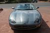
Bmac wrote:
Photographed at Robert Moses State Park, which is part of Fire Island NY. Which, if either, crop do you prefer? Further critique, comments and suggestions welcomed. Thanks.
Select download for additional resolution.
Select download for additional resolution.
Better balanced in 2.
Mar 12, 2019 19:08:43 #

Mar 12, 2019 19:15:37 #
bobmcculloch wrote:
#1, not enough clearance over the rod in #2.
I'd consider taking off some of the bottom though.
I'd consider taking off some of the bottom though.
Thanks for taking a look and your suggestion Bob.
Mar 12, 2019 19:17:01 #
maxlieberman wrote:
The lower one would be better, as the horizon comes closer to the top third line, but you should level the horizon.
Thanks for commenting Maxlieberman.
Mar 12, 2019 19:18:32 #
gvarner wrote:
I’d try cropping #1 to bring the bottom right corner up and in to be closer to the diagonal from the first wave. This would also bring the horizon line closer to the middle and give a bit more balance, I think.
Appreciate your suggestion Gvarner.
If you want to reply, then register here. Registration is free and your account is created instantly, so you can post right away.