Which photo for the contest?
Jul 18, 2018 17:50:21 #

I think #2 is the better choice. Number 1 looks "over-cooked" to me.
Jul 18, 2018 18:22:40 #

BrentHarder wrote:
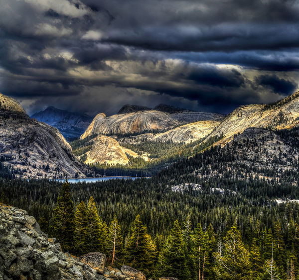
I have my idea which of these two photos I would like to submit into our local city photo contest, but if I am overwhelmingly wrong please let me know.
Which do you prefer?
Thanks in advance.
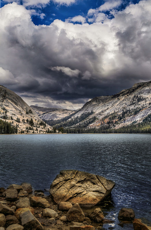
Which do you prefer?
Thanks in advance.
Regarding composition, not post processing or any other things.
#1's composition draws my eye to the sky
#2's composition draws my eye to the rock
this one has eye leading to something exotic, a journey. (rule of thirds, etc)
from the foreground, right ahead into the highlighted trees, then to the highlighted lake, then the mountain pass, then the mountain beyond (which is a bit dim). Like a novel, pulls the reader/viewer into the image.
So, a simple crop, not an image redo.
one idea amongst a million, all good.
(hope you don't mind tinkering to be helpful)
ps: love the image. great job.
Jul 18, 2018 18:32:13 #

You want to be known for what you consider your best work. Submit the one you llke. You win all around that way.
Jul 18, 2018 20:11:22 #
Sunnely
Loc: Wisconsin
BrentHarder wrote:
I have my idea which of these two photos I would like to submit into our local city photo contest, but if I am overwhelmingly wrong please let me know.
Which do you prefer?
Thanks in advance.
Which do you prefer?
Thanks in advance.
I like # 2. Gives me more of the idea of DoF with the foreground rocks. But, I must admit that I'm not in your level of expertise. It just appeals to me.
But upon further review, the call on the field is reversed. Both are equally beautiful.
Jul 18, 2018 20:21:16 #

AlohaJim wrote:
Regarding composition, not post processing or any ... (show quote)
I like the crop...pulls the eye faster...A little over processed...but it works here. I mean that it turns it into more that a photo...has a little bit of artistic expression.
Jul 18, 2018 21:51:30 #

Brent ..,I sent you a private message with attachments .., including horizon adjustment and taking out the boat on #2 and cropping the sky on #1 .
I purposely didn’t read any reply’s so,as to not be influenced by or see what others had to say ... I only looked after sending you the private message ..
I see Most went with #1 .. and most indicated cropping out some of the clouds ..
Both pictures were amazing ,but #1 took in the most color and landscape composition of the trees.., clouds.., sky.., mountains.., lake.. and had a spacial expanse that kept going ..color tone and shadowing was all present in one shot .. it is like look at art through the lens of your camera ..
Jul 19, 2018 01:42:17 #

Jul 19, 2018 03:17:33 #

I'm doing one massive reply to everyone.......Thanks everyone for your input on these two photos. Every one of you had comments that I have been digesting. Your comments have been helpful in my decision and your suggestions all have merit.
For image #1 I purposely cropped it the way I did. I think the rule of thirds works best in this one and that is why there is so much sky showing. I tried cropping it other ways but always came back to this one. I felt it was more dramatic this way.
In Photo #2 I goofed up and had a black line on the left edge that I overlooked......also as several of you have mentioned, my horizon line is off, so I fixed that. The rock out in the lake is distracting and now it is cloned out.
My preference is to submit a print of #1 for the contest. I know several of you have mentioned that it is over processed. I can see why you say that and understand where you are coming from. Personally, I hate overcooked HDR images which I would put in the same category.
I don't have any horizontal images of these two photos, sorry.
I'm attaching the revised image of #2 with those three changes.
Thanks so very much for all of your thoughts and comments. I respect each of your opinions very much.
Jul 19, 2018 03:19:17 #

Both Great shots Brent..but the first one is brooding and really captures the beauty of the Landscape..best of luck whatever you enter.
Jul 19, 2018 03:48:48 #
#2 - the visual separation between the various elements within the composition is very effective, which I think makes it especially attractive to most viewers. And I feel there is a tad too much busy sky in the first image, drawing too much attention away from the beautiful wilderness.
Jul 19, 2018 05:56:43 #

Jul 19, 2018 06:20:22 #
rrm_imagry
Loc: Scotland
What is criteria for competition? If it has need for structures as part of city you could lose out as none obvious
Both good images !
Both good images !
Jul 19, 2018 06:21:28 #

Jul 19, 2018 06:26:17 #

Both are great, however, I prefer the moodiness and drama in #1. Draws me right into the shot.
Jul 19, 2018 06:29:23 #

If you want to reply, then register here. Registration is free and your account is created instantly, so you can post right away.