Why B&W When You Have Colour?
Apr 19, 2018 18:47:38 #
Feiertag wrote:
Colour is natural and alive. B&W photos are flat and dull to my eyes. To each their own but what is the attraction to B&W? Just curious.
Harold
Harold
In arenas of creativity, “to each his own” has validity. One’s preferences for how one expresses their vision artistically can be quite different between artists/photographers. Likewise, viewers can vary greatly in their preferences for images they see. What appears alive and natural to some, can be seen as mundane and ordinary by others. What some see as flat and dull may be viewed as dynamic and intriguing by someone else.
To answer the query directly, some of us who occasionally work in B&W find the attraction in the emphasis on contrasts, textures, and shapes rendered without color, to be compelling and an interesting challenge to work with. Not better or worse than color; just artistically interesting to work with.
One of my original instructors (in a class devoted to color photography) would often ask during critique about why the photographer chose to shoot in color rather than B&W (or vise versa). The implication was that from the standpoint of artistic expression, some images may lend themselves better to one over the other. Over time, I’ve come to appreciate that implication. Exploring the process of how to make that choice, for me, provides the attraction of sometimes eschewing color for working an image in B&W.
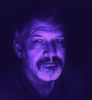
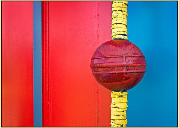
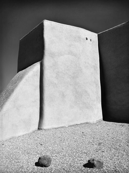
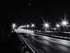
Below are two of my images. Each was consciously rendered as either color or B&W to emphasize those aspects of the scene I found most interesting; in one, the strong primary colors: in the other, the shapes, textures and contrasts.
Apr 19, 2018 18:48:56 #

tdekany wrote:
How about you work on your own skills, so you can appreciate your own B&W photos and respect that other people may like something different. How about that for a start?
Buddy, from what I have seen what you have displayed, I will take you on, one on one. My skill against yours. What do you say, big nuts?
Apr 19, 2018 18:53:24 #
canon Lee wrote:
Thanks Lee. I'm in your corner! B^)Your the man... 
Apr 19, 2018 18:57:48 #
mwsilvers
Loc: Central New Jersey
Photographer Jim wrote:
In arenas of creativity, “to each his own” has val... (show quote)
Exactly! Love them both. The composition of the first one is really interesting. The second one is made for black and white. It would probably lose all its impact in color.Apr 19, 2018 19:14:52 #

Photographer Jim wrote:
In arenas of creativity, “to each his own” has val... (show quote)
Perfect example, and explanation. Thanks for sharing.
Apr 19, 2018 19:59:33 #
Apr 19, 2018 20:23:00 #
Feiertag wrote:
Buddy, from what I have seen what you have displayed, I will take you on, one on one. My skill against yours. What do you say, big nuts?
The more you post in this thread, the more narcissistic you are sounding.
Did you not say that you are still working on your color photos and that you don’t like your own B&W? That is what I was referring to
If you want to have a pissing contest, you have to find someone else.
Apr 19, 2018 20:46:46 #
Apr 20, 2018 05:31:29 #
To me black and white is interpretive whereas color must be just the way I saw it. I enjoy both and most of my images stay in color but the ones that hit me emotionally are in black and white. As others have suggested it’s individual taste. But the photos of Ansel Adams and Edward Weston are just magnificent. Just my two cents worth.
Apr 20, 2018 05:44:03 #
billnikon
Loc: Pennsylvania/Ohio/Florida/Maui/Oregon/Vermont
Feiertag wrote:
Colour is natural and alive. B&W photos are flat and dull to my eyes. To each their own but what is the attraction to B&W? Just curious.
Harold
Harold
B&W, done right, is it's own unique medium. In the days that it was king, highlights and shadows expertly exposed could blow away anything done in color today.
Apr 20, 2018 06:32:35 #

Apr 20, 2018 06:34:51 #
Feiertag wrote:
Colour is natural and alive. B&W photos are flat and dull to my eyes. To each their own but what is the attraction to B&W? Just curious.
Harold
Harold
You said it all...."to each his own." (Notice I corrected your improper pronoun)
Apr 20, 2018 06:55:29 #

Apr 20, 2018 06:57:28 #

mleuck wrote:
If you have to ask, you will never know why.
Yep. 👍
Apr 20, 2018 07:00:53 #
“When you photograph people in color, you photograph their clothes. But when you photograph people in Black and white, you photograph their souls!”
-Ted Grant
-Ted Grant
If you want to reply, then register here. Registration is free and your account is created instantly, so you can post right away.