Explain Yourself
Sep 9, 2019 13:41:04 #
Anhanga Brasil
Loc: Cabo Frio - Brazil
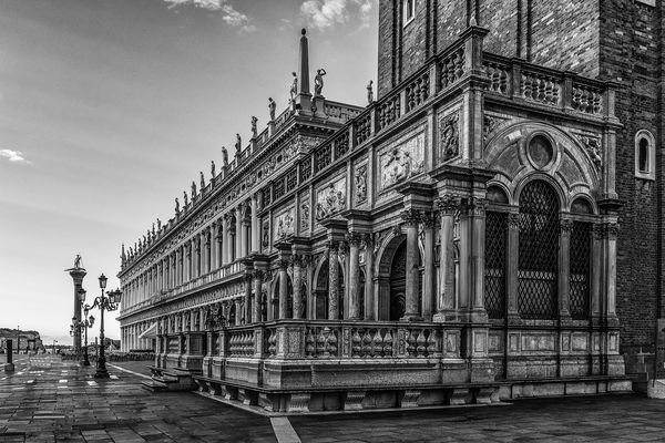
I prefer the B&W version. I do not like the "halo effect" used.
I noticed it is becoming a trend here. Try plain, simple and
contrasty B&W, IMHO.
Edit: Some already mentioned the halo. I agree with them.
I noticed it is becoming a trend here. Try plain, simple and
contrasty B&W, IMHO.
Edit: Some already mentioned the halo. I agree with them.
Sep 9, 2019 14:29:32 #
jerryc41 wrote:
Being in the minority here, I prefer the processed color version. The B&W seems to have more contrast, but the colored one looks better overall. Zooming in, the color also looks better.
Did my wife contact you? You just summed up her view of the photos. Arguing with her does not turn out well so I will not try to contradict you. Thanks for sharing your thoughts.
Sep 9, 2019 14:32:52 #
Anhanga Brasil wrote:
I prefer the B&W version. I do not like the "halo effect" used.
I noticed it is becoming a trend here. Try plain, simple and
contrasty B&W, IMHO.
Edit: Some already mentioned the halo. I agree with them.
I noticed it is becoming a trend here. Try plain, simple and
contrasty B&W, IMHO.
Edit: Some already mentioned the halo. I agree with them.
I am going back to re-edit for the halo effect. I promise to do better in the future. If I had a photoshop teacher, I would fire them. However, as I am self taught, I will put the blame on myself.
Sep 9, 2019 15:04:39 #
Hamltnblue
Loc: Springfield PA
IMO, the brick building continues to distract in black and white.
I wonder what it would look like if you masked out the brick building and replaced with sky or something else.
I wonder what it would look like if you masked out the brick building and replaced with sky or something else.
Sep 9, 2019 16:27:26 #
Hamltnblue wrote:
IMO, the brick building continues to distract in black and white.
I wonder what it would look like if you masked out the brick building and replaced with sky or something else.
I wonder what it would look like if you masked out the brick building and replaced with sky or something else.
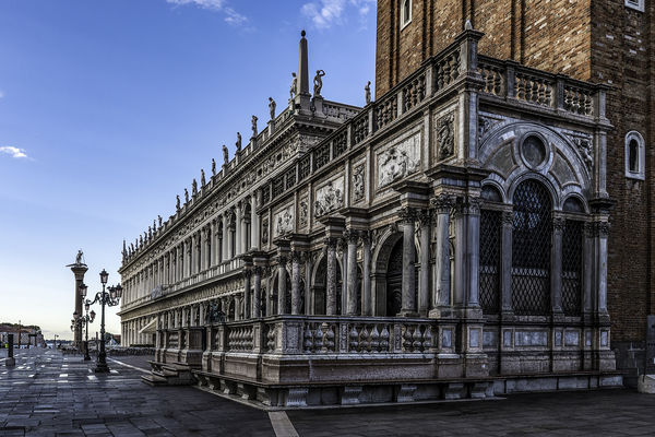
The brick building is the St. Mark's Campanile which is one of the most famous buildings in all of Venice. This is the base of a 323 ft. tower. Masking it out of the photo would create a firestorm from folks who know this as the most important location in Venice.
Sep 9, 2019 19:56:40 #
Sep 10, 2019 07:51:52 #
jcave
Loc: Cecilia, Kentucky
Personally, I have seldom found color to be a distraction unless it is unnatural to the subject. Lighting, focus and composition are the key ingredients. Subject matter, timing and uniqueness add interest. While there is beauty in black and white, I find it comparable to a pencil sketch vs an oil or watercolor.
Sep 10, 2019 08:50:15 #

Thanks for posting the 3 images. The B & W does show the most detail that is lacking in #1 and is seen in #2. The B & W gives the details without distracting with the color.
Sep 10, 2019 10:44:38 #
gtilford
Loc: Woodstock, Ontario, Canada
I prefer the black and white version of the photo as well as more detail is seen in the building but again I agree and do not like the halo effect that is seen. Did you convert the original to black and white then edit the birds out etc or did you convert to black and white after you had edited the photo. I only asked because I downloaded the original and just quickly converted to black and white and there was no halo present then I could have done the other edits?
Great shot
Great shot
Sep 10, 2019 11:36:41 #
jeep_daddy wrote:
It does make for a very nice B&W photo. But, I do think that you've overdone the processing as evidence of banding in the sky and halo around the building. This is just because of the way you've processed it and can be easily changed if you start over with the original and convert it to B&W first. It appears that you've used the second (processed) image and simply changed it to B&W. The second image has the same problem with banding (subtle) and halo around the building.
Ok, I went back and reprocessed both images separately from the original file. I was successful in removing the halo in both but was unable to remove the banding in the B&W. Any suggestions on how to do that would be greatly appreciated.
Sep 10, 2019 11:53:39 #

Both are greatly improved with the additional processing and removal of the halo - but I still like the color version for its perceived contrast between "old and new." As far as the banding is concerned, I'd like to know how to get rid of that as well! 
Sep 10, 2019 11:59:17 #

I like the monochrome just the way it is--it looks squared correctly to me.
Sep 10, 2019 12:03:05 #
jaymatt wrote:
I like the monochrome just the way it is--it looks squared correctly to me.
Thanks for viewing.
Sep 10, 2019 12:04:37 #
tommystrat wrote:
Both are greatly improved with the additional processing and removal of the halo - but I still like the color version for its perceived contrast between "old and new." As far as the banding is concerned, I'd like to know how to get rid of that as well!
Thanks for taking the time to compare. Sometimes I get lazy and don't do my best. I had lots of encouragement to step up my game.
Sep 10, 2019 12:06:58 #
JFCoupe
Loc: Kent, Washington
I like you B & W conversion. When subjects or compositions have the right contrast, B & W really works.
If you want to reply, then register here. Registration is free and your account is created instantly, so you can post right away.