Explain Yourself
Sep 9, 2019 10:14:18 #
I have been doing serious photography for only 15 years and just recently looked for opportunities in black and white. Here is a photo I ignored as a color photo because it just didn't seem to be interesting enough to spend the time to process. This is the building opposite the Doge's Palace in Venice. It was taken at sunrise which is why there are almost no people present. I used a Panasonic GX8 with a 12-60mm lens.
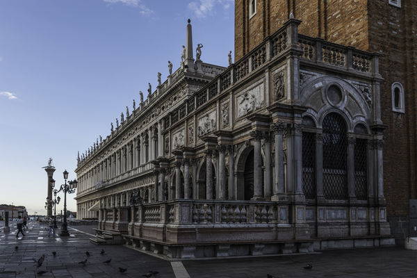
The original shot: I kind of liked this shot but wasn't willing to think about how it could be improved. The birds were a distraction and a couple of people also were annoying. The smooth piece of white stone on the ground was at an odd angle and was too bright. Also, the end of the building didn't seem to have an element that worked for the rule of thirds.
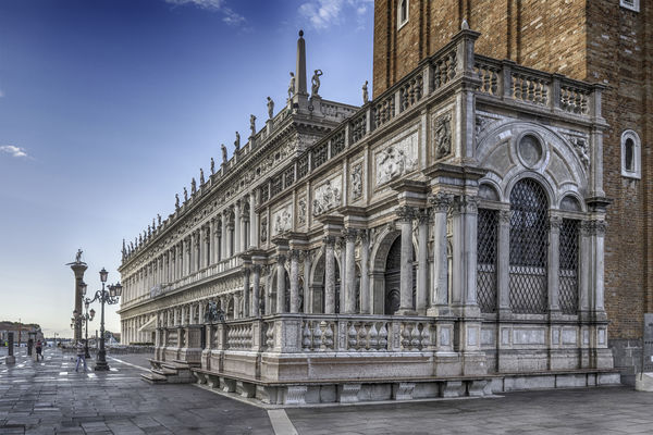
Why I don't like the color shot: The building in the foreground is magnificent in design and texture. However, the red/brown brick of the building behind it is, to me, a jarring contrast and becomes a distraction.
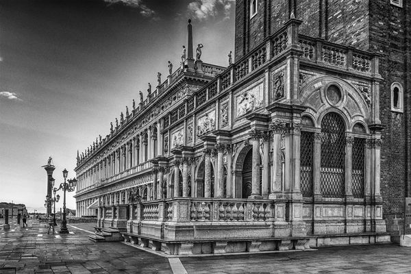
What I like about the Black and White: I think this building is abut 500 years old. There is not much color in the building so nothing is lost in the B&W conversion. This created a harmony between the main stone building and the brick structure behind it.
This is how I see the differences in this image. When I last posted this kind of question, there seemed to be considerably differing opinions that were more about personal taste rather than what is the best presentation of the image. My questions are: Is this an interesting shot, has it been improved by the processing and is the B&W an appropriate representation?
Thanks for taking the time to think about the photo and responding.
Sep 9, 2019 10:27:03 #
katu41 wrote:
I have been doing serious photography for only 15 ... (show quote)
Black and white version is best by far, brings out the details without distraction.
Sep 9, 2019 10:28:35 #
photophile wrote:
Black and white version is best by far, brings out the details without distraction.
I hate it when I ignore the obvious.
Sep 9, 2019 10:37:53 #
I think it works great in black and white. I think the biggest problem with the photo is that it appears to be needing several degrees rotation counterclockwise. Having converted to black and white from your processed color version, the more pronounced is the sky from black to white. I would have wanted to avoid that distraction from the building.
Sep 9, 2019 10:38:12 #
katu41 wrote:
I have been doing serious photography for only 15 ... (show quote)
"Why I don't like the color shot: The building in the foreground is magnificent in design and texture. However, the red/brown brick of the building behind it is, to me, a jarring contrast and becomes a distraction."
~ THAT statement right there..... You have made your subject PoP with PP!! That image in B&W is simply elegant and forceful!! B&W brings your subject building forward.
Well done!!


Sep 9, 2019 10:42:32 #
fergmark wrote:
I think it works great in black and white. I think the biggest problem with the photo is that it appears to be needing several degrees rotation counterclockwise. Having converted to black and white from your processed color version, the more pronounced is the sky from black to white. I would have wanted to avoid that distraction from the building.
I looked at the image and all of the vertical elements seem to be perfectly aligned. The right edge has a slight distortion from the lens and I tried, somewhat imperfectly, to realign using transform/distort.
Sep 9, 2019 10:43:23 #
Sep 9, 2019 10:44:14 #
yorkiebyte wrote:
"Why I don't like the color shot: The buildin... (show quote)
Thanks for your comment. It was fun to "discover" this photo and make it into something that wasn't there in the original.
Sep 9, 2019 10:45:51 #
StanMac wrote:
Wonderful image, Katu!
Long live monochrome!
Stan
Long live monochrome!
Stan
Thanks Stan. I'm finding a lot of old photos that can be brought to life with B&W.
Sep 9, 2019 10:45:52 #
Sep 9, 2019 10:48:26 #
I like your reasoning for converting to B&W. I can't seem to think that cleverly.
Did this post twice?
Did this post twice?
Sep 9, 2019 10:48:38 #
fergmark wrote:
I think it works great in black and white. I think the biggest problem with the photo is that it appears to be needing several degrees rotation counterclockwise. Having converted to black and white from your processed color version, the more pronounced is the sky from black to white. I would have wanted to avoid that distraction from the building.
....Hmmm.. Looks to be Very squared up to me. side to side, all vertical with no keystoneing (sp?). At least to my eyes on my PC monitor.


Oops... I see this has been answered... I suffer from O.A.S. (Old And Slow)
Sep 9, 2019 10:50:09 #
Your bw is a great choice! It allows the element of design to shine through without the distraction of color.
Sep 9, 2019 10:50:35 #
Tom85 wrote:
I like your reasoning for converting to B&W. I can't seem to think that cleverly.
Thanks Tom. I kind of enjoy this as an exercise as to how to look at a composition for its flaws and to see if the elements are present that can make it a better picture. Some are just lousy shots and need to be accepted as such. The others are like you children. They hold promise and are worth making the investment of time and love.
Sep 9, 2019 10:51:41 #
BlueMorel wrote:
Your bw is a great choice! It allows the element of design to shine through without the distraction of color.
Thanks for taking the time to view and respond.
If you want to reply, then register here. Registration is free and your account is created instantly, so you can post right away.


