What's wrong with these photographs
Oct 18, 2022 12:37:02 #

twosummers wrote:
A few weeks ago I took some real estate photograph... (show quote)
Colors look a little too muted, and most of them are slightly overexposed. Just adding a little more contrast would make them pop.
Oct 18, 2022 13:45:48 #
You are shooting into a large light range, so YOU might consider using a polarizing lens when doing so, otherwise you must increase the saturation by using the contrast or level sliders on PS... that should help some
Oct 18, 2022 13:57:53 #
amfoto1
Loc: San Jose, Calif. USA
Are we looking at the same images?
I'm using on a calibrated monitor and a (supposedly) color corrected browser.
A few of the images appear over-saturated. In particular the dining room. And, to a lesser degree, the blue bedroom and the back yard seem a bit over done.
Many of the other images are fine, just as they are. There are nit picky little details here or there that might have improved them, but overall they present the home well and it looks very nice indeed.
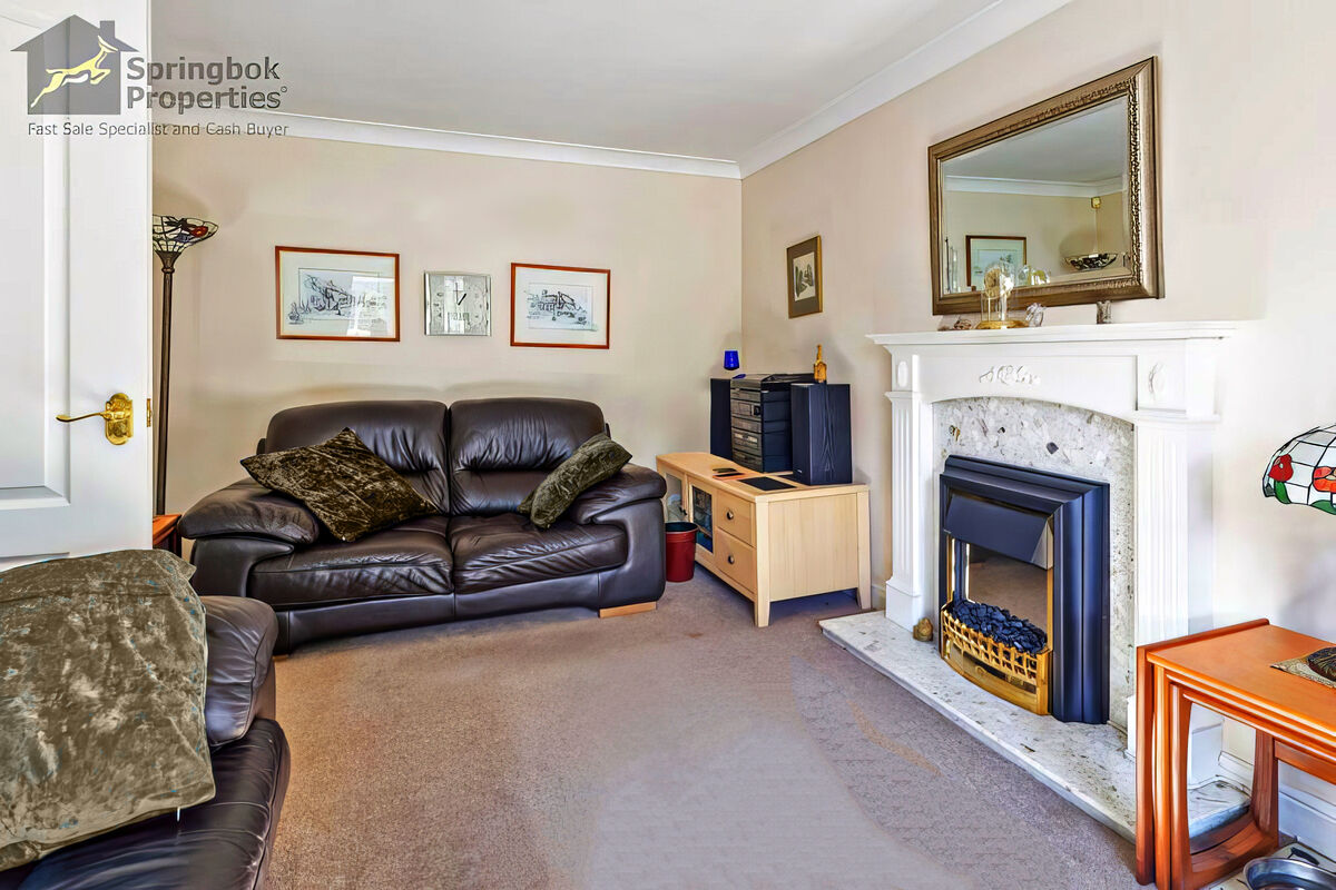
However, I do feel compelled to pick on the image that was uploaded first, in particular. In my opinion, the problems with that photo started well before the shutter button was pressed. The blue throw pillows DOMINATE the room! Bright colors look great in the kitchen, but aren't very relaxing here. I would have removed those pillow, perhaps substituted something more neutral (if available) or just gone with no throw pillows at all. As it stands now, with the photo already taken, Photoshop's color replacement brush was all that could be done. Another thing I experimented with was adjusting the framed pictures on the wall a bit lower and better centered on the sofa (I just did a quick move of them, didn't feather in the tonalities on the wall very carefully, so don't look too close). Results below.
But wait, there's more... What is that in the extreme lower, right hand corner of that image? A dog bowl? As with the pillows, a lot can be accomplished by simply taking a few moments to closely examine and prepare the room before the photo is taken. Also note the shadows from flash. Some sort of diffusion might have helped soften or reduce those. A couple final nits to pick... The right hand cushion on the sofa could have been fluffed up. And the carpet in that room looks pretty dirty. Maybe it is, or maybe just a quick vacuuming would have evened it out.
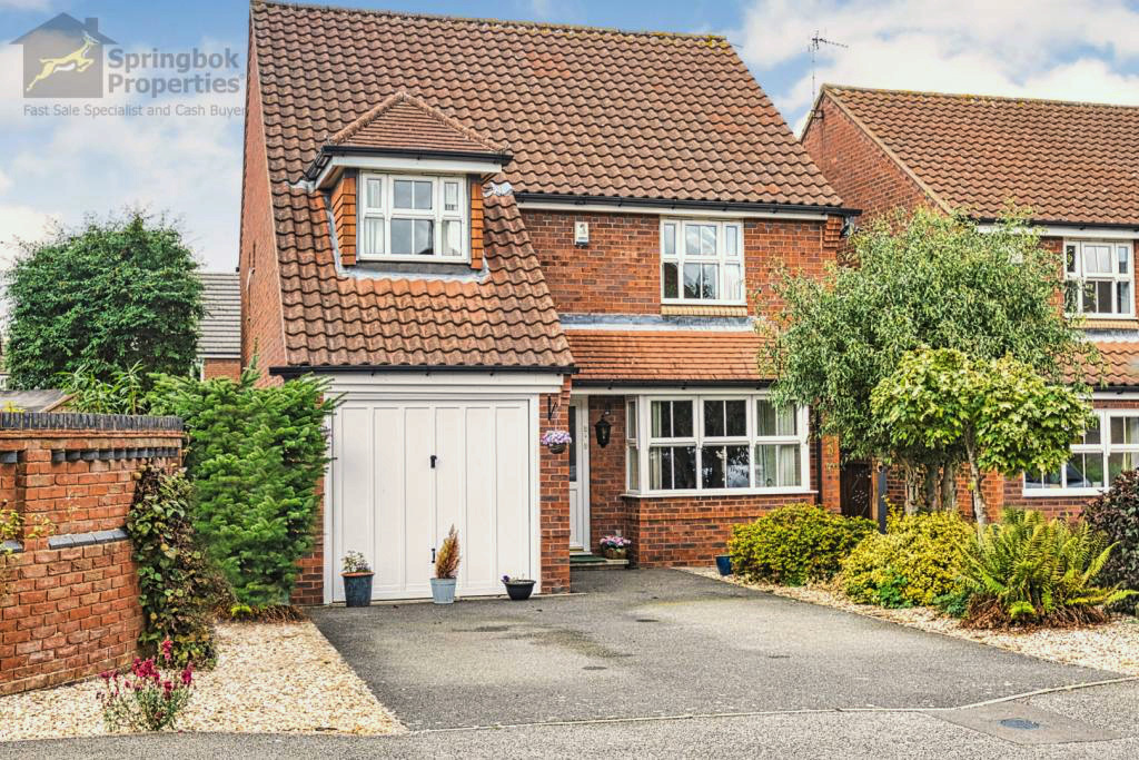
Finally, to me the "warmed up" version of the exterior of the property was way overdone and looks washed out. Another problem was illustrated in that image's histogram: No pure whites or blacks. The reason that image looks washed out is that dynamic range was clipped badly on both ends... but even more-so toward the highlights. Often out of fear of "blowing out the highlights" people clip the pure whites that exist in almost every image. Here it showed up especially in the clouds (which turned yellow with the warming). So I adjusted the curves in Photoshop, dialing up mid-tones and shadows, while also extending the highlights. Then I cooled it a bit and boosted the saturation a tad.
Another little nit to pick on that exterior shot... It appears that two cars were moved from the driveway, leaving dry patches on the otherwise wet pavement. I might have used a garden hose to wet down the driveway more evenly.
I'm using on a calibrated monitor and a (supposedly) color corrected browser.
A few of the images appear over-saturated. In particular the dining room. And, to a lesser degree, the blue bedroom and the back yard seem a bit over done.
Many of the other images are fine, just as they are. There are nit picky little details here or there that might have improved them, but overall they present the home well and it looks very nice indeed.
However, I do feel compelled to pick on the image that was uploaded first, in particular. In my opinion, the problems with that photo started well before the shutter button was pressed. The blue throw pillows DOMINATE the room! Bright colors look great in the kitchen, but aren't very relaxing here. I would have removed those pillow, perhaps substituted something more neutral (if available) or just gone with no throw pillows at all. As it stands now, with the photo already taken, Photoshop's color replacement brush was all that could be done. Another thing I experimented with was adjusting the framed pictures on the wall a bit lower and better centered on the sofa (I just did a quick move of them, didn't feather in the tonalities on the wall very carefully, so don't look too close). Results below.
But wait, there's more... What is that in the extreme lower, right hand corner of that image? A dog bowl? As with the pillows, a lot can be accomplished by simply taking a few moments to closely examine and prepare the room before the photo is taken. Also note the shadows from flash. Some sort of diffusion might have helped soften or reduce those. A couple final nits to pick... The right hand cushion on the sofa could have been fluffed up. And the carpet in that room looks pretty dirty. Maybe it is, or maybe just a quick vacuuming would have evened it out.
Finally, to me the "warmed up" version of the exterior of the property was way overdone and looks washed out. Another problem was illustrated in that image's histogram: No pure whites or blacks. The reason that image looks washed out is that dynamic range was clipped badly on both ends... but even more-so toward the highlights. Often out of fear of "blowing out the highlights" people clip the pure whites that exist in almost every image. Here it showed up especially in the clouds (which turned yellow with the warming). So I adjusted the curves in Photoshop, dialing up mid-tones and shadows, while also extending the highlights. Then I cooled it a bit and boosted the saturation a tad.
Another little nit to pick on that exterior shot... It appears that two cars were moved from the driveway, leaving dry patches on the otherwise wet pavement. I might have used a garden hose to wet down the driveway more evenly.
Oct 18, 2022 16:41:27 #


Oct 18, 2022 17:16:39 #

If one of my pictures looks washed out, I use the brightness/contrast facility to brighten and deepen colors (USA spelling).
Oct 18, 2022 18:18:01 #

Look at it this way!
Nobody is gonna buy a house sight unseen from a picture. Real estate photos shod just create interest and desire for the property and give the potential buyer I good idea of what the place looks like. If the picture and the accompanying copy are decent enough the buyer will make an appointment with the estate agent and see the house in person.
The potential buyer will not usually worry about colour accuracy or saturation or otere technicalities with reason. So, any criticism I offer will have to do with how what you do affects the viewer. If you are havg issues with certain technicalities as to colour accuracy, contrast, saturation and exposure, you will eventually work these out, For me, the big issue is "staging" and attention to detail.
I realize that you can not change the furnishings but you can make the best of what you have to work with. The idea is not to restyle the entire property but to have the potential buyers FEEL that will be comfortable in that place- shoot it so they can relate to it.
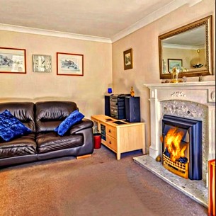
Due to limited time, I just used a detail of one of the rooms in our - want to the colour a bit and to have good "detail shot" shots. I put a fire in the fireplace, cropped out the door and the sofa pillow in the foreground and concentrate on the cozy corner of the room.
In the original shot of the room, I noticed 2 stained glass lams at the edges. If you fully included the in the shot and turned them on, perha exposed for the ambient lig and fill in with a tungsten source, you would have a nice mood shot. Flat lighting causes a lack of dimensionality. It's OK if the foreground is a bit darker- it leads the eye into the room
Make certn pillows are puffed up, and things arein place, remove items wastebasket, etc., and if a door is open, perha ligh and show the adjoining room in the background. Watch vertical lies for off-kilter tilts and distortion. For smaller rooms, you might need a shorter wide-angle lens. Avoid "falling over walls" due to distortion. If you do not have perspective control eons, just keep the camera perpendicular and paralleled and cor the unwanted excess ceiling and floor areas.
There is nothing terribly wrong with what you have done. If you want to improve your work and seek out high-end real estate markets, the aforementioned are a number of suggestions. Thereis a lot of estate photography out there that is rather mediocre but it passes and probably does the job. There is high-end interior work that you see in architectural and interior decoration publications. If you come in somewhere in between you are on the rigt track.
Good luck and much success!
Nobody is gonna buy a house sight unseen from a picture. Real estate photos shod just create interest and desire for the property and give the potential buyer I good idea of what the place looks like. If the picture and the accompanying copy are decent enough the buyer will make an appointment with the estate agent and see the house in person.
The potential buyer will not usually worry about colour accuracy or saturation or otere technicalities with reason. So, any criticism I offer will have to do with how what you do affects the viewer. If you are havg issues with certain technicalities as to colour accuracy, contrast, saturation and exposure, you will eventually work these out, For me, the big issue is "staging" and attention to detail.
I realize that you can not change the furnishings but you can make the best of what you have to work with. The idea is not to restyle the entire property but to have the potential buyers FEEL that will be comfortable in that place- shoot it so they can relate to it.
Due to limited time, I just used a detail of one of the rooms in our - want to the colour a bit and to have good "detail shot" shots. I put a fire in the fireplace, cropped out the door and the sofa pillow in the foreground and concentrate on the cozy corner of the room.
In the original shot of the room, I noticed 2 stained glass lams at the edges. If you fully included the in the shot and turned them on, perha exposed for the ambient lig and fill in with a tungsten source, you would have a nice mood shot. Flat lighting causes a lack of dimensionality. It's OK if the foreground is a bit darker- it leads the eye into the room
Make certn pillows are puffed up, and things arein place, remove items wastebasket, etc., and if a door is open, perha ligh and show the adjoining room in the background. Watch vertical lies for off-kilter tilts and distortion. For smaller rooms, you might need a shorter wide-angle lens. Avoid "falling over walls" due to distortion. If you do not have perspective control eons, just keep the camera perpendicular and paralleled and cor the unwanted excess ceiling and floor areas.
There is nothing terribly wrong with what you have done. If you want to improve your work and seek out high-end real estate markets, the aforementioned are a number of suggestions. Thereis a lot of estate photography out there that is rather mediocre but it passes and probably does the job. There is high-end interior work that you see in architectural and interior decoration publications. If you come in somewhere in between you are on the rigt track.
Good luck and much success!
Oct 18, 2022 18:36:45 #

If your using a calibrated wide gamut monitor make sure that you convert the images to the srgb color space before you make the jpegs otherwise the colors and density can change. I would be ask the real estate agent if they have altered then in anyway. When I shot real estate I always keeped the images on file because they are very small.
Oct 18, 2022 20:25:20 #

When we were house-hunting, nearly twenty years ago, we spent a few weeks sifting through options, then drove nearly a thousand miles to the tiny town in Kansas we were moving to. I must admit that my wife failed to recognize one of the houses that had been high in our list - it was actually much smaller than it looked in photographs, and the photographs were taken in such a way as to hide the fact that one one the stairways was dangerous and would require serious repairs …… but none of this is the responsibility of the photographer - it is the responsibility of the buyer to keep alert.
Oct 18, 2022 20:28:35 #

The photographer, though, should be using a calibrated monitor and the sRGB colorspace for their JPEGs.
Oct 18, 2022 20:30:43 #
dayranch
Loc: Douglasville Georgia
Wow! Why did you use a flash over exposure big time and ISO to high photo composition very bad. Do over for sure if possible. Good luck.
Oct 18, 2022 21:11:25 #

twosummers wrote:
A few weeks ago I took some real estate photograph... (show quote)
Some of them look a little oversaturated but I have seen much worse! Check the metadata to see if the camera was accidentally set to Vivid?
Oct 18, 2022 21:53:13 #
There is a lot of conversation about colour accuracy and saturation. In certain kinds of commercial photography, some aspects of real estate and interior architecture, colour accuracy and authenticity might be important. On a printed or online catalogue of clothing, shoes, fabrics, etc., colour matching is required. Real estate, for the most part, is an accurate colour rendition that may count but there is also mood and sometimes a bit of drama. The colours of the walls and furnishings, even to the eye, can vary. The light from a fireplace, candlelight, incandescent lamps, LED kitchen lights, and sunlight streaming in through a window may each yeid variation of the same colour of paint or fabric. This is not fakery and it can help sell a property. Some of these moods can be very attractive and enticing.
If the photographer can take into consideration the "selling points" of any given property and bring out the character and style and create a theme such as spacious, modern, warm, cozy, traditional, rustic, different, etc.
The distortion that exaggerates space is bad and should be avoided. A serious potential buyer will also want to see diagrams and "blueprints" along with measurements and other vital specifications. Again, nobody is gonna buy a house or sign a significant lease sight unseen.
Sometimes a house is simply a "fixer-upper" and the new owner will gut the place and completely change the interior. All the photographer can do is try to illustrate the potential space, etc.
Oct 18, 2022 22:09:06 #
E.L.. Shapiro wrote:
There is a lot of conversation about colour accura... (show quote)
Buying a house based on the real estate photos is like buying a camera based on the sample photos provided by the manufacturer. Your results may vary!
I have shopped older houses and consistently they all look fabulous, spacious, warm and inviting in the photos. The reality check happens when you pay a visit.
Oct 18, 2022 22:55:57 #
JD750 wrote:
Buying a house based on the real estate photos is like buying a camera based on the sample photos provided by the manufacturer. Your results may vary!
I have shopped at older houses and consistently they all look fabulous, spacious, warm and inviting in the photos. The reality check happens when you pay a visit.
I have shopped at older houses and consistently they all look fabulous, spacious, warm and inviting in the photos. The reality check happens when you pay a visit.
I agree! I have had realtors ask me questions about the effect of "will your photos sell houses"! I surprise them and say "NO"! My photographs will get them interested in viewing the property. The images will be honest and well crafted and show the interior and exterior as good as they can be without fakery or extreme alteration or editing. YOU will have to sell the houses or the apartments- I will just help the bring the to your door!
Some years ago, I was seeking out a new studio space and came across a commercial property ad with dreadful images- the place look like it was unfit for hman habitation! The area was desirable and the price was in my range so met the agent and went to see the property. The place was 1,000% better than it appeared in the images. It just needed a facelift and a few retrofits. The pictures made it look like an abandoned dingy cellar! I bought it and had my studio there for 18 years! Go figure! I moved an industrial park and that building is now an Italian food grocery store!
Oct 19, 2022 09:32:12 #

twosummers wrote:
A few weeks ago I took some real estate photograph... (show quote)
The only thing "wrong" with these pictures is the subject. Real estate lies about most things in a listing so who will notice it in their photographs? A friend recently complimented me on the "art work" in my house. I asked how she knew, since she had never been IN my house. She had "seen" it on Zillow! Zillow had never been in my house either. Zillow had fabricated a similar room setting. They had overlooked the fact the west wall is almost completely glass and had placed a "bay" window centered in that wall. You're complaining about colors being incorrect? Photoshop is the tool of choice when accuracy in not an object considered highly.
If you want to reply, then register here. Registration is free and your account is created instantly, so you can post right away.