What can be done with this picture?
Feb 26, 2022 16:13:10 #

gener202002 wrote:
Yes, sharpening does seem to increase the noise. Someone mentioned to me Topaz sharpening. It does cost a little though, I may get it later. Sharpening in camera raw doesn't seem to do exactly what I want to do, I do have a few other options that I am going to work on. I'm can't seem to do anything with "smart sharpening." And the lens I am using is a professional lens, and I never used to notice that problem so much.
Thanks,
Thanks,
If you’re using Photoshop, look up how to use the High Pass filter as a sharpening option. If you the apply a mask, Carl-I to invert, you can brush in the sharpness only where you want it.
Feb 26, 2022 17:32:49 #
Grahame wrote:
For pictures such as you have posted above you sho... (show quote)
Thanks to you and everybody for great information. Sharpening is not something I have used a lot with pictures, but I have been trying different methods lately to get different kinds of looks and feels in my picture. The picture I posted is not one I would normally send to an agency anyway as there are lots of problems with the pictures. I like the sun rays but they in this case create problems with the look of the trees and such. I had to crop it for the wall, and that didn't help matters.
I am more concerned about noise than sharpening. I have been told that you should not go above 40 in noise reduction, but I find that a lot of times it requires more than that. I am also trying to find out more about various kinds of noise reduction, such as color and such, and some here have given me some good hints about that.
I will respond to other people's suggestions next, as there are some good points made.
Feb 26, 2022 17:39:48 #
R.G. wrote:
The fringing could be due to the lens but more lik... (show quote)
This is very useful information. Thank you. Interestingly, I have increased the use of clarity, dehaze, and vibrance lately, which apparently is a mistake. I will go back to my old way of doing things and see how that works.
Thanks again for good information.
Feb 26, 2022 17:49:46 #
gener202002 wrote:
Hello everyone br br I am not a professional phot... (show quote)
Well, it sounds like you've had a good experience with selling photo's on the market, so I don't think that general discussions about composition and lighting is really necessary. Your success says that you're well versed in those subjects. So I'll give my opinion about this image. Your opinions may differ.
The overall image looks over-processed.
I'm not sure what the subject really is. Is it the angry sky or the sun rays as it sets over the building. I'm assuming that the sun and the sun rays are the main characters. If the clouds are not a key element of your composition then I would suggest cropping out the top part of the image and space to the left of the building. It doesn't feel that it adds to either the sky or the sun.
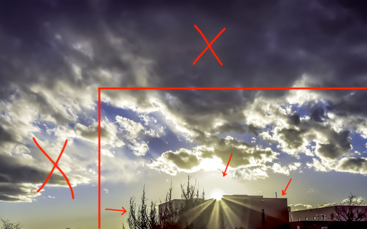
The sun rays just doesn't look right. It looks added but it could be real. Either way, the area around the sun generating the sun rays is hidden in the large overexposed area cause by the sun. This would have been a good time to either try reducing your exposure (at the risk of increasing noise) or taking a second shot at a reduced exposure to digitally blend detail back into clipped parts of your image. I see that you added +2/3 EC but you may have been better off with a -2/3 EC and dealt with the added noise. To describe what I'm discussing, I've added some detail back into the clipped area around the sun to give the sun a little more definition.
I do see white halos around the building and trees. It's not real obvious in the smaller image but it would show in a larger print. The best solution is to prevent it in your initial processing, but sometimes when it's not an easy fix in your initial processing, then it's an easy fix in photoshop, a method I use to remove halos. Rather than describe it here, I'm posting a link to a tutorial by Sean Bagshaw below. Removing the halos in your image just took less than a minute using this technique.
https://www.youtube.com/watch?v=jCZpSWillLg
Hope this helps
Mar 9, 2022 15:55:56 #
Tomsadvice2
Loc: S F Bay Area
One big disadvantage of mirrorless cameras is they often get dirt and dust on the sensor when changing lenses. Even just the zoom action will pump air (and dirt) into the camera body. Try buying a cleaning kit for your sensor, also check the rear elements of your lenses. Your problem sounds like it built up over time which makes me suspect this issue. Tom
Mar 10, 2022 00:16:14 #
Tomsadvice2 wrote:
One big disadvantage of mirrorless cameras is they often get dirt and dust on the sensor when changing lenses. Even just the zoom action will pump air (and dirt) into the camera body. Try buying a cleaning kit for your sensor, also check the rear elements of your lenses. Your problem sounds like it built up over time which makes me suspect this issue. Tom
Thanks for the information, although that is not the case here. When I was using my Canon T7 I did have problems with that. The mirrorless, however, has a self cleaning mechanism, plus it is a fairly new camera, and I almost never change lenses. I use the 25 to 105 almost exclusively. I have seen evidence of a spot on the lens one time in the past, and it disappeared the next time I used the camera. I do find that I have to use a very low iso to make sure I do not have noise. But even then it does show up a lot, depending on the nature of the picture. I was always taught, never go over forty in noise reduction, and for quite a while with the camera I was using almost no noise reduction and getting good pictures. Since I take a lot of sunset pictures it shows up there a lot in the low light. I think I have found ways to reduce this problem, but I watch all the time, and practice taking sunset pictures outside the house. Well, I am always learning, and sometimes learning more leads to worse pictures rather than better, but that gets fixed eventually as well. Photography is a very fine art which one can always learn more on. Thanks again for the info.
May 15, 2022 18:39:42 #
PhotoSnapper
Loc: Salt Lake City, UT
I like your attempt at creating drama with a sunset over a building. You have a good sense seeing a good picture.
But my experience tells me there are too many clouds in the picture which take away from the beautiful sunset with golden rays. In other words, you've got too many elements in this picture.
I would first lighten the entire picture a tad because I feel it is too dark. In fact, the problem may be too much contrast has been added. I wouldn't know until I actually sat with the picture at the computer.
So, I would either drop the contrast and/or raise the exposure to lighten the entire picture a bit. Don't drop it too much or you could lose the silhouette effect and the strong glow of the golden rays of the sun.
Then, I would crop the clouds just above the full cloud directly above the sun. The next crop I would make is to the left of the photo just before you reach those gorgeous clouds that step. Yes, as dramatic as they are, unfortunatley, I would take them out of the picture, leaving blank space between them and the bushes. On the right side of the picture, I would crop just a tad right of the last window of the second building. Now, in my humble opinion, you have narrowed the scope of this picture so that the viewer focuses on the goregous sunset first. The dark clouds and building compliment but are not the dominating scene.
One more thing I just thought of: if you have applied "dynamic" contrast which sharpens more than it differentiates the tone, take that off of the clouds to make them more fluffy. I can do this with my On1 software by using a brush to remove the "dynamic contract" from the clouds. The main problem I see with this picture you're trying to get too many elements into the scene. Thank you for asking us for our advice.
May 16, 2022 21:59:18 #

gener202002 wrote:
Hello everyone br br I am not a professional phot... (show quote)
First - Don't use your TV as a monitor. Second - Calibrate your P.C. or Mac monitor with a Spyder or other monitor calibration and only do your editing on that computer. Third - spend some money and print out several versions of your image to see how print will look. Print black point is almost always different from your back lit monitor. Forth - It would be helpful to know just how much you know about post processing...i.e. what software and how proficient you are with it.
Regarding the attached: The first thing I noticed was the lamp post at the bottom of the frame. There is a dark halo around it that shouldn't be there. In fact I would have cloned that out completely. It's not needed and is an immediate distraction the overall image.
Learn to look at your whole picture. Try different crops and be carful about how much post you put into it. This image doesn't really speak to me much. If I entered this image into any of my clubs I doubt it would make much of an impression.
That being said - join a local photo club. You can learn so much and it's cheep.
May 29, 2022 18:16:48 #

To me, it looks like the dynamic range of your camera is not sufficient record everything you are looking for (and I doubt many are). In such a situation I would be temped to try an HDR image.
Jun 10, 2022 21:53:33 #
I think you may be overconcerned about this particular image.
Only advice have is keep submitting and shoot what you love and keep the lowsest ISO you can to keep noise from effecting your image. I would suggest that over sharpening images is to be avoided.
Curious as to what agencies you are with. I am with Getty and Alamy.
Please send me a private message and I will give you my image sites on these agencies. I would be happy to look at your images as well. I am retired but have been a professional stock shooter since 1970.
Jul 26, 2022 01:36:20 #
I don't intend to be overly harsh or unkind. But to progress as a photographer we must be willing to be critical of our own work. And being critical, we must be willing to accept the fact that some of our images have little or no redeeming value. I have many. In my opinion, this is one of those instances and it's time to move on to other images rather than wasting time trying to salvage the unsalvageable. Move on and commit your time and energy to something with more potential. Again, forgive me for my bluntness.
Sep 28, 2022 14:35:00 #

gener202002 wrote:
Hello everyone br br I am not a professional phot... (show quote)
Here are a few ideas I had (some others have given similar suggestions already), but they are mostly personal taste except for the first couple of composition changes.
1. There is too much black cloud color at the top and too little building silhouette at the bottom. I suggest you put back the bottom you cut off and then cut more of the top.
2. Then cut the final photo to follow the suggestion of 2/3 rule, which is not a rule but which would help you composition in this case.
3. To me, you have too much contrast which makes the photo really dismal and hides some details in the shadows. In the photo attached, I reduced the contrast by 60 in IrfanView, which is a lot.
4. Just in case there was some noise in the original post of this i mage or my adjusts revealed any noise, I applied a 67 of plain Blur in IrfanView which is the same as de-noising in some other programs.
5. After changing the contrast, I sharpened the photo which is often needed after de-noising and changing the contrast.
6. Then I applied the smallest amount of Median filter (3) in IrfanView which helps to reduce any artificial artifacts. A bit of sharpening is usually necessary after this.
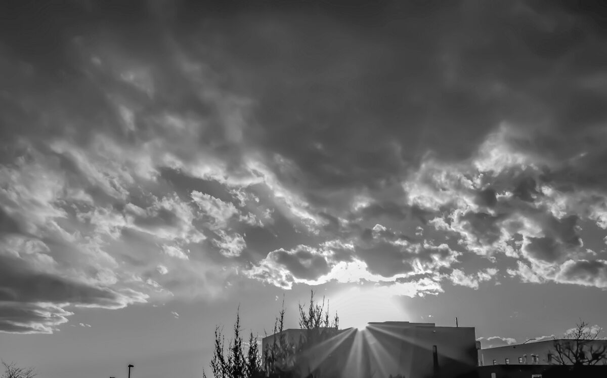
7. To me, there is very little color in the image, so I thought that making a black-and-white image by changing it to grayscale would have more punch. So the attached image is b&w.
Be challenged and intrigued by taking more photos and working with them. Hold off on direct sun photos which can be very hard to work with after taking. --Richard
Sep 28, 2022 15:03:13 #
profbowman wrote:
Here are a few ideas I had (some others have given... (show quote)
Looks very nice.
Thanks
Sep 28, 2022 15:13:54 #
profbowman wrote:
Here are a few ideas I had (some others have given... (show quote)
Thanks again. Here is a newer one taken in the same general area but not exactly the same and has more color.
Sep 28, 2022 16:09:58 #

gener202002 wrote:
Thanks again. Here is a newer one taken in the same general area but not exactly the same and has more color.
Paradise ⭐🥇⭐🥇⭐
If you want to reply, then register here. Registration is free and your account is created instantly, so you can post right away.