Better? Or just different?
Dec 23, 2021 13:49:25 #
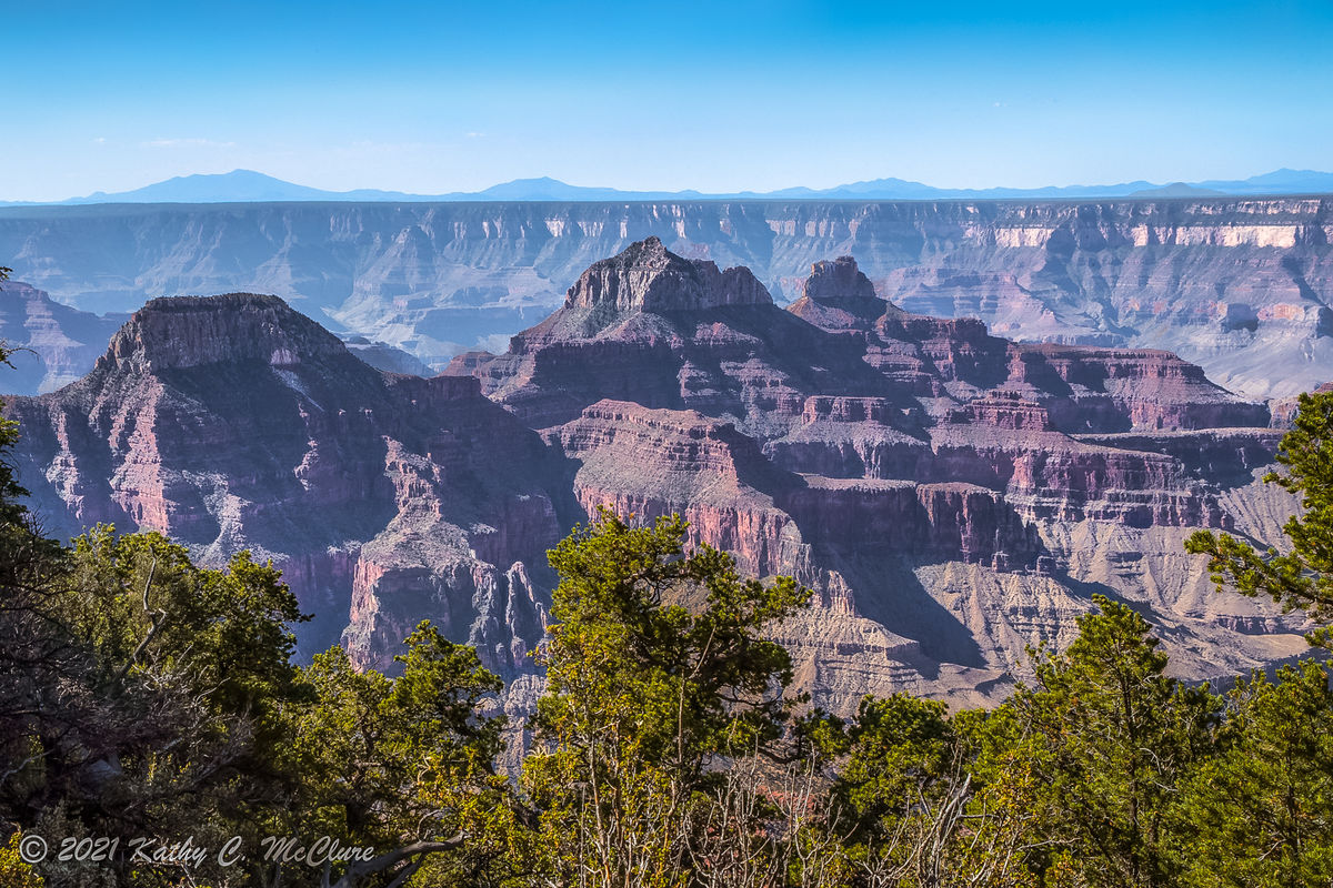
IMO, that's truly all its is, I think you have pushed the blue too far. The top of the sky looks unnatural, too blue. Try and move your white balance toward the right, yellow. As you do watch your center rocks increase in color, this increases red. This helps the center adding color and detail. If you like this you might now want to bring the blue down above the red rock area. Again IMO 🤤
Jim
Jim
Dec 23, 2021 13:51:18 #

Did you try to use the WB and Tint sliders to bring out the colours of the cliffs? It would have been better to use some other means such as saturation via an adjustments brush or the HSL tool.
.
.
Dec 23, 2021 14:35:16 #

UTMike wrote:
Kathy, I am impressed by your use of the tools and your latest version. Merry Christmas and Happy New Year!
Thanks Mike. I really appreciate your comment.
Dec 23, 2021 16:50:53 #
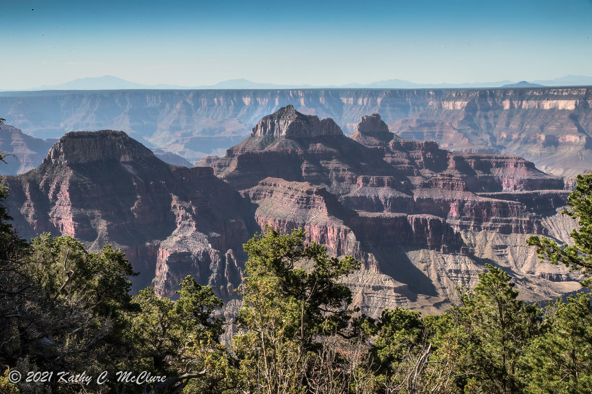
I've followed some of the suggestions offered, and this is my latest revision. I really appreciate all of y'all helping with this. Let me know if this has helped (or hindered!).
If you want to reply, then register here. Registration is free and your account is created instantly, so you can post right away.