Better? Or just different?
Dec 22, 2021 11:50:24 #

I like this image. I liked it when I clicked, and when I first worked on it. Last Sunday my church used it as one of their background images. I didn't like it. The colours were all the same density and the whole image lost a lot of its punch. So I've reworked it. I started in LR, went to Topaz Sharpen, then to PS. (My programs are NOT the monthly payment ones.) I thought lightening up the trees along the bottom would do it, but no. I've increased the contrast and did some dodging in PS. I want to know if I've made it better, or just different and what else I might do to make it better.
This is the original RAW - converted to jpeg in order to post here.
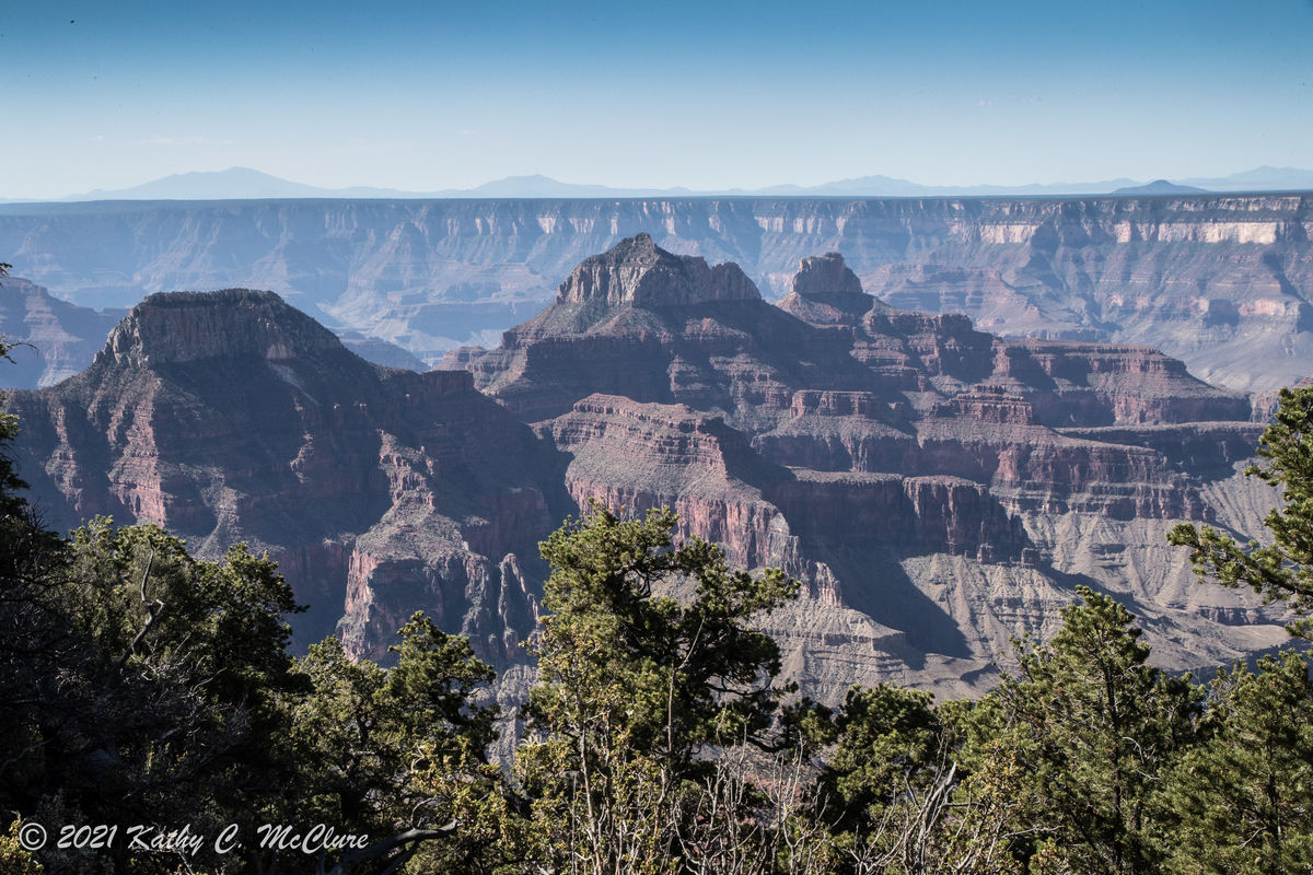
(Download)
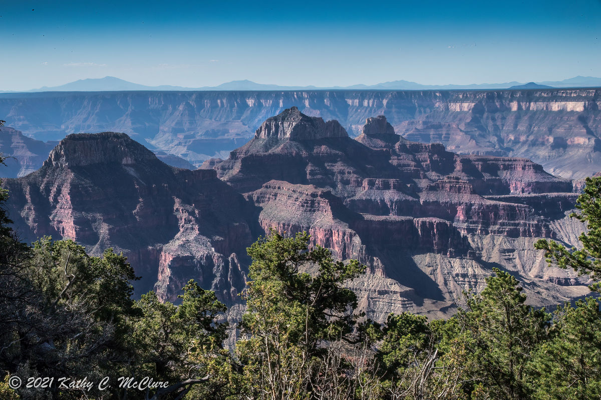
This is my first processing - the one I thought I liked!

(Download)
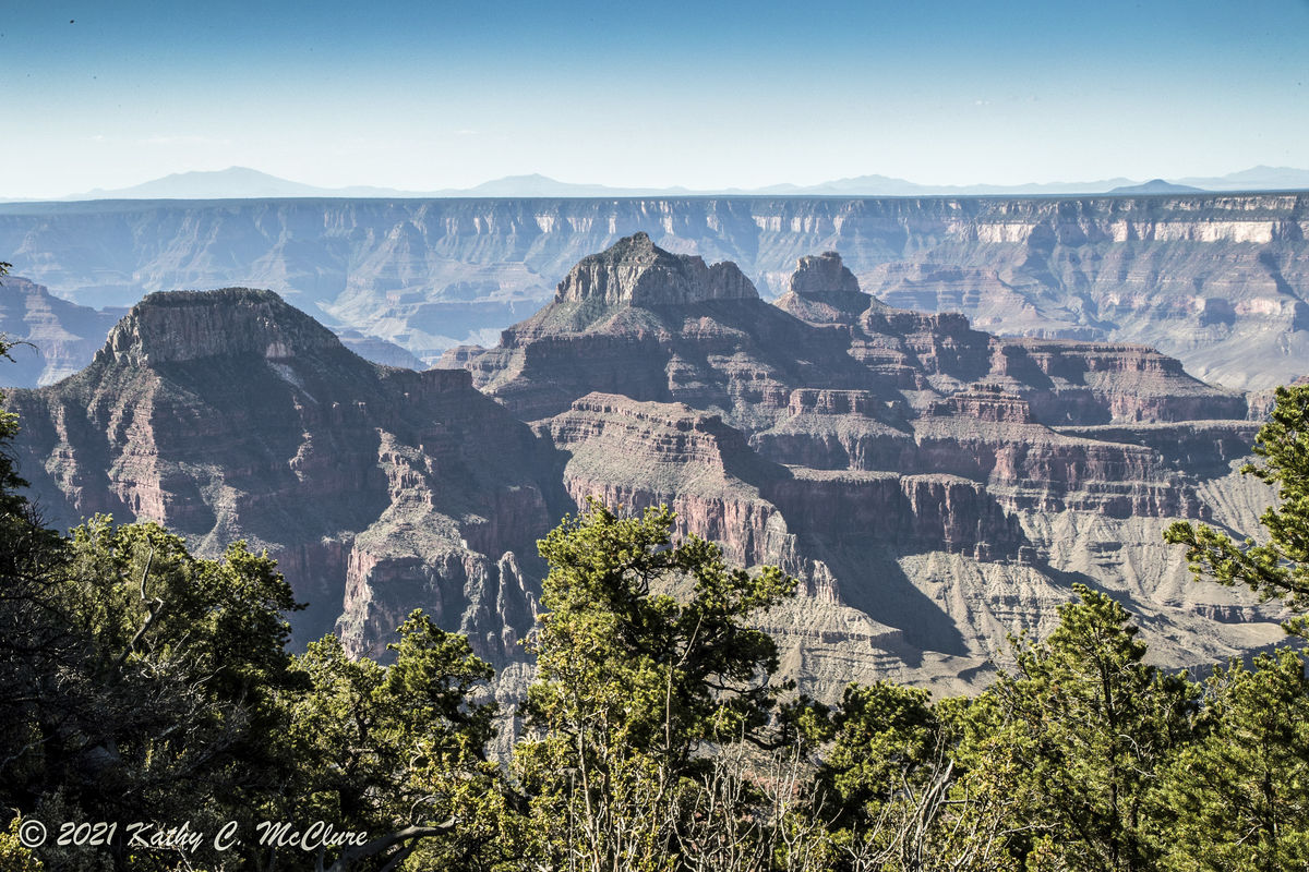
This is my current working.
(Download)
Dec 22, 2021 12:00:53 #

I think you’ve improved it a lot APL, you now have separation of foreground to background. I wonder if you might improve it further by applying Dehaze and/or Clarity to the dark foreground form (in Lr). This would add contrast locally, bringing the area closer to the viewer. It’s a beautiful image!
Dec 22, 2021 12:07:34 #

Dec 22, 2021 12:18:56 #
AzPicLady wrote:
I like this image. I liked it when I clicked, and... (show quote)
The image you are working on now is many times better than what you started with. Good use of the tools!
Dec 22, 2021 12:21:29 #

When you took the pic, was it a perfect day for shooting? Would it have looked better if it was a less hazy day? Could the lighting have been softer or harsher? The point I'm making is that if you can imagine what it would have looked like if you'd taken the shot in more ideal conditions, you can use PP to push it in that direction. Even if you feel a need to be true to reality, the simple fact is, the reality you saw that day was only one of many possible realities. Feel free to imagine any (realistic) reality that you wish.
Your edit is an improvement but I'd say that the colour of the rocks could be stronger and the blue of the sky has gone a bit dark along the top. Getting just the right amount of dehaze can be tricky but if you know how to reduce any unwanted effects of dehaze you can push the dehazing farther and still end up with something that looks perfectly realistic.
I would recommend giving the foreground more dehaze and not worry too much about the background. The main thing that worries me about the background is the predominance of blue. That may be a WB issue or it may be due to the haze, but whatever the cause, it looks like there's room for more colour than just blue. And while blue in the sky can in reality become very strong and vivid, if it gets too dark in PP it can end up looking unrealistic.
Dec 22, 2021 12:31:30 #
AzPicLady wrote:
I like this image. I liked it when I clicked, and... (show quote)
Here's a quick attempt. Mostly a bit more contrast, less haze, and some saturation.
Dec 22, 2021 13:17:58 #
AzPicLady wrote:
I like this image. I liked it when I clicked, and... (show quote)
I love layers in a photo like this. Some near element in sharp focus to put your toes in the scene. Then the well lit and color balanced subject of the near mesas. Then the distant cliffs separated by blue haze. Then the far mountains, pale sky, and cold blue of space.
The third edit might be the best without being too heavy handed, but if the image is intended for projection or display you might want to push the sliders more than normal to compensate for the probable loss of saturtion.
Dec 22, 2021 15:40:34 #
magnetoman wrote:
I think you’ve improved it a lot APL, you now have separation of foreground to background. I wonder if you might improve it further by applying Dehaze and/or Clarity to the dark foreground form (in Lr). This would add contrast locally, bringing the area closer to the viewer. It’s a beautiful image!
First, thank you for the compliment. I have applied clarity already. So you think it needs more? I don't have the Dehaze tool. My LR is far too old for that. I use clarity and contrast to do whatever I can to haze.
Dec 22, 2021 15:42:14 #
Alphabravo2020 wrote:
I love layers in a photo like this. Some near element in sharp focus to put your toes in the scene. Then the well lit and color balanced subject of the near mesas. Then the distant cliffs separated by blue haze. Then the far mountains, pale sky, and cold blue of space.
The third edit might be the best without being too heavy handed, but if the image is intended for projection or display you might want to push the sliders more than normal to compensate for the probable loss of saturtion.
The third edit might be the best without being too heavy handed, but if the image is intended for projection or display you might want to push the sliders more than normal to compensate for the probable loss of saturtion.
It was the projection on our church screen that prompted me to rework this. Do you think it needs more? I know that projection eats both contrast and saturation. Thanks so much. I'm glad you don't think the most recent got overdone. I was sort of worried about that.
Dec 22, 2021 15:43:29 #
Horseart wrote:
All beautiful, but the last one is superb!!
Thanks, Jo. Glad to know I'm headed in the right direction!
Dec 22, 2021 15:45:39 #
rmm0605 wrote:
The image you are working on now is many times better than what you started with. Good use of the tools!
Thanks, RMM. Processing isn't my forte, although I've been doing it for a long time. And I don't like things to look fake!
Dec 22, 2021 15:50:02 #
R.G. wrote:
When you took the pic, was it a perfect day for sh... (show quote)
I didn't notice the day being hazy, but there had been fire smoke in the area, so I'm sure it was there. I don't have the "dehaze" tool in my LR, so I have to control it with contrast and clarity. If I use too much clarity, I get rings along the edges. So apparently you think I should go a little further? I did up the blue a LOT more in the later attempt. Perhaps I should back it off a bit.
Thanks so much for your detailed analysis.
Dec 22, 2021 15:50:57 #
Fred Harwood wrote:
Here's a quick attempt. Mostly a bit more contrast, less haze, and some saturation.
So did you do this from the original, unprocessed image?
Dec 22, 2021 15:51:17 #
AzPicLady wrote:
First, thank you for the compliment. I have applied clarity already. So you think it needs more? I don't have the Dehaze tool. My LR is far too old for that. I use clarity and contrast to do whatever I can to haze.
I need to find a tutorial on just exactly what each Lr tool is doing, digitally speaking. I'd think that even though later versions have new named tools, anything could be done manually in the old Lr if you knew how to manipulate histograms, colors, etc.
Dec 22, 2021 15:53:15 #
Alphabravo2020 wrote:
I need to find a tutorial on just exactly what each Lr tool is doing, digitally speaking. I'd think that even though later versions have new named tools, anything could be done manually in the old Lr if you knew how to manipulate histograms, colors, etc.
I'd appreciate what you can find. THANKS!
If you want to reply, then register here. Registration is free and your account is created instantly, so you can post right away.