Hannna
Oct 2, 2012 09:30:06 #

coco1964 wrote:
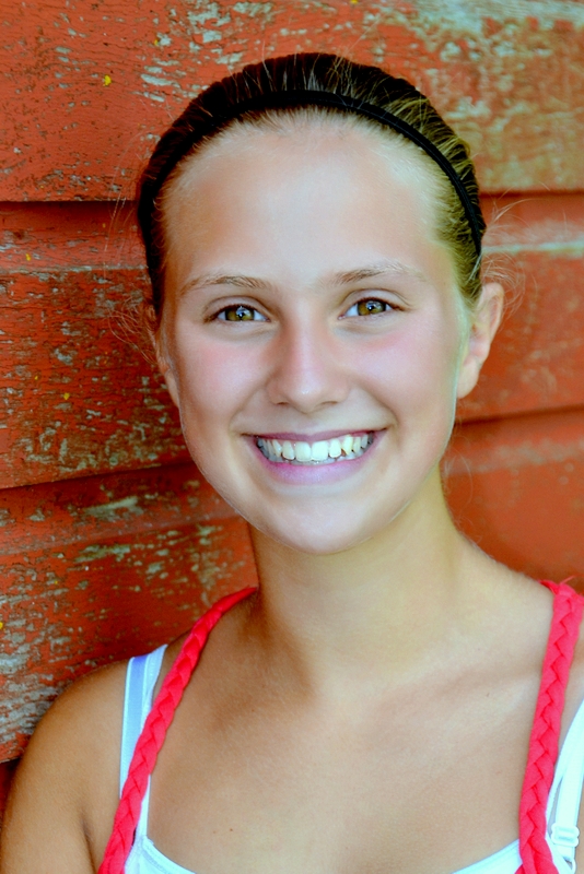
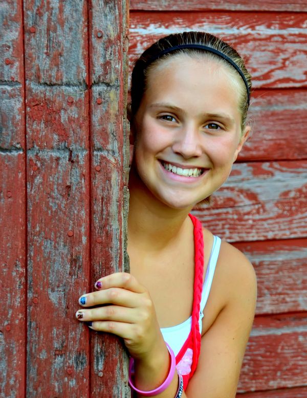
Here are a couple of shots I took of my young model this summer. I do like the B&W medium for these type of portraits, it just seems like it just works better for me. Please feel free to give your opinions and suggestions. These were both shot with a Nikon D-3100 and a Tamron 18-270mm zoom.........
Number 2 is perfect!
Oct 2, 2012 12:12:05 #

Would be interesting to see the color versions now.........
Such a nice job with a beautiful young lady, the color must be very good too.
Such a nice job with a beautiful young lady, the color must be very good too.
Oct 2, 2012 13:32:57 #

Wahawk wrote:
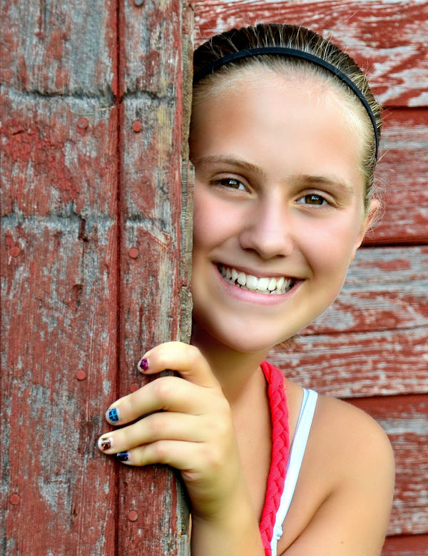
Here are the color versions and if you notice on the wood near her face it grabbed part of the facial color into the wood. Actually that is why I did the B&Ws plus Hanna likes the B&W format better........Would be interesting to see the color versions now.........
Such a nice job with a beautiful young lady, the color must be very good too.
Such a nice job with a beautiful young lady, the color must be very good too.
Oct 2, 2012 13:54:53 #
coco1964 wrote:
Wahawk wrote:
Here are the color versions and if you notice on the wood near her face it grabbed part of the facial color into the wood. Actually that is why I did the B&Ws plus Hanna likes the B&W format better........Would be interesting to see the color versions now.........
Such a nice job with a beautiful young lady, the color must be very good too.
Such a nice job with a beautiful young lady, the color must be very good too.
WOW!! I do see the color from the wood affecting the skin color a bit, but you sure do have a beautiful young model to work with!! I really prefer the color versions but the B&W are awesome as well!!
Enjoy that gorgeous model as long as she is willing!! Great work!!
Oct 2, 2012 14:01:11 #

I really like these. To me, it's not the hand that's distracting but the dark nail polish. Polishing short nails draws attention to how short they are. In the real fashion world, only long nails are polished. (of course this is photography, not fashion)
Oct 2, 2012 14:09:27 #
Thank all for looking and if anyone has a suggestion why the colors would fade into each other I'm open to a quick lesson............
Oct 2, 2012 14:16:34 #
coco1964 wrote:
Thank all for looking and if anyone has a suggestion why the colors would fade into each other I'm open to a quick lesson............
I think most of the color "bleed" is due to the light reflection off the painted wood. If you used a flash with a reflector or diffuser to keep the lighting similar to what you have, it would have a better white balance and therefore the skin color would be more natural as well.
I just took the first color version and made a little adjustment to reduce the red. Not perfect, but I have not done much of this so would take a lot more trial and error practice. Made much more difficult by not knowing the model and her natural skin tones.

Oct 2, 2012 14:19:41 #

I tend to agree with colo43; the hand in #1, IMO, doesn't seem to matter. I was automaticaally drawn to the youg lady's eyes. Where in #2 my eyes wanted to take in the entire image at once and I just couldn't get the warm feeling that #1 gave me. However, all three images are very pleasing to look at. Nice job coco. :P
Oct 2, 2012 14:46:41 #
Wahawk wrote:
Actually I can live with the skin tones, it's the skin reflecting onto the wood that bugs me.......... quote=coco1964 Thank all for looking and if anyon... (show quote)
Oct 2, 2012 14:55:27 #
coco1964 wrote:
Actually I can live with the skin tones, it's the skin reflecting onto the wood that bugs me..........
Didn't really notice that..... Usually that isn't a factor.
Without being there to see the actual scene, that is difficult to judge.
Maybe use a reflector so the light wouldn't be bouncing from her face onto the wood?
Oct 2, 2012 14:59:42 #
coco1964 wrote:
Here are a couple of shots I took of my young model this summer. I do like the B&W medium for these type of portraits, it just seems like it just works better for me. Please feel free to give your opinions and suggestions. These were both shot with a Nikon D-3100 and a Tamron 18-270mm zoom.........
Nice shots of a beautiful model. #1 is a keeper, but next time move the hand down away from her face. It's distracting.
#2 looks a little soft to me.
Good job on the B&W. Keep it up.
Al
Oct 2, 2012 15:03:24 #
Wahawk wrote:
Didn't really notice that..... Usually that isn't a factor.
Without being there to see the actual scene, that is difficult to judge.
Maybe use a reflector so the light wouldn't be bouncing from her face onto the wood?
The building is on her property so I may have to do a fall reshoot with a reflector if the wind ever quits blowing. Right now I want to get her out in the autumn colors and I have a huge stone grotto at a local church I want to visit with her. Schedule conflicts are a bitch. Thanks for the advice and taking the time.........coco1964 wrote:
Actually I can live with the skin tones, it's the skin reflecting onto the wood that bugs me..........
Didn't really notice that..... Usually that isn't a factor.
Without being there to see the actual scene, that is difficult to judge.
Maybe use a reflector so the light wouldn't be bouncing from her face onto the wood?
Oct 2, 2012 15:04:47 #
xphotog1 wrote:
Thanks Al for looking and the advice---always needed and appreciated........ quote=coco1964 Here are a couple of shots I took ... (show quote)
Oct 2, 2012 15:28:43 #
Oct 2, 2012 16:58:52 #

Oh! If I were only 17 again.... She is gorgeous...and your shots ain't bad neither. :thumbup:
If you want to reply, then register here. Registration is free and your account is created instantly, so you can post right away.