Help photographing artwork for true colors!
Oct 18, 2019 20:40:37 #
artBob wrote:
This is from an Art Professor, professional artist... (show quote)
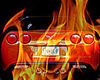
Thanks, artBob. Yup, I'm just a novice artist (and even more novice photographer) looking for an inexpensive way to photograph my work; some for online posting, some for judging, some for prints. I am thankful for all the helpful advice from all the people here on this forum - lots of things for me to try to correct this. I never even considered that the problem could be in the calibration of my monitor, and I will be purchasing a ColorChecker Passport or some other type of white balance card to try that, too. Thank you for the tips on the indoor lighting configuration - I will try that, also. And thanks for your kind critique of my artwork - just a novice, trying out a new style - but luckily, I'm pretty thick skinned, lol.
Oct 18, 2019 20:43:57 #
Thanks, PixelStan77 - I have ordered a lighting set, and will try this along with artBob's diagram for setting up the shot!
Oct 18, 2019 20:44:52 #
Oct 18, 2019 20:46:26 #
Oct 18, 2019 21:51:28 #
Gene51 wrote:
Lots of blind leading the blind. br br The only w... (show quote)

Absolutely the only way to get accurate color of anything you shoot!
I do quite a bit of artwork for my brother-in-law and friends of his who are artists.
They are thrilled with the results.
Custom white balance only gets you close in the neutral colors.
The Color Checker tweaks all the others.
One of the first things I replaced when my camera bag was stolen.
(Luckily, I had the camera, flash and lenses with me)
Oct 18, 2019 22:03:29 #

If you require exacting reproduction, here's the method. This is the procedure I use for art reproduction for museums, galleries, collectors, artist's portfolios, the creation of prints or lithographic reproduction in books and photographs submitted to experts for identification, authentication, and evaluation.
You must use a full-spectrum light source with a compatible white balance setting- I prefer electronic flash. 2 lights are used, each at 45 degrees to the surface of the original painting or other flat artwork. Each light is fitted with a polarizing filter, usually made of a plastic material and oriented in the same direction as per rotation. The camera is fitted with a (CPO) Circular Polarizing Filter on the lens. The filter is rotated until all surface reflections are eliminated and the colors are accurately saturated.
The lights should be aimed and feathered so that the same exact aperture reading is obtained in each corner of the original. I like to use an aperture that is 2 to 3 stops down front the maximum aperture is advisable to obtain maximum sharpness and avoidance of diffraction. A lens of normal to slightly longer than normal is preferable to avoid linear distortion.
The camera is centered on and parallel to the original.
A color chart and gray card strip are included in the frame in a position where it can easily be cropped out for the purpose of color matching. If the original is available during the final color correction, it should be illuminated by a full spectrum ligh source that is designed for accurate color matching and assessment.
Using alternative methods or natural light may work to some extent but there are too many variables and maintaining consistent quality control may become extremely difficult.
Of course, the screen used for editing should be carefully calibrated.
I shoot in RAW and tweak density, color balance, contrast and saturation in post-processing.
Remember, the pigments in the paints in the original art are chemically and physically different for the color process in the camera and any pigments, inks or dyes, films and papers used in reproduction, so there will always be some discrepancy but this method gets you in as close a possible to the colors and tones the original art.


Oct 18, 2019 23:55:51 #

Steve758 wrote:
Been there and done that. When doing that type of ... (show quote)
I wrote this up back in 2012
http://pixeldiarist.blogspot.com/2012/01/correcting-color-cast-in-photoshop.html
Oct 19, 2019 08:00:56 #
Read a long time ago that red and purple are the two hardest colors for a camera to correctly capture and recreate. That might be some part of the problem.
Side note: when shooting my WB is either auto or K (color temperature). If K, then my check is to shoot anything red, if it reproduces correctly, then the K is set correctly.
Side note: when shooting my WB is either auto or K (color temperature). If K, then my check is to shoot anything red, if it reproduces correctly, then the K is set correctly.
Oct 19, 2019 08:02:11 #
Have you tried changing the white balance to determine the best choice?
Oct 19, 2019 09:37:44 #

E.L.. Shapiro wrote:
If you require exacting reproduction, here's the m... (show quote)
I would completely trust this photographer and his procedures. In fact, I have had some of my paintings shot by a pro, like this. If you can afford it, or the photographer, why not?
However, you can also get perfectly good color as I suggested, due to post processing, without costing yourself more than the price of floodlights and clip-on pan light holders.
Oct 19, 2019 09:55:28 #
Swifti wrote:
I have been trying to photograph some acrylic pain... (show quote)
Best way is to have the recommended target(s) with(in) your shots to ascertain that you are getting all the necessary elements of your view/shot. Then you can make the adjustments in post to obtain your desired result(s).
Oct 19, 2019 11:03:32 #

Swifti wrote:
I have been trying to photograph some acrylic pain... (show quote)
Comment about painting is not relevant, and not what you asked about.
You may have a white balance issue, and I am sure you will get many suggested solutions.
Good luck.
Oct 19, 2019 12:18:12 #
fetzler
Loc: North West PA
artBob wrote:
This is from an Art Professor, professional artist... (show quote)
Lots of good advice from artBob. Calibration is certainly important. You should make an image that includes a grey card and color checker card. Use these to assure that the proper color temperature and exposure has been made. Remember also that pigments and dyes used in art materials may not reproduce photographically. This may be a problem with the camera sensor (Your camera is working correctly however) or the quality of light. Many colors appear different in different types of light. Difuse daylight and light from incandescent lights is the standard as these lights have a spectrum of a black body radiator. LED's and florescent lights even if of photo quality may fall short at times. You may wish to experiment with different lights and post processing.
This book may be of use.
How to Photograph Works of Art Paperback
by Sheldan Collins (Author)
It is available from Amazon
Oct 19, 2019 14:47:11 #
artBob wrote:
And your reason would be?
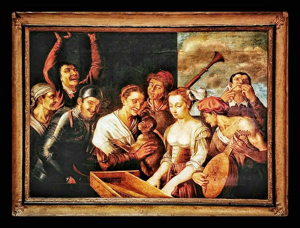
I know your comment is horrible, and the painting is fine and enjoyable because the colors use a low intensity complement to the dominant, highly saturated colors. Those bold colors are not too jarring because of the soft foreground shapes and rhythmical, receding composition. Also, I have seen and judged thousands of artworks in critiques and competitions. I would enjoy seeing the progress of this artist.
I know your comment is horrible, and the painting is fine and enjoyable because the colors use a low intensity complement to the dominant, highly saturated colors. Those bold colors are not too jarring because of the soft foreground shapes and rhythmical, receding composition. Also, I have seen and judged thousands of artworks in critiques and competitions. I would enjoy seeing the progress of this artist.
artBob, I concur with you, and I am "color (deficient) blind".
That doesn't keep me from enjoying art.
Besides, do you like it, wasn't the question!
I really wish that folks would read and understand the question/topic/statement prior to responding.
Just my humble opinion, and no, I'm not trying to start something. . . .
Smile,
Jimmy T Sends


Oct 19, 2019 15:18:16 #
Has anyone heard of Akums razor. Why do we always try and make things more difficult.
You don't need a studio. You don't need special lighting. What you do need is a good working knowledge of light, your camera, your lenses and the exposure triangle, oops, How about a color calibrated workflow.
"The critical part is the set of reference colors/points in your image."
Once you have your image, TAKEN IN RAW, you'll need to post process it (I use ProPhoto and 16 bits).
I use photoshop and ACR for all my work. I'm not an expert, just an advance amateur.
I use the color passport for setting the WB and to compare the image colors against the know color values of the passport colors. Knowing that difference allows for the fine tuning of specific colors far beyond what WB alone will give. Its just like the process used when creating an icc profile for your printer.
No I did not make my living as a photographer, but I have duplicated visually exact image (color, size & media) of images ceated from pastels, water colors, oils, pen and pencils. I use the term visually exact because few people can distinguish minor hue difference when viewing an image at normal viewing distance. When measured using a color photo spectrometer there are some differences, its impossible to an exact match.
Having a studio is great, having fancy lights is great, but a fancy studio and lights still won't get you there.
This is not hard, nor is anything else in photography. It does take study, patients and a desire (determination) to accomplish it.
If you want to reply, then register here. Registration is free and your account is created instantly, so you can post right away.