Help photographing artwork for true colors!
Oct 18, 2019 16:47:13 #
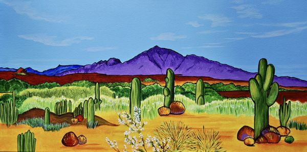
I have been trying to photograph some acrylic paintings, but having difficulty capturing a true purple color in one of the paintings. Even after processing, it looks too blueish. Photos taken with a Nikon D40x, standard kit lens at about 30 - 35 mm, iso 100, f5.6, on tripod outdoors with indirect sunlight. Using MacBook Pro stock Photos program for processing. Is it my camera, my lighting, my processing program, or my inexperience - or any combination of the above? Any tips appreciated! Oh, and it’s the mountains in the front that are supposed to look more like a light purple, back ones to left side are actually blue.
Oct 18, 2019 17:32:03 #
Oct 18, 2019 17:50:55 #
Hey, that’s ok, everybody has different tastes. But really looking for an answer to my photography question.
Oct 18, 2019 17:58:02 #

donrent wrote:
May I be quite frank ?
That painting is horrible !
That painting is horrible !
Well Frank,
That wasn't the question.
Oct 18, 2019 18:01:31 #

Swifti wrote:
I have been trying to photograph some acrylic pain... (show quote)
Need to change lighting to 5500 daylight balanced at 45 degrees on both sides.
Problem solved for $38
https://www.ebay.com/itm/Photography-Lighting-20-x-28-Softbox-Photo-Equipment-Soft-Studio-Light-Kit-US/352486200820?_trkparms=aid%3D555018%26algo%3DPL.SIM%26ao%3D1%26asc%3D60710%26meid%3Dd4dbf9204d9b4ec19d37a940b72a1378%26pid%3D100005%26rk%3D3%26rkt%3D12%26mehot%3Dco%26sd%3D142155855598%26itm%3D352486200820%26pmt%3D1%26noa%3D0%26pg%3D2047675&_trksid=p2047675.c100005.m1851
Oct 18, 2019 18:03:11 #

Swifti wrote:
I have been trying to photograph some acrylic pain... (show quote)
If you get a color checker passport photographed in the same light, you should be able to make a camera profile and you would need to calibrate your monitor too. AS to what software to use, i will let other people address that.
Oct 18, 2019 18:06:17 #

donrent wrote:
May I be quite frank ?
That painting is horrible !
That painting is horrible !
And your reason would be?
I know your comment is horrible, and the painting is fine and enjoyable because the colors use a low intensity complement to the dominant, highly saturated colors. Those bold colors are not too jarring because of the soft foreground shapes and rhythmical, receding composition. Also, I have seen and judged thousands of artworks in critiques and competitions. I would enjoy seeing the progress of this artist.
Oct 18, 2019 18:09:13 #
artBob wrote:
And your reason would be?
I know your comment is horrible, and the painting is fine and enjoyable because the colors use a low intensity complement to the dominant, highly saturated colors. Those bold colors are not too jarring because of the soft foreground shapes and rhythmical, receding composition. Also, I have seen and judged thousands of artworks in critiques and competitions. I would enjoy seeing the progress of this artist.
I know your comment is horrible, and the painting is fine and enjoyable because the colors use a low intensity complement to the dominant, highly saturated colors. Those bold colors are not too jarring because of the soft foreground shapes and rhythmical, receding composition. Also, I have seen and judged thousands of artworks in critiques and competitions. I would enjoy seeing the progress of this artist.

Oct 18, 2019 18:16:11 #
Swifti wrote:
I have been trying to photograph some acrylic pain... (show quote)
I am not sure what you original looked like. However, I went to Photos, and got two results that might be what you want. The actual numbers, I suggest you use as a starting point. Move the sliders I'm mentioning to meet your needs. If you know how the color wheel works, you should be fine. If not, hit that study first.
1. Color/Cast -0.86
2. White Balance/Temperature/Tint---- changed tint to 33.75
Your shooting should be okay, with adjustments. If you are going to be doing a lot, You will have more control if you shoot indoors, with lights of proper temp and at the right angle and knowing about white balance. White balance can be set in camera and corrected in post processing programs. One of the easiest ways is in Photoshop. If you want to see results of shooting and checking for white balance, check out http://robertstanleyart.com.
There are several ways to shoot paintings and get proper color. I suggest you google "how to photograph paintings," and perhaps volunteer to assist an artist near you. You are fine, but can make life easier of course. Good luck.
Oct 18, 2019 18:28:36 #
Swifti wrote:
I have been trying to photograph some acrylic pain... (show quote)
You don't mention any calibration, so I assume that you did not do any.
You need to calibrate your monitor. Get a hardware device (I use a Spyder), and use it to generate a calibration profile for your monitor.
You need to calibrate your camera. Usually you can just use a white balance target to correct white balance; this is recommended for any photography where you want to get accurate color. But if you want precise color calibration, then you need to use a more precise calibration target (I use a ColorChecker Passport), which is then used to generate a color profile for your camera/lighting.
Then, if you are trying to print, you need to calibrate your printer. This can be pretty expensive if you want a spectrophotometer (well over $1000). But you can use a scanner and some software (I use Silverfast) to do a pretty decent job. Still pretty expensive, and you need a supported scanner.
Oct 18, 2019 18:56:51 #
Been there and done that. When doing that type of photography WB is critical. I use an X-rite passport in my initial shots to make sure that I have a reference point for my WB. If you don't have one of those, find yourself a "white" card, place that in your initial shot, this will give you the needed reference point for setting your white balance. I use Photoshop camera raw for this process. This will address an overall minor color cast created from lighting.
From your initial write-up I'm make the assumption that your having difficulty viewing the correct color on your monitor. If you were having difficulty reproducing a color on you printer I'd be pointing you in a different direction.
I'm a photoshop user, so if you use photoshop there are some things that you could try. If your not a photoshop user then stop reading and accept my apologies for wasting your time.
1. If your experiencing an unwanted color case, which could through off some colors then you could try the following:
Open your image in Photoshop
Duplicate the base layer
Invert the just created layer (Ctrl I) for a PC. MAC I believe is a Command I
Go to Filter, Blur and select Average
Set the Blend mode for this layer to "subtract"
Reduce opacity to taste.
(this process is looking at all the colors in your image and averages them out producing a layer that contains that color. The subtract blend mode is then subtracting that color from the image.
The next suggestion is also a Photoshop treat that many don't know about let alone use.
The learning curve can be quite steep, but what a rush when you know and understand.
Go on the internet and look up Dan Margulis, he is the guru of photoshop LAB Color, his book is called
"The Canyon Conundrum and other adventures in the most powerful colorspace"
This hidden gem will open up world's of opportunity to fine tune colors beyond your imagination.
Dan has some videos that are well worth watching that demonstrate the power of the LAB colorspace.
Hope this helps, enjoy.
Oct 18, 2019 18:59:20 #
donrent wrote:
May I be quite frank ?
That painting is horrible !
That painting is horrible !
That's not the question but frankly I like it.
Oct 18, 2019 19:13:34 #
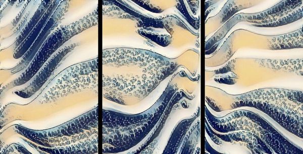
I take photographs of my artwork all the time and post them online. Artbob can attest to this as he and I have been in conversations about each others works and I appreciate his comments about my work. The objective seem to be once you discover the type of lighting you need which the painting seem to indicate you've achieved the desired lighting, Next it would to post edit the work and adjust the colors based on your image. However not all camera's preset colors will look the same. Post editing even using an online web editor, the image would allow you to adjust the color to as close as possible to your painting. Here's my latest work.. a 3 panel set of Japanese style wave art. Although the color is slightly off it is the closest I was able to edit using what tools I have. The point is, I don't edit or try not to edit. But in some cases my art needs a bit of enhancing if posted online. But the above colors are the closest match to date. The only draw back to doing it this way is the textured canvas will have some glow to it because of the texture. I would angle the canvas down slightly to avoid and glow or excess shine.
Oct 18, 2019 19:49:30 #

Swifti wrote:
I have been trying to photograph some acrylic pain... (show quote)
Lots of blind leading the blind.
The only way to get this right is to use real software and a camera calibration target and editing your images on a color profiled display. By this I am referring to an Xrite ColorChecker Passport and Lightroom, and more than likely an Xrite i1 Display Pro, calibration tool at the minimum.
To answer your question - the least of your problem is the camera. On the other hand, you need to be working on a color accurate display. If you haven't profiled it there is a good chance it is not accurately displaying colors. Calibrating your camera/lens combo for the correct color is critical for artwork. Every camera has a slightly different color response curve, and colors can be recorded incorrectly. A ColorChecker Passport will address that. Using Photos will not give you the control you need, and the last time I looked at it there was no provision for a camera profile. Adjusting individual colors without a color accurate display and relying on how things "look" to you is hit or miss at best. And so is dialing in a color temperature setting, which only affects white balance and not green-magenta tint. In addition, your editing environment is critical - it needs to be dark and contribute no color influence. Your lighting would not be my choice, but it can work. And finally, your lack of experience isn't that bad, you know enough to ask the questions that hopefully will get you to your goal.
You don't have to get 100% of the above correct. But the more checkboxes you can tick the better your results will be.
Here is a short video on the ColorChecker Passport and you can see how the question of color accuracy is handled correctly. The software used is Lightroom, which does have the capacity to use a camera profile.
https://www.youtube.com/watch?v=NDtebpvATzc
Oct 18, 2019 20:11:14 #
This is from an Art Professor, professional artist, and juror of decades of experience:
First, you are correct to get good color, exposure, and sharpness in perfectly justified (rectangular) borders.
Yes, you can get very expensive and very professional. You do not need to, if you learn a few things about post processing. If you are doing a few, even Mac Photos will suffice. If you are going pro, I would suggest Photoshop or an equivalent.
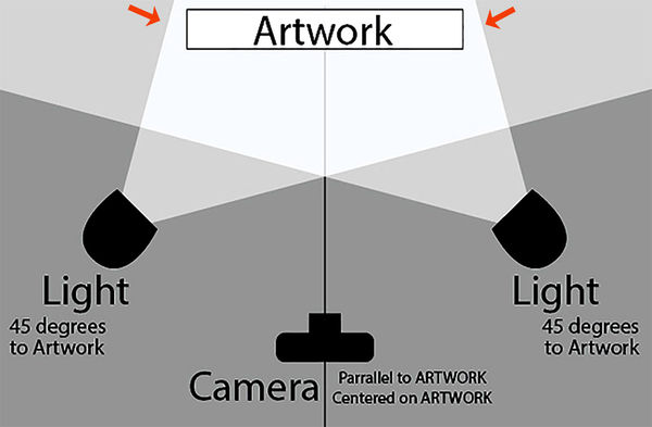
Set up your lights as illustrated. You can even use floodlights in clip on pans, so you can avoid stands or tripods at first. BALANCE them. Same voltage and age. Make sure the outside of each light is near the near edge of the painting (arrows in illustration). Place a white surface (white paint on a piece of paper, for example) in the shot, to be cropped out after adjusting white balance.
Adjust white balance. There are SO many ways. If befuddled, google "correct white balance in [name of your program]." If you are going to be going pro, I strongly suggest Photoshop or its equivalent.
If struggling, ask someone, here or another artist/photographer.
I use these techniques on works seen on my site, robertstanleyart.com. As you can see on my resume, I have works in museums, so the techniques work. You may want to upgrade to some of the suggestions the calibrates have suggested. They work, but.....not necessary if you know how to light evenly and post process. Once I had a pro shoot some of my works. Turned out great. Looked the same as the ones I shot and processed the way I've suggested, without the sweat, time, and money spent.
Work at it, and you will be fine.
First, you are correct to get good color, exposure, and sharpness in perfectly justified (rectangular) borders.
Yes, you can get very expensive and very professional. You do not need to, if you learn a few things about post processing. If you are doing a few, even Mac Photos will suffice. If you are going pro, I would suggest Photoshop or an equivalent.
Set up your lights as illustrated. You can even use floodlights in clip on pans, so you can avoid stands or tripods at first. BALANCE them. Same voltage and age. Make sure the outside of each light is near the near edge of the painting (arrows in illustration). Place a white surface (white paint on a piece of paper, for example) in the shot, to be cropped out after adjusting white balance.
Adjust white balance. There are SO many ways. If befuddled, google "correct white balance in [name of your program]." If you are going to be going pro, I strongly suggest Photoshop or its equivalent.
If struggling, ask someone, here or another artist/photographer.
I use these techniques on works seen on my site, robertstanleyart.com. As you can see on my resume, I have works in museums, so the techniques work. You may want to upgrade to some of the suggestions the calibrates have suggested. They work, but.....not necessary if you know how to light evenly and post process. Once I had a pro shoot some of my works. Turned out great. Looked the same as the ones I shot and processed the way I've suggested, without the sweat, time, and money spent.
Work at it, and you will be fine.
If you want to reply, then register here. Registration is free and your account is created instantly, so you can post right away.