Which do you like - and why?
Sep 7, 2019 20:55:00 #
JimBart
Loc: Western Michigan
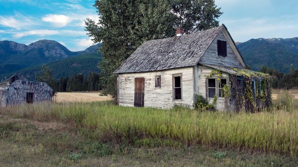
It all depends on what you want to accentuate however I would crop the first one a little more. In addition I would like to see both in black and white or monochrome. It may bring out an altogether different perspective. Just my .02 worth
Sep 7, 2019 21:26:35 #

I prefer #1 or even tighter for an image of the house, thus a little cropping would make it a great image. I think #2 is too close for a landscape image, too much buildings and not enough landscape.
Sep 7, 2019 22:26:09 #
I like the first house more...it is old and worn out. It has personality. The sky matches the house's look by also being dark. In the second picture, for me, there is a disconnect between the bright sunny sky and the dark and sad house. The first one is a moody photo...I leave the technical aspects to the experts!
Sep 8, 2019 04:12:04 #
tommystrat wrote:
I am asking fellow Hoggers for your opinions - of ... (show quote)
 )
)I like both but I like the 2nd better. I would play with the cropping a little, maybe get rid of some on the right side and add a little to the left (if there is more on the left in the original)
Sep 8, 2019 04:13:44 #
SuperflyTNT wrote:
I like the second one better. For the first one I would crop it slightly on the left, moving the house slighter off center and giving it more room at the front of the house.
Also i would decrease the exposure or increase the contrast on the 2nd to make it look more like the first picture
Sep 8, 2019 05:36:31 #
CCChuckles
Loc: Michigan
The first is the best and is perfect composure as is, would not change a thing
good job...
good job...
Sep 8, 2019 08:07:34 #
dayranch
Loc: Douglasville Georgia
I personally like the further away version because there is a defined landscape in the depth of field that has rich colors and both cabins had that reach out at you affect. You can hang that one on the wall for sure!
Sep 8, 2019 10:51:26 #

rmalarz wrote:
Tommy, I like the first, but I'm assuming the hous... (show quote)
I agree.!! .... ..RJM

Sep 8, 2019 14:52:26 #
Sep 8, 2019 15:02:29 #
rich1hart wrote:
Obviously good composition is in the eyes of the beholder.
Obviously, sarcasm can be espoused by any one. Suffice it to say , it’s almost never appreciated, nor is it an indicator of special insight!!!! RJm

Sep 8, 2019 15:57:34 #
Sep 8, 2019 22:37:00 #
WAstinkbug
Loc: Silverdale, WA, U.S.A.
I really like the second photo better... the house with a beautiful sense of place. Overall, I think the detail on the house had more punch and the colors and composition of the photo make it prettier. The position of the tree troubles my eye a little and I'm wondering if it would look better with a different aspect ratio... cropping off part of the top of the frame so the tree doesn't dominate the topline with its high head. So, basically... cropping the top portion of the photo to tone down the dominance of the tree over the dominance of the house and its roofline.
Sep 8, 2019 22:44:05 #
WAstinkbug
Loc: Silverdale, WA, U.S.A.
This is sort of what I was talking about... but I don't know that this would be the best way. There is so much to love about that second picture. <3
Sep 9, 2019 00:26:25 #
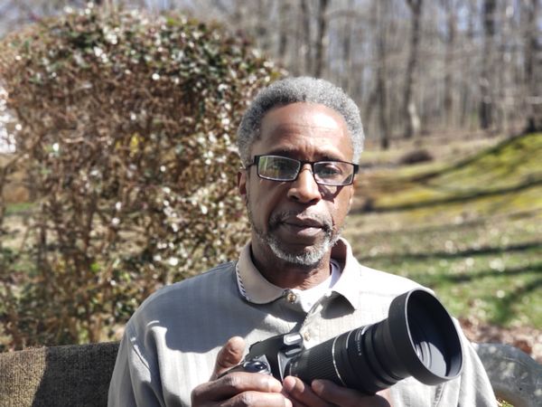
RodeoMan
Loc: St Joseph, Missouri
dayranch wrote:
I personally like the further away version because there is a defined landscape in the depth of field that has rich colors and both cabins had that reach out at you affect. You can hang that one on the wall for sure!
Great portrait. Did someone else take the picture or did you have another camera and used a self timer or a remote?
Sep 9, 2019 08:06:08 #
I love to be get feedback on my photos, it’s helping me be better at it.
I like the first the best.
The first catches my eye more, closer more details, well balanced, my eye is drawn to the house right away, I also would crop the left and bottom, this will create somewhat of a frame to direct your eye in a better flow through the photo. Would make it more pleasing to the eye if it were to be matted, framed and hung
The second is a little more unbalanced looks cramped, my eye kinda bounced around trying to find what exactly you wanted to capture ,I think if I wanted this for framing, matting and hanging, I would go back and reshoot from a farther distance leaving more open space on the left of the building and more space on the right side of the barn stretch it out more, stoop or set down to take the photo, this way the working field in the background wouldn’t show. I believe that will make it more of a landscape photo rather then a snapshot.
Then I could see them staggered side by side on my wall.
B/W is a preference, but it could pull everything together as a pair of photos. I personally like color.
Well any way every one has there own style and opinions and this is mine. Thanks for reading.
If you want to reply, then register here. Registration is free and your account is created instantly, so you can post right away.