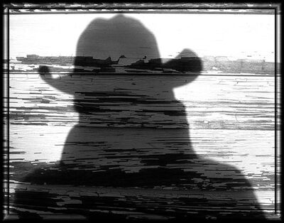
Which do you like - and why?
Sep 7, 2019 12:52:02 #
Charlie157
Loc: San Diego, CA
I like the 1st, it seems more balanced. the wood structure seems to be your subject.
Sep 7, 2019 13:03:42 #
I like the first. The whole visible space looks deserted. In the second one, the field in the background looks like it is being worked and therefore isn't as desolate looking.
Sep 7, 2019 13:08:51 #
Perhaps the question should not be which do you prefer but what do you like or not like about each. They both have merit and tell a slightly different story. Every responder will have a different idea, but most important is - what do you want us to see? What story do you want to tell?
tommystrat wrote:
I am asking fellow Hoggers for your opinions - of ... (show quote)
Sep 7, 2019 13:24:41 #
Sep 7, 2019 13:31:34 #
wham121736 wrote:
Perhaps the question should not be which do you prefer but what do you like or not like about each.
Since that was probably cover in the second half of the title ... why don't you answer the question?
---
Sep 7, 2019 13:36:49 #
tommystrat wrote:
I am asking fellow Hoggers for your opinions - of ... (show quote)
Love both depends on what you are actually trying to portray, but second one is telling me a story.
Sep 7, 2019 13:46:38 #
I like the 2nd one best because it tells more of the story and the background makes your subject standout as a focal point.
Sep 7, 2019 14:04:08 #
The 2nd image because there is more going on within the frame basically.
Sep 7, 2019 14:14:12 #
I like the 2nd one, it give a sence of space and openness and also give off a bit of forgotteness in a ghost town kind of way would look better in black and white also
Sep 7, 2019 15:58:57 #
Flying Three
Loc: Berthoud, CO
Put me down for number 2: the small building on the left leads you into the house. The sky is beautiful providing a great contrast to the weathered house. Either image looks "move in" ready to me.
Sep 7, 2019 19:20:28 #
As a fan of Robert Cappa, who's mantra was, "If your pictures aren't good enough, you're not close enough", I prefer the bottom image, but cropped close to remove the small building and rendering the tree as the background. In other words, fill the frame with just the house.
Sep 7, 2019 19:34:47 #
RodeoMan
Loc: St Joseph, Missouri
Scruples wrote:
I prefer the first photograph. It is obvious that ... (show quote)
perhaps the small window is to let light in the stairwell or was added later when a bathroom was added to the house. I agree with you about adding monocrome. I would say the entire first image would better in B&W.
Sep 7, 2019 19:57:29 #
Sep 7, 2019 20:03:53 #
RodeoMan
Loc: St Joseph, Missouri
I like them both and you should also because each are part of the same story of this old house. My suggestion would be for you to walk around the property, shoot it from other angles, and take close up pictures detailing the house and other buildings. Instead of winnowing your pictures from two to one, I'd urge you to increase them from two to many.
Sep 7, 2019 20:43:54 #
Hey Tommy, I like the second the best. Can’t tell you why, it’s just what feels right to me.
I don’t try to analyze my feelings.
Mike
I don’t try to analyze my feelings.
Mike
If you want to reply, then register here. Registration is free and your account is created instantly, so you can post right away.


 )
)


