Visual Balance
Feb 9, 2019 09:06:08 #

dpullum wrote:
There is a huge free book on composition by an art and psychology department of a university. I read it in sections ... hope it will be helpful.
http://truecenterpublishing.com/photopsy/article_index.htm
http://truecenterpublishing.com/photopsy/article_index.htm
Awesome! I have not had time to google yet as we are doing some repairs on our house. So incredibly kind of you! Thank you.
Feb 9, 2019 09:09:07 #

anotherview wrote:
Effective composition arises largely from the achievement of visual balance within the frame. Balance has to do with the relation of the elements therein. This balance can render even a mundane subject more interesting.
Sorry if my words mislead. To clarify: balance, symmetrical and asymmetrical, is but one of around 5 ways to compose a photo. As such, that's 20% of types of composition, and should not be the only way to use or judge composition. It is, however, almost always a consideration in the other types of composition (radial, rhythmical, circular/spiral, triangular).
Feb 9, 2019 09:15:03 #
Yes, you are, and it's all good. The rule of thirds - and its grid - is useful for deciding where to put elements of the image. Symmetrical can be good, but off-center can be even better - sometimes.
Feb 9, 2019 09:18:45 #
User ID,
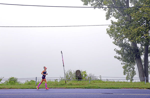
Thanks for your great examples. I am familiar with dead center and likely over use it because it is my tendency. I often get away from it in post via the crop tool. I should spend a week or more just shooting non centered compositions to ingrain it in my brain. But I did include one very purposeful dead center shot in my collection above. And for some reason having that little boat in the middle (of nowhere) is the story I was trying to tell...
Thanks for your great examples. I am familiar with dead center and likely over use it because it is my tendency. I often get away from it in post via the crop tool. I should spend a week or more just shooting non centered compositions to ingrain it in my brain. But I did include one very purposeful dead center shot in my collection above. And for some reason having that little boat in the middle (of nowhere) is the story I was trying to tell...
Feb 9, 2019 09:27:35 #
jerryc41 wrote:
Yes, you are, and it's all good. The rule of thirds - and its grid - is useful for deciding where to put elements of the image. Symmetrical can be good, but off-center can be even better - sometimes.
Thanks, Jerry.
Feb 9, 2019 11:52:33 #

Nice work...i like most of your shots...the last three not so much...but that is just me...
Feb 9, 2019 11:54:43 #
EyeShootWideOpen wrote:
....... having that little boat in the middle (of nowhere)
is the story I was trying to tell .......
....... having that little boat in the middle (of nowhere)
is the story I was trying to tell .......
I find it amusing that it's NOT the middle of nowhere.
There is an industrial scene on the horizon. The boat
is at the exact 1/2 way point on the horizon, and the
industrial plant is at the exact 1/2 way point between
the boat the the frame edge.
If I were working on it, and it had even barely enuf
resolution, I'd zoom in to nearly pixel level and edit
the industrial plant for some contrast and sharpness
to give it some "pull" in the image, cuz there's also
a story here called "middle of nowhere - not really" !
BTW, ATM I'm in a seaside summer resort town but
it's quiet, cuz February in the frozen northeast. It's
no ordinary summer destination. Summer houses,
and some of the year-round houses, are huge and
belong to the elite of the planet. Soooo .... the art
works in the shops are rather large cuz the houses
can "swallow" that. Point is, there are scenes very
much like your boat-in-nowhere image, printed at
about 50x50 inches, turning a wall into "window"
with a view of an outdoor summer scene. IOW the
boat image with its great empty expanses would be
terrific printed 50"x50" but just looks like a second
rate novice compositional error at too small a scale.
So above we have a missing element concerning all
these guidelines for visual arrangement. What may
just die on a laptop screen or as a modest framed
print could be perfect as mural or really large print.
There's more to all this than meets the eye LOL ! ! !
Punning aside, there is also what meets the mind.
A small print is an object, and is placed in [some]
environment. OTOH a huge print or a mural IS the
environment and details within the image become
the objects placed within. On a small print, details
are just "decorations" on/of the object/print. Scale
alters context, which affects what meets the mind.
Maybe all this is covered in that linked book that
appears to have both psychological and visual arts
oriented contributors, from some university.
Again, as example, same shot, cropped for small
scale as "an object" or for large scale like a mural.
The mural crop printed about 18 inches would just
look like a shot in need of cropping. But as a foggy
environment, printed at least the size of a window,
it becomes a place hather than an object.

Feb 9, 2019 12:12:42 #

EyeShootWideOpen wrote:
Yes, but the challenge was for Visual Balance so I tried to understand the different elements of visual balance....maybe I am confused.
I don't know where this list of attributes comes from, but it seems like an attempt to arbitrarily classify creative choices which are, by their nature, not possible to classify. As a result, I don't think there's a helpful answer to the question of whether you're correct or not. Forget trying to find some kind of formula. Go forth, shoot, gain experience, and rejoice in your successes.
Best wishes,
Alan
Feb 9, 2019 12:47:53 #
aellman wrote:
I don't know where this list of attributes comes from, but
it seems like an attempt to arbitrarily classify creative
choices which are, by their nature, not possible to classify.
As a result, I don't think there's a helpful answer to the
question of whether you're correct or not. Forget trying to
find some kind of formula. Go forth, shoot, gain experience,
and rejoice in your successes.
Best wishes,
Alan
It's OK to "arbitrarily classify creative choices which
are, by their nature, not possible to classify" so long
as the reason is Descriptive and not Prescriptive. IOW
you're right that it's not a great set of "how-to" info,
but after the fact, it's a way to organize one's take on
how something works, now that the image is a done
deal before our eyes.
Descriptive vs Prescriptive is a verrrrry important idea
concerning music theory. The former is enlightening,
the latter is deadly.
.
Feb 9, 2019 13:34:12 #

It is a matter of what you want the image to say. Rule of thirds is boring and uninteresting, if not cliche. Use the golden spiral if you want to use a guide. Rather than being constrained by "rules", be creative and compose the image as you see it and what you want to say with that image. Many aspects of design and tones, and color, and negative space, and filling the frame, and lighting, etc. are there to use. One or two of these could more important to use to tell show what you want.
Feb 9, 2019 13:51:50 #
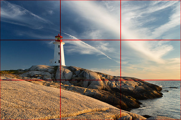
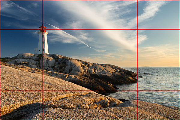
Here is a link for the article "Beyond Basic Composition: Line, Shape and Form in Photography" from Shutterbug magazine.
https://www.oopoomoo.com/2013/12/beyond-basic-composition-line-shape-and-form-in-photography/
This is the example of rule of thirds and the golden spiral. In the upper image, they placed the cap of the lighthouse at a rule-of-thirds intersection. In the lower photo, they placed the cap of the lighthouse at the power point of the golden spiral. It really makes for a more dynamic photo.
Feb 9, 2019 13:56:17 #
User ID wrote:
It's OK to i "arbitrarily classify creative ... (show quote)
I was not interpreting it as prescriptive, but if it works for you that's what it's all about. >Alan
Feb 9, 2019 13:59:08 #
CO wrote:
Here is a link for the article "Beyond Basic ... (show quote)
The rule of thirds seems to be permanently stuck in my brain, but you are absolutely right. The "golden spiral" composition looks much better. Something I will keep in mind. Thanks! >Alan
Feb 9, 2019 15:30:55 #
Photographers do not need a "bag of tricks" to make their work look "good." If that's all you want, e.g., to make a living selling a lot of photographs, that is okay of course. However, if you want to express yourself and produce truly great photos, you need to to progress beyond "Rule of Thirds" and "Golden Spiral" or any other "sure-fire trick."
My advice is to shoot like crazy, both spontaneously and with a pre-planned concept. Keep sponging up composition/design principles in exhibitions, books, discussions with friends. Use whatever one(s) [usually more than one] BOOST your idea/feeling, in post processing, darkroom, or shooting. Watch your work get stronger and stronger.
My advice is to shoot like crazy, both spontaneously and with a pre-planned concept. Keep sponging up composition/design principles in exhibitions, books, discussions with friends. Use whatever one(s) [usually more than one] BOOST your idea/feeling, in post processing, darkroom, or shooting. Watch your work get stronger and stronger.
Feb 9, 2019 21:01:47 #
artBob wrote:
Photographers do not need a "bag of tricks&qu... (show quote)
My interest in the "Golden Spiral" was driven by the fact that I had never heard of it
which, considering my involvement in photography, surprises me. (Are we sure the OP
didn't just make it up?) In fact, I strongly believe that the term originated as the name
of a psychedelic rock band in the 60s, and was much later adapted to photography by
the only surviving band member who, lacking other income, began shooting weddings
and portraits. With just 2 wedding shoots for distant cousins and a few scattered
portraits of a stray dog under his belt, he's now giving weekend
seminars to enthusiastic professional photographers' associations on Weddings
for Bitter Divorced Photographers and Sedation as a Means to Limit
Distracting Subject Movement During Portrait Shoots.
I intend to look up the "rule" to inform myself. I hope and trust that this research will not
cast an evil spell over my visual creativity, but if it does I will seek spiritual enlightenment by
acquiring obscure unreleased Golden Spiral recordings on ebay and playing them every evening as
a sleep aid.
Respectfully,
Alan
If you want to reply, then register here. Registration is free and your account is created instantly, so you can post right away.