Visual Balance
Feb 8, 2019 10:54:57 #

Understanding Visual Balance in Photos:
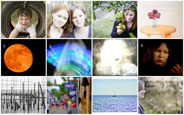
1-2 symmetrical
3-4 asymmetrical
5-6 color
7-9 tonal
10-12 conceptual
Am I understanding all the elements correctly?
1-2 symmetrical
3-4 asymmetrical
5-6 color
7-9 tonal
10-12 conceptual
Am I understanding all the elements correctly?
Feb 8, 2019 11:05:32 #
Feb 8, 2019 11:22:56 #

EyeShootWideOpen wrote:
Welcome to the forum. Visual balance is only one part of an image. Lighting, composition and impact are very important.Understanding Visual Balance in Photos:
1-2 symmetrical
3-4 asymmetrical
5-6 color
7-9 tonal
10-12 conceptual
Am I understanding all the elements correctly?
1-2 symmetrical
3-4 asymmetrical
5-6 color
7-9 tonal
10-12 conceptual
Am I understanding all the elements correctly?
Feb 8, 2019 12:55:50 #
PixelStan77 wrote:
Welcome to the forum. Visual balance is only one part of an image. Lighting, composition and impact are very important.
Yes, but the challenge was for Visual Balance so I tried to understand the different elements of visual balance....maybe I am confused.
Feb 8, 2019 13:08:26 #
Feb 8, 2019 14:08:07 #

It's usually good to apply the rule of thirds to horizons in landscape photos. The horizon would be either 1/3 the way from the top or 1/3 the way from the bottom. If there's equal visual weight in the upper and lower halves it's often good to have the horizon midway.
In photo 11 example you posted, I would not have put the horizon midway in the photo. There's more visual weight in the lower half. I think it works better to have the horizon 1/3 of the way from the bottom in that photo. Maybe other people would compose that differently.
I have an issue of Shutterbug magazine that has an article titled "Beyond Basic Composition". One of the things they discuss is how using the golden spiral instead of the rule of thirds can make for a more dynamic composition. They have examples. I can see how the photos are more dynamic using the golden spiral.
Feb 8, 2019 14:52:29 #
Thanks Co. I have a terrible habit of placing things in the middle. I am a symmetrical girl living in an asymmetrical world (little Madonna throw back). I often have to adjust my composition in post. I have read about the golden spiral that you mention. I think I have a setting on my camera that puts an overlay, or it might have been an older one (cant remember), that guides your composition. Might need to revisit that feature and work on breaking the habit. Appreciate your comments and your time.
Feb 8, 2019 15:31:04 #

EyeShootWideOpen wrote:
Thanks Co. I have a terrible habit of placing thin... (show quote)
Quote:
I have a terrible habit of placing things in the middle.
That is called subject fixation. It is habit that can be broken, start by trying to remind yourself that just about any subject displays better and/or is more flattered by not being in a bull's eye. :) Another name BTW, Bull's eye photography.
Feb 8, 2019 15:45:07 #

1-2 symmetrical-Yes
3-4 asymmetrical_ yes, but the preferred heaviest weight is usually put left of center, using an odd number of objects (thus the vase with flowers is seen as one object and with the table hard to make look good, although sorta okay)
5-6 color—Yes, one is complementary (dynamic) and the other harmonious (quieter)
7-9 tonal—yes—good range
10-12 conceptual—? not sure of meaning. If you mean “idea,” or “creative,” Yes. However, learning from asymmetrical weighting left, flipping #10 would work better.
BTW, I think “The Rule of Thirds” (as some here based their critique on) is WAY over-stressed. It is but s subset of asymmetrical balance and center of interest design concepts. Your #11 is a wonderful symmetrical composition, so calm but with such subtle, rich colors and values.
Good work. I base my judgments on 30 years of teaching design and composition in college and jurying numerous shows, so my comments are not just opinion.
Your already good knack for composition would likely profit from a book. The principles are basically the same in every book, just sometimes presented differently. I suggest heading to a library, finding the composition or design section(s), and flipping through several until one grabs your interest. It will likely have the same principles an any other. There are five types of composition, of which three have been mentioned in this discussion.
Feb 8, 2019 17:10:55 #
Feb 8, 2019 17:13:14 #
PixelStan77 wrote:
........
Visual balance is only one part of an
image. Lighting, composition and
impact are very important.
Visual balance is only one part of an
image. Lighting, composition and
impact are very important.

Feb 8, 2019 18:40:21 #
ArtBob,
1-2 symmetrical-Yes
this one is easy for me, lol. thank you
3-4 asymmetrical_ yes, but the preferred heaviest weight is usually put left of center, using an odd number of objects (thus the vase with flowers is seen as one object and with the table hard to make look good, although sorta okay)
hmmmm...I would have thought that the weight would be right of center being that we read left to right.
I learned something new! Thanks!
5-6 color—Yes, one is complementary (dynamic) and the other harmonious (quieter)
Thanks again, taking the time to comment in depth is much appreciated.
7-9 tonal—yes—good range
Thanks, this one was easier for me than color and conceptual.
10-12 conceptual—? not sure of meaning. If you mean “idea,” or “creative,” Yes. However, learning from asymmetrical weighting left, flipping #10 would work better.
I googled Visual Balance in Photography and ended up at this article and it mentioned and explains
Conceptual Balance: www.adorama.com/alc/what-is-balance-in-photography
BTW, I think “The Rule of Thirds” (as some here based their critique on) is WAY over-stressed. It is but s subset of asymmetrical balance and center of interest design concepts. Your #11 is a wonderful symmetrical composition, so calm but with such subtle, rich colors and values.
Thank you!!! Yes, I was going to say this one would also fall under the symmetrical balance but I
thought it might work under conceptual given the smooth sky above vs the choppy water on the bottom
and thought the texture play might qualify it. Not sure though.
Good work. I base my judgments on 30 years of teaching design and composition in college and jurying numerous shows, so my comments are not just opinion.
Honored to have your input! Thanks so much for taking the time to comment so thoroughly. You clarified
things for me. Being more skilled at recognizing these elements was my objective and you were helpful.
Your already good knack for composition would likely profit from a book. The principles are basically the same in every book, just sometimes presented differently. I suggest heading to a library, finding the composition or design section(s), and flipping through several until one grabs your interest. It will likely have the same principles an any other. There are five types of composition, of which three have been mentioned in this discussion.
I will definitely look into composition or design books for further exploration of the subject!
Feb 9, 2019 02:49:08 #
EyeShootWideOpen wrote:
Thanks Co. I have a terrible habit of placing thin... (show quote)
Tho it's not for all scenes or subjects, the
bull's eye dead center approach, when it's
executed with obvious intent, can be very
effective and impactful and still have that
visual balance that you seek. OTOH, done
in a thoughtless manner, dead center can
really look stoopid and awkward. But just
becuz it CAN look stoopid/awkward is no
reason to banish it from your toolbox :-)
IOW, it tends to look bad as an accidental
or careless snapshot, but can look terrific
when willfully and suitably imposed. Plus:
Dead center can provide for symmetry :-)

Feb 9, 2019 08:21:08 #

There is a huge free book on composition by an art and psychology department of a university. I read it in sections ... hope it will be helpful.
http://truecenterpublishing.com/photopsy/article_index.htm
http://truecenterpublishing.com/photopsy/article_index.htm
Feb 9, 2019 08:23:16 #

Effective composition arises largely from the achievement of visual balance within the frame. Balance has to do with the relation of the elements therein. This balance can render even a mundane subject more interesting.
Largobob wrote:
Visual balance is a small part of total composition!
If you want to reply, then register here. Registration is free and your account is created instantly, so you can post right away.