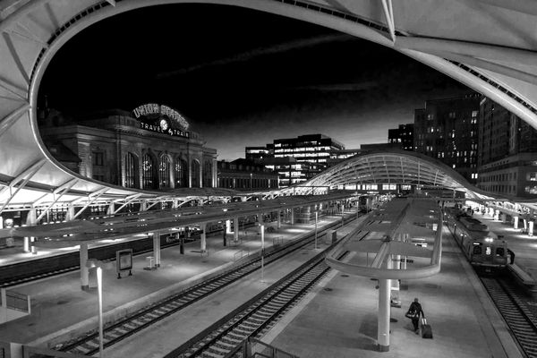
Union Station, Denver Colorado
Apr 22, 2018 17:45:28 #

wdross wrote:
I think this is the stronger B&W. Good job. And although the original is really good, I think I like your "treated" color shot better. Normally for me, it is just the opposite; normally it is the straight shot over the treated..
Thank you, wdross. I agree the second B&W is a better one. The added contrast, while subtle, gives just a bit more punch. I agree with you also. I am not usually one to modify photos too much from the original but I liked the look of the edited photos better than the original which was rather flat.
Apr 22, 2018 17:46:12 #
wdross
Loc: Castle Rock, Colorado
jmdenver wrote:
Here are two versions of the same photo, one color and one b/w. A recent thread questioned the purpose of b/w. That individual preferred color for all occasions. Personally I find a lot of value in b/w. I am interested in what others feel regarding these two photos. Comments welcome.
This shot should make proud. Color, B&W, natural, color, B&W, natural, color, B&W, natural; they are all good and hard to chose from.
Apr 22, 2018 17:56:30 #
Thanks for the translation, Ken. Before I saw the second line, my mind instantly jumped to something else!
Apr 22, 2018 18:03:15 #
alx
Loc: NJ
jmdenver wrote:
Thank you all for giving such constructive guidance. I am happy to supply the original. Here it is.
Don't hate me, but my gut was right. At least for me, I definitely prefer the original. The others are nice posters, and that may have been your intention, but I feel I could walk into the original. That works best for me.
I agree with Linda in that a little more of that top curve would be nice, especially in the posters.
Apr 22, 2018 18:15:31 #
alx wrote:
Don't hate me, but my gut was right. At least for me, I definitely prefer the original. The others are nice posters, and that may have been your intention, but I feel I could walk into the original. That works best for me.
I agree with Linda in that a little more of that top curve would be nice, especially in the posters.
I agree with Linda in that a little more of that top curve would be nice, especially in the posters.
Not in the slightest, alx. I appreciate the input. I, too, wish I had a bit more of the roof. As I recall, when I tilted the camera up even slightly, it distorted the buildings to a degree that I found unsatisfactory. I probably could have fixed the issue in PS to a degree, but I had to make a decision. I should have shot it both ways and made a decision once I was looking at the photo on a full size monitor, but I failed to do so. Experience is sometimes a painful teacher!
Apr 22, 2018 18:27:29 #

jmdenver wrote:
Linda, thank you for your reply. I went back and made the whites a bit whiter, to the point where some of the lights in the office building in the background are blown out. I don't think it detracts from the overall effect and the platform is now a bit whiter.
Very interesting to compare, thanks! I think I prefer the less contrasty version, but it's a close race

Apr 22, 2018 18:30:51 #

jmdenver wrote:
Here are two versions of the same photo, one color and one b/w. A recent thread questioned the purpose of b/w. That individual preferred color for all occasions. Personally I find a lot of value in b/w. I am interested in what others feel regarding these two photos. Comments welcome.
I prefer the bw version here, I often like bw images.
Apr 23, 2018 03:25:44 #
Your color treated Shot is very impressive ..., there is talent showing in the original and the direction you take on post color treatment ...
Apr 23, 2018 07:12:23 #
jmdenver wrote:
Thank you all for giving such constructive guidance. I am happy to supply the original. Here it is.
I prefer this version the best because it presents the vision of the location the most. The dynamics of the circle starting with the blue sky, left to the station building, down to the rails, up the rails and platform to the right, upwards to the sky, bring out a visual story. The colors also work to separate the pieces and compliment the whole.
The other three are great photos on their own. But to my eye, they do not reach the level of the original.
Apr 23, 2018 07:38:00 #

Much prefer the original color version to the HDR version. I think its possible to do a black and white without dissolving the curving lines which seems to me, to be what the photo is all about. The dark cloud against a bright sky tends to destroy the composition, and too bright a foreground looses the sweeping curves. I think its a very cool picture.
Apr 23, 2018 07:42:34 #

The color version looks to me that this is part of the future. Looking for space ships flying lol. I love the b&w as well.
Apr 23, 2018 07:58:02 #
The original is very good but I do like your pp in the first picture and in the second b&w, I would be hard pressed to decide between the two.
Apr 23, 2018 08:29:15 #
I have continued to play with this photo and its just full of possibilities. Blue and red/yellow dominate. Using a blue filter vs a yellow filter yield radically different approaches, but I think either makes a good places to start. I think there are many more than one very successful black and white versions.
Apr 23, 2018 08:32:31 #
fergmark wrote:
I have continued to play with this photo and its just full of possibilities. Blue and red/yellow dominate. Using a blue filter vs a yellow filter yield radically different approaches, but I think either makes a good places to start. I think there are many more than one very successful black and white versions.
I'd love to see what you came up with using your filters. Would you mind posting?
Apr 23, 2018 08:50:23 #
jmdenver wrote:
I'd love to see what you came up with using your filters. Would you mind posting?
Not at all.

If you want to reply, then register here. Registration is free and your account is created instantly, so you can post right away.