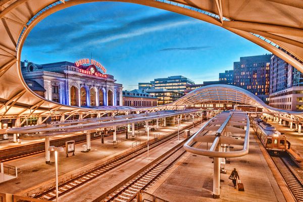
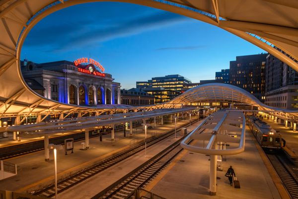
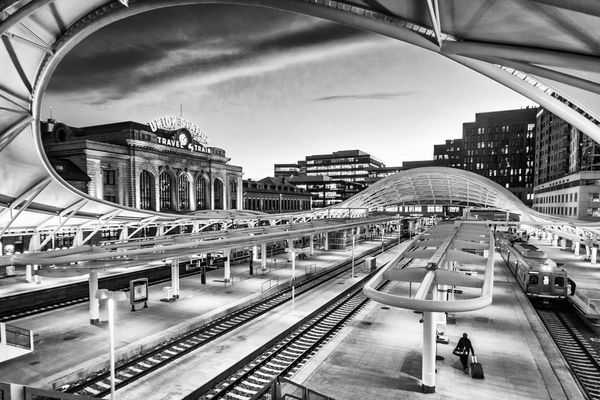
Union Station, Denver Colorado
Apr 22, 2018 15:32:40 #
Here are two versions of the same photo, one color and one b/w. A recent thread questioned the purpose of b/w. That individual preferred color for all occasions. Personally I find a lot of value in b/w. I am interested in what others feel regarding these two photos. Comments welcome.

Apr 22, 2018 15:36:30 #
I very much prefer the second, largely due to your composition which to me is excellent.
Apr 22, 2018 15:39:38 #
Thanks BassmanBruce. I appreciate your opinion. Does middle of the mitten mean somewhere in MI?
Apr 22, 2018 15:49:22 #
I like the 1st one better, I think the colors in it make it a more dynamic image.
I do think you really did capture a great composition of this scene.
But I don't think there are enough contrasts and blacks in this scene to make it a B&W image that I like. JMHO.
will
I do think you really did capture a great composition of this scene.
But I don't think there are enough contrasts and blacks in this scene to make it a B&W image that I like. JMHO.
will
Apr 22, 2018 15:51:12 #
wdross
Loc: Castle Rock, Colorado
jmdenver wrote:
Here are two versions of the same photo, one color and one b/w. A recent thread questioned the purpose of b/w. That individual preferred color for all occasions. Personally I find a lot of value in b/w. I am interested in what others feel regarding these two photos. Comments welcome.
I haven't been downtown in some time. Looks likes it time to pay it a visit and see how much has changed.
I like the treatment of your first shot. I like both the contrast of color and the composition. The B&W is really good too, but something just "grabs" me with the first one.
Apr 22, 2018 15:52:34 #

I enjoy topics like this since it's a great way to discuss what makes a successful b&w shot. Yours is the second in recent days I've seen that references that main forum topic, which is also nice because I publicly criticized that one for the snarky comments and insults that arose early on 
Composition - I'd like to see a tiny bit more at the top where the curve seems abruptly cut. But, as for color vs. b&w, I find value and interest in both.
The color is a little unnatural to my eyes and on my monitor, but that works well because it's such a "showy" unnatural looking structure! I could see going even a bit more fanciful.
The b&w I'd normally say has too many small details to be totally successful, yet I find myself immersed in all the cool little stories within. Nice tonal range, too, which helps keep the details separated and ordered. It'd be interesting to see a version with more true white, but I suspect that an "in your face" contrasty product would be a bit too much.
Fascinating, engaging work!
Apr 22, 2018 15:55:37 #
I would have preferred the 3rd "un-tricked" version of an otherwise interesting photo
Apr 22, 2018 16:04:24 #
jmdenver wrote:
Thanks BassmanBruce. I appreciate your opinion. Does middle of the mitten mean somewhere in MI?
Yes, a dozen miles west of Lansing.
Apr 22, 2018 16:05:08 #
wdross
Loc: Castle Rock, Colorado
ken_stern wrote:
I would have preferred the 3rd "un-tricked" version of an otherwise interesting photo
If we are lucky, maybe we can persuade him to provide it. Just be aware, it may not "look" as interesting as the two he presented.
Apr 22, 2018 16:34:37 #
Apr 22, 2018 16:38:10 #
alx
Loc: NJ
ken_stern wrote:
I would have preferred the 3rd "un-tricked" version of an otherwise interesting photo
I have to agree. I'd very much like to see the original and have the feeling I would prefer it.
Apr 22, 2018 17:02:34 #
Thank you all for giving such constructive guidance. I am happy to supply the original. Here it is.
Apr 22, 2018 17:18:09 #
Linda, thank you for your reply. I went back and made the whites a bit whiter, to the point where some of the lights in the office building in the background are blown out. I don't think it detracts from the overall effect and the platform is now a bit whiter.
Apr 22, 2018 17:41:10 #
wdross
Loc: Castle Rock, Colorado
jmdenver wrote:
Linda, thank you for your reply. I went back and made the whites a bit whiter, to the point where some of the lights in the office building in the background are blown out. I don't think it detracts from the overall effect and the platform is now a bit whiter.
I think this is the stronger B&W. Good job. And although the original is really good, I think I like your "treated" color shot better. Normally for me, it is just the opposite; normally it is the straight shot over the treated.
Apr 22, 2018 17:41:51 #
jmdenver wrote:
Thank you all for giving such constructive guidance. I am happy to supply the original. Here it is.
Now that's what I call a D.F.P ---
Damn Fine Photo !!
If you want to reply, then register here. Registration is free and your account is created instantly, so you can post right away.