Many Think That Merely Adding Saturation Will Make Their Images Better!!!
Nov 4, 2017 10:01:12 #
Blenheim Orange wrote:
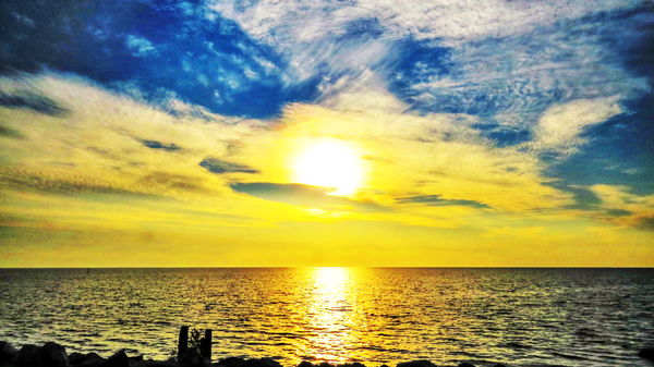
I usually boost the saturation a little. Do mine seem over-saturated to your eyes?
http://www.uglyhedgehog.com/user-topic-list?usernum=40210
Mike
http://www.uglyhedgehog.com/user-topic-list?usernum=40210
Mike
I sometimes boost saturation, but try not to over do it. As for reflecting reality - tell that to Pablo Picasso.
Nov 4, 2017 10:02:28 #


Nov 4, 2017 10:04:33 #
SharpShooter wrote:
What is the proper way to use saturation...., loca... (show quote)
This is like which camera is best. All you are soliciting are opinions. Saturation like DOF, etc etc is salt to taste. if you want to have a photo evaluated then find someplace that does critiques.
Nov 4, 2017 10:09:13 #
I have thought about this and in my humble opinion as the camera interprets what it sees and creates it's reality as close to it as we know and perhaps as our eye can see. If we choose to overexpose under expose in the camera, saturation etc in PP after. I consider that art and art is obviously a matter of opinion, subjective to our likes and dislikes, and those of others
Nov 4, 2017 10:10:23 #
leftj
Loc: Texas
Kiron Kid wrote:
"If you can't say what you need to say in a photograph without heaping layers of software or resorting to the latest trends in post processing, you're probably not saying much of anything."
-C.J. Chilvers
-C.J. Chilvers
That statement is an exercise of elite snobbery.
Nov 4, 2017 10:12:08 #
Tomcat5133
Loc: Gladwyne PA
I have to plead guilty. I push saturation in most shots I post process. I go by the less is more theory.
In photoshop I push the slider up and then come back until it seems somewhat natural.
I also overuse sharpening but with some shots it seems to be right.
So this is my routine and for me a mostly videographer with screen pulls. Sometimes stills.
I find it easier then lightroom and I understand lightroom has more controls in raw.
I open pull down in image/adjustment pulldown in Photoshop (Mac)
Lighten dark areas a bit in Shadow and Highlights a key.
Add some saturation.
Sometimes if need might use (not often)color balance/exposure/brightness & contrast
Then under filters pulldown use just Sharpen. Sharpen more is extreme.
This is my routine for shots people use in PR etc.
I was looking at Ken Rockwell site the other day to check out his lens review. And Ken
is doing all very saturated photos. On all his samples on his site.
I am in my visual soul a purist. but this look seems to be what people like.
these are off of Hybrid Sony screen grabs.
Nov 4, 2017 10:14:17 #
leftj wrote:
That statement is an exercise of elite snobbery.
🤔👍
Nov 4, 2017 10:24:59 #
genocolo
Loc: Vail and Gasparilla Island
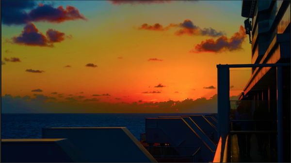
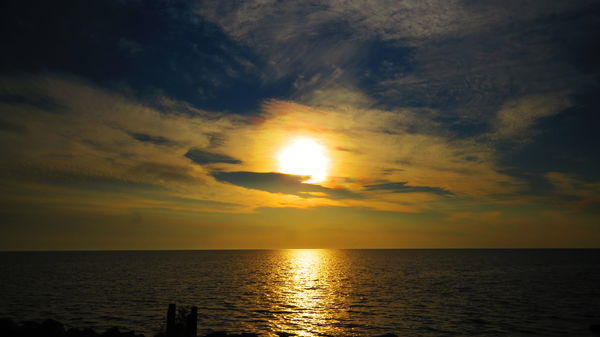
Blenheim Orange wrote:
I usually boost the saturation a little. Do mine seem over-saturated to your eyes?
http://www.uglyhedgehog.com/user-topic-list?usernum=40210
Mike
http://www.uglyhedgehog.com/user-topic-list?usernum=40210
Mike
Not at all. Very nicely done.
Nov 4, 2017 10:26:23 #

To my mind there are three types of PP.
1) Reality.
2) Enhanced reality.
3) Artistically creative.
Which one we opt for should be a matter of choice. I think the problem is some people overdo things like saturation, contrast etc. and then try to pass it off as artistic.
When it's done skillfully and with a degree of restraint (e.g. http://www.uglyhedgehog.com/t-494472-1.html ), over-saturation can produce an aesthetically pleasing edit, but unskillful over-saturation produces garishness.
Nov 4, 2017 10:30:20 #
Lots of fall color pictures posted here have the saturation slider pushed into this zone of ridiculous. Not impressed by it, looks totally fake. Same goes for some flower pictures posted.
WJH
WJH
Nov 4, 2017 10:39:25 #
Cletus
Loc: Mongolia
Garish levels of saturation aren't necessarily unnatural. In my youth, when I was a regular consumer of various illegal weeds and magical mushrooms, I actually could see the natural world that way on occasion. It was what we called, in the language of that era, far out. I imagine that's true for a lot of us. Maybe it's why so many of us like to crank up that ol' saturation slider. Just sayin'.
Nov 4, 2017 10:46:48 #
RichardTaylor wrote:
What's reality?
Does a B&W image reflect reality?
To me it is an artistic decision.
Does a B&W image reflect reality?
To me it is an artistic decision.
This. Various color films also had different levels of saturation. Not sure that any photo can claim to be a full picture of reality.
Nov 4, 2017 10:51:25 #

My sister uses a point-and-shoot and takes fairly good pics. However, she has her camera set on high saturation, and the pics often make me cringe over the "other-worldly" look. They would be good shots otherwise. And what really blows me away is the many comments she gets on them, praising her capture. Guess it's a matter of taste.
Nov 4, 2017 11:17:52 #
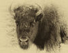
Here's my example ...
SharpShooter wrote:
What is the proper way to use saturation...., loca... (show quote)
Nov 4, 2017 11:18:40 #
nupshaw
Loc: Strasburg, VA
Bison Bud wrote:
While I agree that it's a personal preference and ... (show quote)
I quite agree! I tend to think of photographs as falling into two categories - memorable images of reality, and art. Sometimes the two can overlap, but I like to think of it as, what is the purpose of this image? I like both purposes, but there are times when things just don't look right regardless of the purpose. For instance, if the saturation is so high that it slaps me in the face and draws my attention away from what the subject is, then I don't like it. I think of art as being more abstract than "reality" photos, so if the saturation is high but the subject appears to be trying to capture a real subject, as opposed to an artful representation of the object, the dissonance repels me. This is not hard and fast, because each photo is unique, and I'm only trying to explain what I feel when I'm looking at something.
When I'm making "art" from a photo, I tend to play with contrast and saturation at the same time. Sometimes bad "reality" photos make good starting places for art.
My main point though is that when I'm looking at what I consider over-saturated photos, it has to do with whether the photo is to be considered at at "real". If it is, then the over-saturation gets in the way. Often what I see is a bad mix of "real" and art.
If you want to reply, then register here. Registration is free and your account is created instantly, so you can post right away.