Many Think That Merely Adding Saturation Will Make Their Images Better!!!
Nov 3, 2017 23:03:26 #
What is the proper way to use saturation...., locally, globally?
The biggest offenders are Sunset/Sunrise but every genre is represented. In many of the images posted it's pretty obvious that the photographer felt that oversaturation must be a good thing.
Some things are of unknown color so one can get away with a lot, but other things are KNOWN, like the color of peoples skin, most animals, and yes, even sunset/sunrise. We've all seen them, we know what they're supposed to look like.
How do you apply saturation and how much? Is saturation abused?
Feel free to post a before and after pic to show your point!!!
SS
Nov 3, 2017 23:13:22 #

SharpShooter wrote:
What is the proper way to use saturation...., loca... (show quote)
Completely agree. Over saturation may impress with the intense colors, but it doesn’t reflect reality.
Nov 4, 2017 00:16:49 #
TriX wrote:
Completely agree. Over saturation may impress with the intense colors, but it doesn’t reflect reality.
I reject reality!
We applaud Artists whose vision escapes reality and allows them to re-create on canvas what they see in their mind's eye, so why should we limit our photography to accurate reproductions of reality. Do you remember sitting on the shores of Lake Michigan watching a sunset with that favorite girl when you were a teenager? Carefully consider that image in your mind - were those grey clouds with a tinge of red orange and blue above a lake of grey-blue water, or do those colors burn with the flames of your romance and your thoughts of that night.
When we do a still life of a bowl of fruit, will we settle for that weak orange color of a Valencia orange, the thin red and green color of an apple, or do we saturate those images to increase the saliva flows and the desire to reach into that photograph and grab that fruit.
Study the B&W photographs of the depression and dust bowl eras, study how the photographers added noise and contrast to their images to convey the ultimate hardship of these people's condition. Should we not use saturation the same way.
My goal is never to reproduce reality, but to induce emotions, and saturation is but one tool available to produce that image.
Nov 4, 2017 00:21:32 #

Interesting question. I did a quick scroll via the site's new images feature. I went a few pages with only a few obvious examples of heavy saturation. Possibly the thumbnail aspect downplays the saturation issue ... If I was forced to provide a theory for images where the saturation is well beyond my own tastes, I'd point to uncalibrated monitors (or overly brightened) as the root-cause for pushing the saturation too far rather than a conscious decision by the photo editor.
Personally, I've developed a workflow that is totally dependent on my own personal choice of tools as well as one "best practice". In terms of best practice, the increase in global saturation is a function of the higher ISO values used when capturing an image. As the sensor signal is amplified at higher ISOs, the richness of color is lost at higher and higher ISOs. I have a series of defaults for saturation, noise and sharpening that are all ISO-value based for processing in both DPP and LR. The goal is to achieve an end-result that is roughly uniform regardless of the ISO used when capturing the image. Some might say I'm seeking to mask the use of a higher ISO?
I believe, SS, that I know from your posting history that you prefer Canon's Standard Picture Style and auto WB. Personally, I prefer a more saturated look and will default most work, where applicable, to the Landscape profile and a Daylight WB balance as an initial step in RAW processing. (I capture in Standard / Auto WB, all in RAW.) For those unfamiliar with Canon's Picture Styles, Landscape ups the saturation of Blues and Greens within an overall bump in saturation to the image. By default I add another 0.5 of Canon DPP saturation to all images, regardless of Picture Style.
The Daylight WB is a pretty broad stroke of "warm paint" and many times I'll spend time in DPP determining a more exact Kelvin value to adjust images prior to the RAW conversion to 16-bit TIF. When the resulting TIFs are imported into LR, another set of LR defaults exist for images at every discrete ISO value from ISO-100 to my upper limit of ISO-5000. In LR I use primarily the Vibrance adjustment in values ranging from 1 to 10, based on ISO. More saturation is added, but in values that range from 1 to 5 on LR's -100 to +100 range of slider values.
For discrete color updates rather than global, this occasionally becomes a complex, image-specific interplay of updates within LR to the temp & tint of the White Balance along with Saturation, Luminance and Hue updates typically focused only on the blueness of the sky via the HSL sliders. I've become less accepting of an unrealistic Azure Blue of a sky as well as modifying the too Turquoise or too Cyan initial results after the LR import and application of the ISO-specific default profiles.
Summary: My edit workflow is 100% based on personal and purposeful decisions using a calibrated monitor. Saturation is subtle in a 2- or 3-step process in my workflow based primarily on Canon's Picture Style settings. You might say my end-results is in the range of +0.5 to +1.0 cumulative increase in saturation based on Canon's in-camera Picture Style range of -4 to +4 values for Saturation. I've observed the Canon DPP software as well as the Canon "camera" profiles are all richer / more saturated than the Adobe Standard profile as presented via Adobe Camera Raw or the Camera Calibration section in Lightroom. Hopefully, this long-winded response is in-line with the "how" aspect of your post. Hopefully too, my work didn't fall into your dragnet of over-saturated recent posts ...
Nov 4, 2017 00:41:01 #
SharpShooter wrote:
What is the proper way to use saturation...., loca... (show quote)
I usually boost the saturation a little. Do mine seem over-saturated to your eyes?
http://www.uglyhedgehog.com/user-topic-list?usernum=40210
Mike
Nov 4, 2017 01:07:35 #
If colors are severely clipping all over the place then, at least for me, the image is over-saturated, and this is something I generally avoid. However, some people seem to like it that way. Or perhaps clipping simply doesn't bother them as it does me. If we look at photography as an art form, then there really are no rules concerning what is right and what is wrong.
Nov 4, 2017 01:32:58 #
Blenheim Orange wrote:
I usually boost the saturation a little. Do mine seem over-saturated to your eyes?
http://www.uglyhedgehog.com/user-topic-list?usernum=40210
Mike
http://www.uglyhedgehog.com/user-topic-list?usernum=40210
Mike
They look good to me.
Nov 4, 2017 01:36:45 #
TriX wrote:
Completely agree. Over saturation may impress with the intense colors, but it doesn’t reflect reality.
What's reality?
Does a B&W image reflect reality?
To me it is an artistic decision.
Nov 4, 2017 01:51:53 #
RichardTaylor wrote:
What's reality?
Does a B&W image reflect reality.
To me it is an artistic decision.
Does a B&W image reflect reality.
To me it is an artistic decision.
That sounds about right to me.
Mike
Nov 4, 2017 03:15:43 #
SharpShooter wrote:
What is the proper way to use saturation...., loca... (show quote)
I bet you will receive around zero examples from all the armchair experts rocking FF gear.
Nov 4, 2017 03:28:26 #
SharpShooter wrote:
What is the proper way to use saturation...., loca... (show quote)
This is very subjective. There's really no correct answer. If I were a journalist, I would want to portray reality as accurately as possible. I would try to get a shot as close to what I saw with my eyes.
On the other hand, sometimes reality can be bland. A non journalist maybe even an "artist" may want to spice up reality. Therefore an image can be enhanced by color saturation, sharpness, contrast, etc. depending on the scene or subject. All is done by preference and taste. Just like cooking, it can be overdone with spices, just right or not enough. It's a matter of taste. Not everyone has the same tastes.
As for my taste, I like more saturation and contrast up to a point just to give the image some "pop" for landscapes. For people, I prefer accurate skin tones but maybe everything else with a little more saturation.
In the cooked version, bringing down the highlights was what really brought in the color. It made the sky look more saturated. I only increased the saturation +10 in PS.
Nov 4, 2017 03:48:09 #
SharpShooter wrote:
Feel free to post a before and after pic to show your point!!!SS
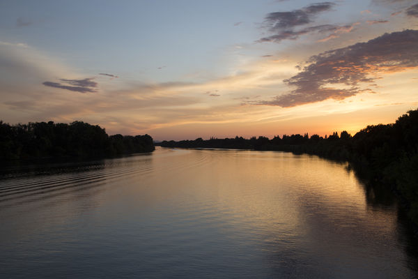
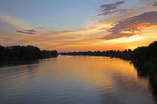
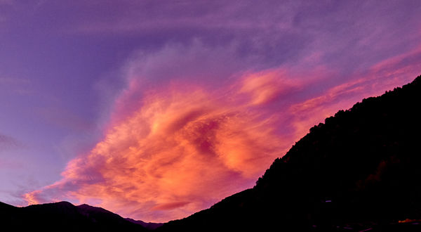
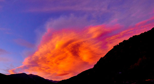
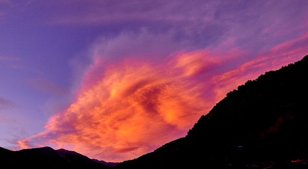
OK, I'll bite. Here are two versions from a sunset I've been playing around with - the levels are in Capture One; not sure what they would be in Adobe. Please let me know which you like better.
Nov 4, 2017 04:01:46 #
Nov 4, 2017 04:22:54 #
Hank Radt wrote:
OK, I'll bite. Here are two versions from a sunset I've been playing around with - the levels are in Capture One; not sure what they would be in Adobe. Please let me know which you like better.
Hank, I too like the first one. Can it use a little vibrance, sure, but the second one by me is a little overdone.
I understand making art but I also understand photography and I've seen a thousand sunsets(maybe a few more! LoL), and pretty much know what's real and what's not. Do they need to be real, no, as is evident by all the oversaturated photography, that's my point!
I've developed my standards from years of competitions and selling photography. I'm not saying you can't saturate to your liking, we read here all the time that you only have to sarisfy YOURSELF, the h*ll with everyone else. Like a stolen Rembrandt that has to stay in your basement....., what's the point.
I shoot and hope my work is good enough that others like it too. IF I were just shooting for myself, I wouldn't bother!!!
But that's just my opinion!
SS
Nov 4, 2017 04:34:22 #
SharpShooter wrote:
Hank, I too like the first one. Can it use a little vibrance, sure, but the second one by me is a little overdone. SS
Thanks, and to toxdoc42 also. Normally, I don't go for 100 saturation, but wanted to push the limit for the purposes of this discussion. Here's the same shot at 25 saturation, to get a bit more vibrance - would welcome your thoughts on this vs. the first. Still too much? Not enough? Thanks!
If you want to reply, then register here. Registration is free and your account is created instantly, so you can post right away.