Black and White, or Color?
May 6, 2012 00:01:24 #
Dragonflydreams
Loc: Alaska
OH I adore the last one you posted. The feel is wonderful. At first I would have said the B & W but at this point I enjoy the last one better!!! I live in Alaska and the blue color/hue is ALWAYS a problem. However, I've learned to enjoy b&w more and more. :)
I've also been playing around with different lighting and such while out with my camera to see what differences I can create. I have to say though that if I'm shooting beside a glacier is always much more crisp for some reason but almost impossible to tone out or even down the blue. Generally it is due to the glacier but thought I'd throw that in there for good measure.
So at the end of my 0.02 I'm sticking with the last one you posted. I certainly wouldn't turn my nose up at the b&w either. I think you did wonderful. I like the emotional response I experienced viewing these which is generally how I determine if I like a image. Mine or others for that matter. I generally shoot from an emotional place and likewise I view from that place as well.
Alright - I promise I'm shutting up!! I enjoyed seeing your work. :)
May 6, 2012 02:27:38 #

The B&W is my choice. I think ADD is right on the Sepia aspect. Give it a try. I all boils down to what you personally like, but I've found winter scenes look better in B&W. They tell the story of the starkness of that time of year. The Sepia approach adds the element of "Yesteryear". Either way, you can't go wrong.8-)
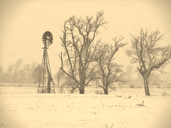
May 6, 2012 11:44:06 #

Thank you all for your input, it is greatly appreciated. For those of you who suggested trying it in sepia, I did and here is the result.
May 6, 2012 16:07:09 #

Either one is a fine shot. I think it depends on the mood you want to establish. The B&W is deffinatly more 'Artsy' but the blue cast really sets the 'Chill' effect. You have a well composed shot with whichever you choose.
May 6, 2012 16:07:09 #
Either one is a fine shot. I think it depends on the mood you want to establish. The B&W is deffinatly more 'Artsy' but the blue cast really sets the 'Chill' effect. You have a well composed shot with whichever you choose.
If you want to reply, then register here. Registration is free and your account is created instantly, so you can post right away.