Black and White, or Color?
May 4, 2012 02:29:42 #

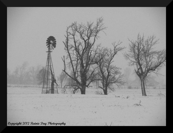
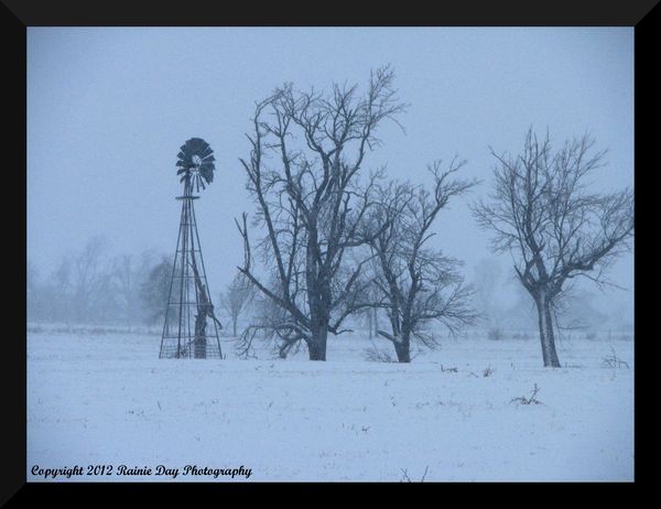
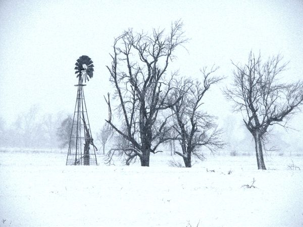
Here is a picture I took of a windmill during a snowstorm several years ago. Does it look better in color, or in black and white?
Black and White
Color
May 4, 2012 02:36:26 #

May 4, 2012 03:04:10 #
JAW
Loc: LA
Hi dtcracer,
Since you asked, I like the black and white a bit more. I think it has more to do with the shade of white (kinda bluish - not an off white) for the second photo as to why I prefer it.
Since you asked, I like the black and white a bit more. I think it has more to do with the shade of white (kinda bluish - not an off white) for the second photo as to why I prefer it.
May 4, 2012 03:08:03 #

B&W for sure - I am sure that is all you could see when you took the photo - the color is a false reading or is reading color our eyes don't detect - I am sure that is why my digital has a "snow" setting.
May 4, 2012 06:46:18 #
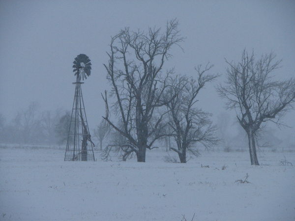
The B&W is the better of the two. The shot is underexposed; if you want the snow to be white, try bumping up the brightness and contrast.
May 4, 2012 07:20:45 #

May 4, 2012 09:52:30 #
May 4, 2012 09:55:13 #
snowbear wrote:
The B&W is the better of the two. The shot is underexposed; if you want the snow to be white, try bumping up the brightness and contrast.
I guess it is still underexposed. I bumped up the contrast and brightness from the original pic, it was almost washed out from the heavy snow fall.
May 4, 2012 09:55:40 #

May 4, 2012 10:02:56 #
May 4, 2012 10:23:21 #
snowbear wrote:
The B&W is the better of the two. The shot is underexposed; if you want the snow to be white, try bumping up the brightness and contrast.
I upped the brightness and contrast some more, and lowered the saturation of blue and cyan. Does this look better? Now it has some serious vignetting, but I kind of like it.
May 4, 2012 10:29:49 #
MissStephie wrote:
b&w - the colored one is too blue.... just my opinion. :)
Thanks! Opinions are what I'm looking for.
May 4, 2012 10:32:45 #

May 4, 2012 18:52:41 #
The last one is much better. The funny thing about snow scenes is you overexpose by one to two stops.
May 5, 2012 06:07:17 #

First off, I think the composition is excellent, most likely because it fits into the scheme of things just like I envision them. In a sense you flatter me.
The blue cast in the color shot evidences a situation that happens to me very often when I tinker with post processing. I try to remove it most of the time, but not without thinking there's a time and place for it--somewhere.
Again, thanks for the good photographs.
All the best,
Martin
The blue cast in the color shot evidences a situation that happens to me very often when I tinker with post processing. I try to remove it most of the time, but not without thinking there's a time and place for it--somewhere.
Again, thanks for the good photographs.
All the best,
Martin
If you want to reply, then register here. Registration is free and your account is created instantly, so you can post right away.