Critiques Please
Apr 13, 2016 10:19:50 #
WAR10CK wrote:
I like it. I don't think its too dark. :thumbup: :thumbup:
Thank you.
Apr 13, 2016 19:06:16 #
Triplets wrote:
Looking for advise.
Adjust exposure to lighten overall image?
Apr 13, 2016 19:12:26 #

Triplets wrote:
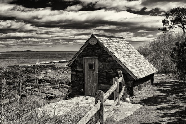
This was taken a couple of years ago on a walk I took in Portland, ME. I converted it to B+W with Nikon's View-NX2 and added the ND+3 filter from Silver Efex. It looked pretty good on my laptop monitor, but not as good on my work monitor. Looking for advise.
Thanks,
Triplets
Thanks,
Triplets
I like the textures, sharpness, contrast and the image in general.
Apr 13, 2016 19:13:35 #

I like it as well. I always go by first impressions and my first response was...Wow!
Apr 13, 2016 19:44:09 #
Triplets wrote:
This was taken a couple of years ago on a walk I took in Portland, ME. I converted it to B+W with Nikon's View-NX2 and added the ND+3 filter from Silver Efex. It looked pretty good on my laptop monitor, but not as good on my work monitor. Looking for advise.
Thanks,
Triplets
Thanks,
Triplets
On download it looks a bit oversharpened. Maybe selective sharpening of building and not the background?
Apr 14, 2016 07:51:35 #
Texcaster wrote:
I like it as well. I always go by first impressions and my first response was...Wow!
Thank you Tex.
Apr 14, 2016 08:28:37 #

Apr 14, 2016 08:31:01 #
jaymatt wrote:
I really like your photo, but it seems a bit dark to me.
Me too. I tried my hand at some editing on this version.
Apr 14, 2016 08:46:35 #
Triplets wrote:
Me too. I tried my hand at some editing on this version.
I love the original. It has a very dramatic look and the shadows don't obscure the detail within. Leave it alone!
Apr 14, 2016 08:47:21 #
rmm0605 wrote:
I love the original. It has a very dramatic look and the shadows don't obscure the detail within. Leave it alone!
Thank you.
Apr 14, 2016 09:19:37 #

Really like the composition. (The only thing I would have done differently would be to take the dog sign out of the background - which was done on page 2, I see....) ... ;)
Apr 14, 2016 09:21:20 #
MissStephie wrote:
Really like the composition. (The only thing I would have done differently would be to take the dog sign out of the background.) But that's just my opinion.... ;)
Thanks Stephie. I posted another copy of the picture earlier and removed the sign. probably not the greatest job of doing that...first time I've tried that.
Apr 14, 2016 11:33:39 #
Looks good to me also. Well done.
If I were going to frame it, I would remove the sign and post from the background.
If I were going to frame it, I would remove the sign and post from the background.
Apr 14, 2016 11:37:11 #
Madman wrote:
Looks good to me also. Well done.
If I were going to frame it, I would remove the sign and post from the background.
If I were going to frame it, I would remove the sign and post from the background.
Thanks Madman.
Apr 14, 2016 14:42:00 #
A fine shot you have there. I would suggest lightening it up a tad or at least burn in a little detail in the front side of the shed. Don
If you want to reply, then register here. Registration is free and your account is created instantly, so you can post right away.