Please leave me constructive advice on this image
Apr 18, 2012 21:11:47 #
largeformat
Loc: Bend, Oregon
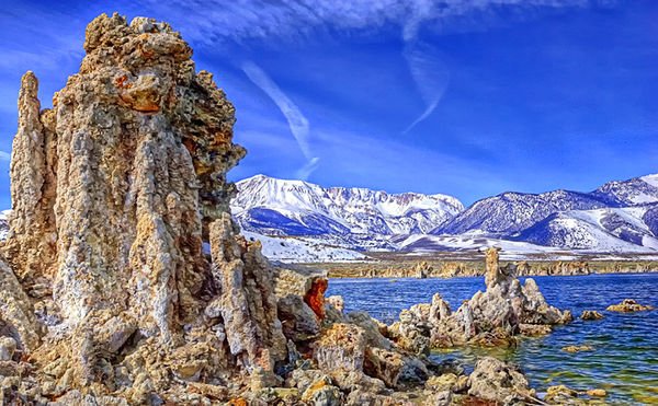
This is an image of Mono Lake in California, it is a photograph of what they call a "Tuff". I have a thick skin and I would like your honest opinion on this image. I am trying to do alternate processing on some of my images to see if any are appealing to look at. Thanks for your comments in advance.
Apr 18, 2012 21:31:55 #
I fully understand the vivid almost over satuation look may well have been what you were trying for, if so I would say you did that. On a personal, subjective level, the subject and technique does little for me. The two white lines towards the middle that I assume are contrails - I found a destraction.
Apr 18, 2012 21:33:37 #
just a smigin too bright for my taste. however it really looks like a painting. have to ask whats a tuff?
Apr 18, 2012 21:36:36 #
largeformat
Loc: Bend, Oregon
sinatraman wrote:
just a smigin too bright for my taste. however it really looks like a painting. have to ask whats a tuff?
The Tuffs are volcanic chimneys, that are usually underwater. As the lake water is drawn down they get exposed. Quite interesting to look at if you go see them in person. Thanks for the comment.
Apr 18, 2012 21:39:06 #
very cool. i was afraid that the answer to my question would be a punch line to a joke such as what's a henway? about 3 or 4 pounds." taught me someting new.
Apr 18, 2012 21:39:29 #
largeformat
Loc: Bend, Oregon
notnoBuddha wrote:
I fully understand the vivid almost over satuation look may well have been what you were trying for, if so I would say you did that. On a personal, subjective level, the subject and technique does little for me. The two white lines towards the middle that I assume are contrails - I found a destraction.
No added saturation, but it did have a polorizer attached.
Apr 18, 2012 21:43:17 #

Apr 18, 2012 21:48:47 #
I'm not much for alternate processing, but, I have to say, I really like this. I does draw my attention and holds it. Some just make my head hurt.
You get my vote.
You get my vote.
Apr 18, 2012 22:09:00 #
Looks like HDR that was oversaturated in the process or in the tone-mapping afterward. Looks like the sky was PS replaced. Just my opinion. Meant to be constructive.
Apr 18, 2012 22:26:46 #
largeformat
Loc: Bend, Oregon
ward5311 wrote:
Looks like HDR that was oversaturated in the process or in the tone-mapping afterward. Looks like the sky was PS replaced. Just my opinion. Meant to be constructive.
You are way off. No HDR, Original sky, It was contrasty from the beginning. I did Polarize the shoot when made. I used a painting program and backed off about 95% of the effect. I was trying for a glowing effect. Thanks for your comments.
Apr 19, 2012 06:53:29 #

For my personal tastes it is too bright which makes an otherwise fine photograph overwhelming.
Apr 19, 2012 09:37:52 #
largeformat wrote:
This is an image of Mono Lake in California, it is a photograph of what they call a "Tuff". I have a thick skin and I would like your honest opinion on this image. I am trying to do alternate processing on some of my images to see if any are appealing to look at. Thanks for your comments in advance.
:D Tuff does not have sharp enough focus Background is to light
contrail distracting. Overall good subject, presents challenge.
Try stacking.
Apr 19, 2012 10:51:29 #
docrob
Loc: Durango, Colorado
largeformat wrote:
This is an image of Mono Lake in California, it is a photograph of what they call a "Tuff". I have a thick skin and I would like your honest opinion on this image. I am trying to do alternate processing on some of my images to see if any are appealing to look at. Thanks for your comments in advance.
way over done
Apr 19, 2012 10:54:10 #
docrob
Loc: Durango, Colorado
largeformat wrote:
No added saturation, but it did have a polorizer attached.
notnoBuddha wrote:
I fully understand the vivid almost over satuation look may well have been what you were trying for, if so I would say you did that. On a personal, subjective level, the subject and technique does little for me. The two white lines towards the middle that I assume are contrails - I found a destraction.
No added saturation, but it did have a polorizer attached.
Why then does this image have the look and feel of an overcooked HDR?
Could it be that you have the camera set up for Extra Vivid and overly saturated capture to start with? Do most of your images have this highly saturated, overly sharpened look?
Apr 19, 2012 13:51:18 #

Have to agree that it looks overcooked on my monitor and the 2 verticle lines are distracting. Is your monitor calibrated?? I ask this because a number of folks have suggested the over saturation and HDR effct but you don't seem to see what we are seeing. Very interesting subject. Also agree would be nice if you posted the original and let some try and play with it..............
If you want to reply, then register here. Registration is free and your account is created instantly, so you can post right away.