exposure
Jan 10, 2012 15:59:04 #
well, I got a nickel to anti up....
I looked at that photo and thought it was OVER exposed until I saw the edit...which to me was really over exposed.
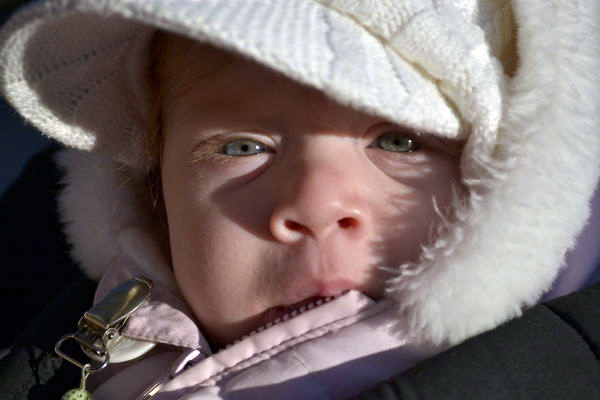
Problem is bright light coming from an odd angle. Look at the shadow the little nose is casting...The hat is white. Thus the struggle for a good read on the light. This would be a good time to experiment with fill flash if you wanted to reduce the shadows. I kinda like it the way it is...it says cold to me.... and i like the shadow of the jacket fur on the face.
I looked at that photo and thought it was OVER exposed until I saw the edit...which to me was really over exposed.
Problem is bright light coming from an odd angle. Look at the shadow the little nose is casting...The hat is white. Thus the struggle for a good read on the light. This would be a good time to experiment with fill flash if you wanted to reduce the shadows. I kinda like it the way it is...it says cold to me.... and i like the shadow of the jacket fur on the face.
Jan 10, 2012 16:56:39 #

I'll see your nickel and raise you a dime. On my screen I think the original exposure is on, I would like to see white balance temp a little more blue or colder. Reason is the child is bundle up it is cold out, winter a portrayal of that feeling. I think I read the creator is not comfortable with photoshop/ACR which this could be accomplished easily, so I am not sure what the creator should do with the image until they start to play around with photoshop like program.
Jan 10, 2012 16:58:32 #
Jan 10, 2012 17:37:28 #
[quote=rivernan]quote]
sorry to start tangent...
welcome back Nan...heard you were under the weather..
hope you are all better [liked your betty in the snow best]...joe
sorry to start tangent...
welcome back Nan...heard you were under the weather..
hope you are all better [liked your betty in the snow best]...joe
Jan 10, 2012 18:57:44 #
Halo.
Wonderful framing of this photo. It's just hard to get a good exposure in light that is that bright. I think you did good with what you were facing.
Wonderful framing of this photo. It's just hard to get a good exposure in light that is that bright. I think you did good with what you were facing.
halo wrote:
how's this photo exposed? i feel like it might be overexposed ,and her skin color looks off what does everyone else think?(im very impressed with the advice ppl give on this forum)im really trying to learn so pls be honest.Thanks hila nikon d3100 f5.6 ,1/2000,iso250,55mm.
Jan 10, 2012 19:16:09 #
[quote=jokescache1]
nope...im good. Maybe your thinking of Tilde?????
Betty's rear was freezing...she needed a change.
rivernan wrote:
quote]
sorry to start tangent...
welcome back Nan...heard you were under the weather..
hope you are all better [liked your betty in the snow best]...joe
sorry to start tangent...
welcome back Nan...heard you were under the weather..
hope you are all better [liked your betty in the snow best]...joe
nope...im good. Maybe your thinking of Tilde?????
Betty's rear was freezing...she needed a change.
Jan 10, 2012 20:16:06 #
halo wrote:
how's this photo exposed? i feel like it might be overexposed ,and her skin color looks off what does everyone else think?(im very impressed with the advice ppl give on this forum)im really trying to learn so pls be honest.Thanks hila nikon d3100 f5.6 ,1/2000,iso250,55mm.
The image is underexposed by at least a full stop. As well as your white balance seems off. If you like I can show you how it would look like with just those two minor corrections.
Jan 10, 2012 22:34:42 #

JimH wrote:
Yeah, the histogram dies off well before the right/bright edge. It's underexposed.
Yep yep I adjusted just the histogram... here is the result
Jan 11, 2012 02:25:01 #
Gosh, I must have weird eyes, but she is perfect right out of the camera! The lightened one looks ghostly. White hat, pink baby skin normal, to me.
JimH wrote:
Yeah, the histogram dies off well before the right/bright edge. It's underexposed.
Jan 11, 2012 02:31:48 #

I am amazed that you judge negatively a photo that was fixed up so well. I find nothing wrong with the enhanced version. As a matter of fact, if I worked on it, my results would likely be the same.
Jan 11, 2012 02:51:02 #
Jan 11, 2012 05:10:59 #
I won't pay a dime for my 2 cents worth, but here it is:
I like the tight crop, and I'll go with the exposure as being an artistic expression. But the strong side-lighting, almost theatrical, is just too mature for such a young subject. The nose-shadow cries out: Pinocchio! Not good for this little tyke.
To sum up: Everything is acceptable to me, but the lighting needs to be less directional, and a little softer. The pose and the cropping have great possibilities.
Thanks for the chance to study this!
Jan 11, 2012 07:04:38 #

I personally like the picture as it is.....I think the shadows make the picture...looks like a very cold winter day
Jan 11, 2012 10:48:48 #
it looks great photophly! thanks for taking the time to edit it,i wish i had time to do this (but right now i just dont) i publicly give anyone permission to edit any photos that i post on this forum.thanks hila
Jan 11, 2012 10:50:18 #
thanks joe for your support i also like this pic,but i thought the face looked too bright for the backround.How would i be able to get rid of shows for next time? not in pp
If you want to reply, then register here. Registration is free and your account is created instantly, so you can post right away.