Posts for: DianeH
Jun 18, 2016 10:10:18 #
This looks like your technique is very nicely done. I can not help with the painter's look but I might suggest adding more texture to the background. That may enable you to rework/improve the areas you are not happy with where the two interact.
May 23, 2016 14:12:59 #
Apr 17, 2016 20:35:52 #
Love tulips ! Plan on heading to Peddlers Village one day this week after work, heard their tulip are up and plentiful.
Apr 12, 2016 17:56:17 #
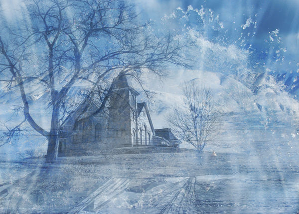
ABC123... I added some more relevant images and reduced the amount of the 'accidental double exposure effect'. I do think it does give the image more subject matter and a sense that things are there to serve a purpose.
Thanks again for the input.
Thanks again for the input.
Apr 12, 2016 17:50:51 #
Apr 11, 2016 10:22:17 #
Apr 11, 2016 10:21:24 #
TheeGambler
Thanks. Not usually a fan of blue either. I went with it because of the snow and water elements in the images.
Thanks. Not usually a fan of blue either. I went with it because of the snow and water elements in the images.
Apr 11, 2016 10:19:34 #
ABC1234,
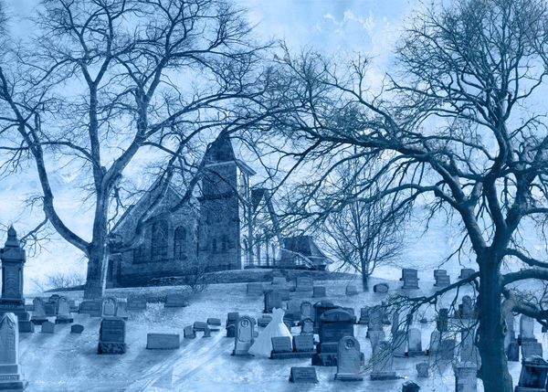
Thanks for your honesty, I do see where I could make the images that I used have a clearer connection to each other. I simply used backgrounds and a church as opposed to working with images that could give the viewer more info regarding the church. Such as crowds of people approaching or departing. Cemetery or burial images. I like your direction, thanks.
Thanks for your honesty, I do see where I could make the images that I used have a clearer connection to each other. I simply used backgrounds and a church as opposed to working with images that could give the viewer more info regarding the church. Such as crowds of people approaching or departing. Cemetery or burial images. I like your direction, thanks.
Apr 10, 2016 16:01:11 #
Sony,
I have cut down on the stronger blues and will boost the contrast so there is a more defined point of interest. Thanks for the input.
I have cut down on the stronger blues and will boost the contrast so there is a more defined point of interest. Thanks for the input.
Apr 10, 2016 15:59:14 #
Good question Howard.
I knew I could not create a composite so realistic that you could not tell that it was 'shot on location' as was the case of the Creative Live class. So using images I had I was going for an image that invoked a dream scape yet had qualities that it could possibly exist, maybe in another world. As with most creative works I think the 'reason or direction' of a piece changes as it the art develops. I was also practicing masking and blending mode. trying to make the transition from image to image flawless. Thanks for asking. It is a good question that I do not always have an answer for yet is needed to make sure that a direction and purpose is achieved.
I knew I could not create a composite so realistic that you could not tell that it was 'shot on location' as was the case of the Creative Live class. So using images I had I was going for an image that invoked a dream scape yet had qualities that it could possibly exist, maybe in another world. As with most creative works I think the 'reason or direction' of a piece changes as it the art develops. I was also practicing masking and blending mode. trying to make the transition from image to image flawless. Thanks for asking. It is a good question that I do not always have an answer for yet is needed to make sure that a direction and purpose is achieved.
Apr 10, 2016 11:26:08 #
Hi,
I watched a Creative Live class on compositing the other day and was inspired. I am looking for critique on what might make this better. Do you see mistakes in lighting, shadows or unwanted edges from underlying images? Thanks in advance for sharing your honest thoughts.
Diane
I watched a Creative Live class on compositing the other day and was inspired. I am looking for critique on what might make this better. Do you see mistakes in lighting, shadows or unwanted edges from underlying images? Thanks in advance for sharing your honest thoughts.
Diane
Nov 11, 2015 17:17:27 #
Dave, Here is my go at it. I did not know how to send a larger jpeg through dropbox. this on is a smaller condensed file. But as a wallet it should work if you like.
Aug 17, 2015 22:45:49 #
Thank you all for your kind words and for your time it took to look and rely.
Diane
Diane
Aug 16, 2015 15:48:43 #
Aug 16, 2015 15:46:47 #
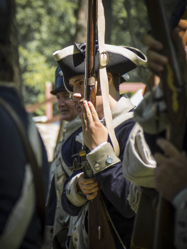
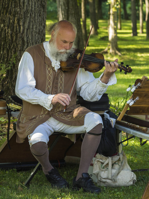
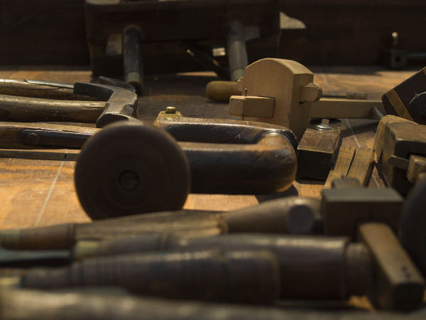
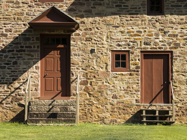
A few from the Moland House historical site. CC is welcome!
Tools of the trade
Doors
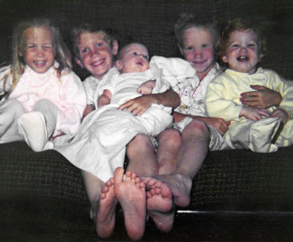
The 5th