Posts for: BillFeffer
Jan 17, 2020 16:11:46 #
R.G. wrote:
Are you after feedback or is there a specific issue that you want help with?
Feedback solicited.
Jan 17, 2020 14:12:14 #
Since you all were so helpful with the last one, here is another. Thank you in advance for all of the input.

Jan 17, 2020 12:55:33 #
Uuglypher wrote:
Bill,
This has been a great image for some excellent discussion!
Thanks for posting.
Dave
This has been a great image for some excellent discussion!
Thanks for posting.
Dave
I appreciate all of the input.
Jan 16, 2020 15:45:07 #
SalvageDiver wrote:
Hello Bill, br br I think this is a very nice and... (show quote)
Excellent. Thank you.
Jan 16, 2020 12:34:01 #
First, thank you all for the input. Linda's crop works best for me. It is actually what I envisioned for an 8x10 crop with most coming off the right side. GeorgeK feels way too tight to me. For tonality, I have to go with Linda. You all have expanded my thinking.
Jan 16, 2020 08:56:06 #
GeorgeK wrote:
Engaging photo. I like some of the suggestions abo... (show quote)
Comments appreciated. I reposted in another section for additional critique.
Jan 16, 2020 08:51:58 #
AzPicLady wrote:
Bill, I agree with what Linda said. I think Uuglypher's is too dark. The log gets lost in it. Your version is better, with more contrast. Keeping the lightness of the white of the stones is key, but you do need contrast and clarity to get all the edges to show up. I think you're getting really close to a final image here.
Thanks. I'm a bit sensitive to over sharpening, overly contrasty or over saturated images.
Jan 16, 2020 08:47:01 #
Linda From Maine wrote:
The feedback in Critique Forum on processing seeme... (show quote)
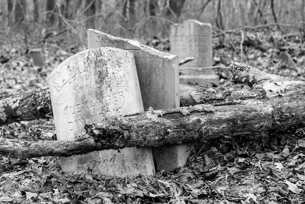
Thanks Linda. This is the graveyard of what was the first Methodist church in southern Kentucky. It is tucked back in the woods about a mile from my house. I appreciate your comments. It is an image I will continue to work on. To my taste the log is an important element. What would block the eye from following it out of the frame? I think the hot spots on it need work. As to the background, maybe the vignette should be reduced or eliminated.
Jan 15, 2020 16:31:23 #
Thanks Linda. I agree that the mean-spirited people are very off putting. They are a symptom of our devolving society as are the Astros, Patriots and others' lack of civility and fairness and consideration and kindness and.....
Jan 15, 2020 16:18:39 #
Uuglypher wrote:
Hi, Bill
Here’s the result of my suggestion that exposure be reduced a bit and that some Clarity be used to boost the mid-tonal contrast.
Here’s the result of my suggestion that exposure be reduced a bit and that some Clarity be used to boost the mid-tonal contrast.
Here is another version. I steepened the tone curve and added a little vignette. Also a bit more on the Clarity slider. I do prefer to keep my brightest tones in the low 90's.
FYI I work in LR 6.14

Jan 15, 2020 16:12:56 #
Linda From Maine wrote:
Bill, are you asking for others to edit and post here? That's what I'm assuming from the feedback in your Critique Forum topic: https://www.uglyhedgehog.com/t-627590-1.html
But "assuming" is often not the best course of action
But "assuming" is often not the best course of action
I agree that sometimes assuming means assuming someone else's problems. In this case. I want critique so I can learn. I do not always agree with comments, but it is never wise to reject differing opinions out of hand. By the way- How about those Packers?
Jan 15, 2020 15:28:59 #
It was suggested that more can be learned from this image. Rather than being the only one to benefit, I posted here so others may learn as well and perhaps more of us will be encouraged to explore B/W.

Jan 14, 2020 19:23:15 #
Thanks all for the helpful and excellent comments.
Jan 13, 2020 14:54:38 #
In a church graveyard. The church is long since burned down and the graveyard minimally maintained.
Jan 7, 2020 08:24:59 #
I used to be a wedding photographer. I carried multiple backups. Backup equipment saved the day numerous times. One particular time, two different Mamiya 645's and two Rolliflex TLR's decided to fail in spite of having been checked out the night before. I was saved by my brand new D100 I had carried just because. Fortunately, the Graflex strobes didn't burn out the circuitry.