Posts for: R.G.
Apr 16, 2016 11:17:30 #
TheeGambler wrote:
Sure sets a mood and lots of potential if you decide to work it!
Great capture.
Great capture.
Thank you eGambler. You're right - there's numerous possibilities here.
Apr 16, 2016 11:16:17 #
Frank2013 wrote:
Wonderfull perspective R.G. well seen.
Thank you Frank. It's not a difficult capture.
Apr 16, 2016 08:41:21 #
Singing Swan wrote:
I'll volunteer ...... :) That would make for a great day of photographyfun!!!
Sounds good. Don't worry if you don't have red hair - most Scots don't. And there's not that many Irish red-heads either - we just have more than our fair share :-) .
Apr 16, 2016 08:29:34 #
Singing Swan wrote:
The only thing missing is the lovely maiden standing on the bridge where the wind whips her hair and dress around her like a shroud as she awaits the return of her lover lost :)
You're right, Singing Swan. It must have been her day off :-) . Lots of wind-swept tourists, though...
Apr 16, 2016 08:05:02 #
MadMikeOne wrote:
The mood that comes across here is perfect for this iconic landmark. I can see in my mind's eye the spot you stood when shooting this perspective. Love it. Thanks for sharing.
Thanks for commenting, MadMike. Sometimes "picturesque" isn't the best way to go.
Apr 16, 2016 07:44:54 #
As Shakey suggested, a specialised program may do a better job than Lightroom, but what you can do is use LR to get things started.
When there's noise and softness together, what you want to avoid is sharpening the noise or having the de-noise soften the picture even more. The most effective tool for that in LR is the Masking slider in the Details section. You can crank up the masking so that only the main edges are sharpened, and when you've done that you can get away with using more de-noise without worrying too much about it softening the image.
There will be some loss of fine detail, but in a situation like this you're looking for the most acceptable compromise, and what matters most is what it looks like at normal viewing distance.
Finally, if you can't have proper sharpness, the next best thing is vividness. Clarity, lifting the shadows and getting the overall contrast and light levels right are the main factors, but you might also find that Vibrance or Saturation can help too.
And the real "finally" is that you can select problem areas and give them targeted adjustments. In your pic the main problem area for noise is the background, and it can be selected and given softening treatments of various kinds (including de-noise).
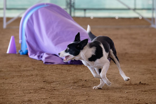
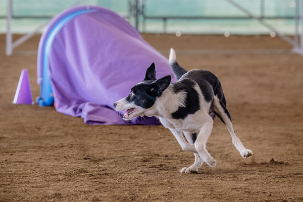
#1 below is just a crop, which focusses on the problem and has the same effect as enlarging.
#2 might seem like nothing much has been done, but it has sharpening where it matters and the de-noise isn't enough to significantly soften the image. It could have been given more, but that's when you start to lose fine detail, and when taking the next step into account, the image doesn't need massive amounts of global de-noise.
#3 shows the next step, which is targeted adjustments for the background (done by selecting the background). Noise on the dog isn't going to be that noticeable, and any attempts to use more de-noise would result in softening and loss of detail - which would be noticeable.
It's often the case when using de-noise and sharpening that you have to consider what matters and what doesn't - what's going to be noticeable and what isn't. If you can, you want to avoid using sharpening and de-noise where it's not really needed, and keeping them both to a minimum.
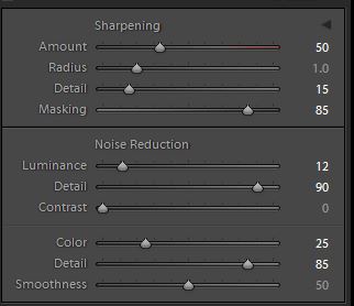
#4 is a snip of the adjustments in the Details section. The Masking is quite high, and done with the ALT key depressed to show what's being affected by the sharpening. You want large smooth areas to get none and the sharpening mostly limited to the main edges.
I wanted to use a Radius value greater than 1 to include the areas that have soft focus (due to the wide aperture), but unfortunately the dog's ears were prone to getting that tight haloing that's a symptom of using too high a Radius value (or too much sharpening in general).
-
When there's noise and softness together, what you want to avoid is sharpening the noise or having the de-noise soften the picture even more. The most effective tool for that in LR is the Masking slider in the Details section. You can crank up the masking so that only the main edges are sharpened, and when you've done that you can get away with using more de-noise without worrying too much about it softening the image.
There will be some loss of fine detail, but in a situation like this you're looking for the most acceptable compromise, and what matters most is what it looks like at normal viewing distance.
Finally, if you can't have proper sharpness, the next best thing is vividness. Clarity, lifting the shadows and getting the overall contrast and light levels right are the main factors, but you might also find that Vibrance or Saturation can help too.
And the real "finally" is that you can select problem areas and give them targeted adjustments. In your pic the main problem area for noise is the background, and it can be selected and given softening treatments of various kinds (including de-noise).
#1 below is just a crop, which focusses on the problem and has the same effect as enlarging.
#2 might seem like nothing much has been done, but it has sharpening where it matters and the de-noise isn't enough to significantly soften the image. It could have been given more, but that's when you start to lose fine detail, and when taking the next step into account, the image doesn't need massive amounts of global de-noise.
#3 shows the next step, which is targeted adjustments for the background (done by selecting the background). Noise on the dog isn't going to be that noticeable, and any attempts to use more de-noise would result in softening and loss of detail - which would be noticeable.
It's often the case when using de-noise and sharpening that you have to consider what matters and what doesn't - what's going to be noticeable and what isn't. If you can, you want to avoid using sharpening and de-noise where it's not really needed, and keeping them both to a minimum.
#4 is a snip of the adjustments in the Details section. The Masking is quite high, and done with the ALT key depressed to show what's being affected by the sharpening. You want large smooth areas to get none and the sharpening mostly limited to the main edges.
I wanted to use a Radius value greater than 1 to include the areas that have soft focus (due to the wide aperture), but unfortunately the dog's ears were prone to getting that tight haloing that's a symptom of using too high a Radius value (or too much sharpening in general).
-

Apr 16, 2016 06:09:48 #
.....and it's not looking pretty :) .
This is one of the shots I got from the other side and I haven't even tried to pretty it up. The tide was out and there's a generous amount of seaweed to be seen, but this isn't about making it picturesque.
-
This is one of the shots I got from the other side and I haven't even tried to pretty it up. The tide was out and there's a generous amount of seaweed to be seen, but this isn't about making it picturesque.
-
Apr 16, 2016 04:50:55 #
Nightski wrote:
It is a lovely scene, very nicely composed .. except I do wish the bow of the boat was turned more toward you so it would be more of a leading element and not a blocking element. Colour, exposure and focus are spot on. Nicely done.
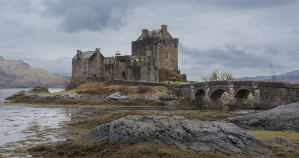
Yes, that would have been nice, but I wanted the shoreline to act as a leading line leading the eye across the loch to the distant glen. If I'd gone further left, the leading line of the boat would have hidden the shoreline, and without any interference from me, the boat wouldn't have been pointing towards the glen. If, as they say, the eye tends to move from left to right, I don't see the boat as being a blocking element, and from the back of the boat it's shoreline-loch-glen.
Apr 16, 2016 04:41:22 #
Nightski wrote:
For me RG, there is too much empty space in the middle without a dramatic foreground element. Might have been better if you had worked the scene and found a way to get one of the boats in closer, leaving the other out. As is, it's a little confusing to the eye.
Thanks for commenting.. I like the fact that the foreground and mid-ground both channel the eye towards the distant cloud beams and illuminated mountains. If there was a dramatic foreground element it would tend to become the main subject of the scene, and the eye would be inclined to stop there. As a consequence the foreground element would become an obstacle blocking the way to the rest of the shot.
The way it is, whatever part of the image that the eye stops on, there will always be that channelling effect to lead the eye deeper into the image, with that pleasant reward at the end. I think that's what Dave was referring to when he mentioned good depth cues.
Apr 16, 2016 04:30:11 #
Billyspad wrote:
Its run initially from an Action in Photoshop R.G. which leaves you around 30 layers which can all be adjusted to suit. Its probably over complicated but as you say a long way ahead of a pre set. Background colour choice is infinite so any mistakes in that area are totally down to me.
The image is then merged and mixed with tho original via layer masks with different blend modes applied. The hardest bit so far is knowing when to stop!
The image is then merged and mixed with tho original via layer masks with different blend modes applied. The hardest bit so far is knowing when to stop!
I would say the skill is in adapting the effect to suit the image, which isn't going to happen with a one-click effect. That and knowing when to stop (when is that not a requirement... :-) ).
Apr 16, 2016 04:18:25 #
DWU2 wrote:
I used the DNG. When I uploaded the result, I created a JPG using LR, setting quality level at 70%. So, no problem.
Thanks for the feedback, DWU. As long as the drop in resolution didn't cause any problems with editing.
Apr 16, 2016 04:16:29 #
Shakey wrote:
I tried to load the DNG file, R.G. It showed up as a tiff file when I downloaded it. I thought a tiff would load easy but this one would not open. I used the jpg to produce the image way back. I hope this helps in a negative way.
:-(
:-(
That's a funny one, Shakey. Windows and Lightroom both recognised it as a DNG on my computer. Do you have your importer set to import raw files as tiff? I believe that DNG is classified as a type of raw.
Apr 15, 2016 15:58:56 #
DWU2 wrote:
Here's a mono version made from the DNG with help from NIK Silver Efex Pro II.
Thanks for taking part, DWU. There's nothing quite like contrasty B&W for drama. Did you find the reduced resolution a problem at any point in your edit?
Apr 15, 2016 15:56:27 #
rborud wrote:
R.G.
I found this Loch so beautiful, I had to give a go.
RBorud
I found this Loch so beautiful, I had to give a go.
RBorud
Thank you RB. Very moody, and there's definitely an increased sense of presence from the mountains :thumbup: .
Apr 15, 2016 12:46:40 #
NJFrank wrote:
RG this one doesn't seem to work for me. I feel like I am looking at two pictures at the same time. My eyes keep bouncing back and forth between the mountains and the gable. A crop can be made one focusing on the mountain. The other on the gable. I hope that makes sense to you
Thanks for commenting, NJ. One of the things that I liked about the scene was that the shape of the gable was echoed in some of the peaks of the mountains. Again that's something that was clearer to me when I viewed it first-hand. Maybe with a re-shoot with better light for the mountains and some of the gable outlined by the sky.......