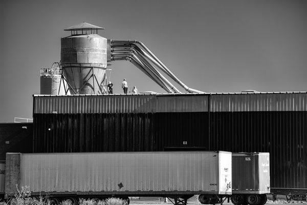
Posts for: R.G.
May 26, 2016 13:12:20 #
Mark7829 wrote:
I like this perspective as well, perhaps more so than the original as it reveals more of the sky....the sky is the show, it is the image, it is the drama and emotion.
Thanks. But I think you'll have your work cut out trying to convince Min to part with the foreground....
 .
.May 26, 2016 13:08:07 #
I'm not sure if you have the equivalent of Lightroom's Adjustments brush. If you have you could use a large well-feathered brush to select the vignette (making the feathering match the fall-off of the vignette), then hit it with several duplicate applications of lifting the shadows and follow that up with a reduction in contrast and a Brightness adjustment.
The below edit is after one application of what I just described. The vignette in the corners is resistant to treatment, and if it was still too strong for your liking you could repeat the above.
After a few applications of lifting the shadows it stops having any effect, but if you wanted to go further you could use brightness adjustments and contrast reduction. With a flat, detail-less sky like that you can drop the contrast as much as you want, and even throw in a reduction in Clarity.
-
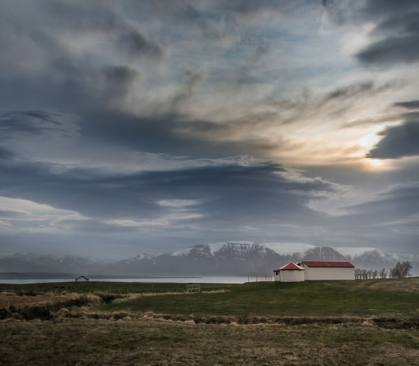
May 26, 2016 12:40:26 #
minniev wrote:
.....The distant mountains were all but invisible behind the very strange atmospheric and I am not sure what, if anything, to do about that......
I was thinking more about the composition and getting closer to the mountains (not knowing how easy/difficult that might be). The trouble with de-misting or de-hazing is it's sooooo easy to lose the subtleties of the light, and I get the impression that those subtleties were exactly what you hoped to capture in this shot.
I used a bit of perspective jiggery-pokery to simulate a closer viewpoint, and tentatively used some de-haze on the mountains (although that wasn't the main point of my suggestion). Even using a light touch I think the overall look of the light has changed a bit. But the mountains are definitely closer.....
.-
May 25, 2016 12:04:56 #
This one speaks of possibilities. I hope you have some that give more emphasis to the distant mountains.
May 24, 2016 15:03:07 #
Linda From Maine wrote:
I like your suggestion, R.G. and no, this one was not about the flowers Here's a trim:
Here's a trim:Beautiful. If it was mine I'd take even more off of the left.
May 24, 2016 13:09:07 #
Jim-Pops wrote:
This is taking most of brush strokes out of the car. Better?
I will still have to make final cropping and framing.
I will still have to make final cropping and framing.
You've almost completely lost the watercolour look. Maybe there's a happy medium somewhere, or possibly just soften what you have now.
May 24, 2016 12:15:12 #
The desaturated colours give an impression of coldness and bleakness.
May 24, 2016 12:12:39 #
Jim-Pops wrote:
....Maybe I am finally getting the hang of this D750.
I'd agree with that verdict.
May 24, 2016 12:10:54 #
Jim-Pops wrote:
I took this photo of a friend of mine during the 4th of July parade last year. He has received a lot of awards for this car. I thought this watercolor effect would be something he doesn't have. Before I give it to him let me hear your thoughts. The framing is made for a 11x14 frame
If there was a way to ease off on the messy look......
May 24, 2016 12:08:03 #
Treepusher wrote:
.....And the kitties will never give up their attempts at world domination. It's in their blood. Never mind that they now have a dreadfully evil wicked witch helping them! ; )
Cats with agendas and witches with malicious intent! We're doomed.
May 24, 2016 11:54:51 #
Linda From Maine wrote:
Is this a photo of a river, a train, or a river and a train?
The most eye-catching feature of this shot is the way the river and the railway follow each other twist for twist. I suggest you crop a bit off the left and bottom to focus on that.... which makes it even less about the flowers. But I'm sure you have lots of flower shots from there already
 . I think the second of these two is just a bit too messy for my taste.
May 24, 2016 11:36:34 #
minniev wrote:
This one is ramped up to 100% on contrast and clarity in LR, but I can do more with it when I get it home, I think.....
I was thinking more of selecting the ice for the adjustments. If anything I'd say the beach could do with a drop in contrast.
May 24, 2016 11:30:17 #
magnetoman wrote:
.......What about the general attempt to depict a colder place than the first post of The Crowns...
I'd say you have achieved your objective. Both versions are valid.
May 23, 2016 15:27:23 #
magnetoman wrote:
This follows Linda's suggestion for a less colourful version showing harsher weather courtesy of some pp. I didn't find this easy so any suggestions will be gratefully received.
The sky's come out a bit grainy. You could selectively add some de-noise or de-sharpen or de-contrast to the sky. The loss of detail shouldn't be a concern - in fact it'll add to the mistiness.
May 23, 2016 15:11:27 #
Linda From Maine wrote:
Do you follow his topics in Photo Gallery? He keeps us in constant suspense with his soap opera-like tall tales of fantasy, mischief and mayhem 
It's been a while. Are his fiendish cats any closer to world domination?