Harsh Weather at The Crowns
May 23, 2016 15:22:06 #

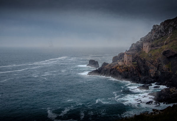
This follows Linda's suggestion for a less colourful version showing harsher weather courtesy of some pp. I didn't find this easy so any suggestions will be gratefully received.
May 23, 2016 15:27:23 #

magnetoman wrote:
This follows Linda's suggestion for a less colourful version showing harsher weather courtesy of some pp. I didn't find this easy so any suggestions will be gratefully received.
The sky's come out a bit grainy. You could selectively add some de-noise or de-sharpen or de-contrast to the sky. The loss of detail shouldn't be a concern - in fact it'll add to the mistiness.
May 23, 2016 15:39:42 #
R.G. wrote:
The sky's come out a bit grainy. You could selectively add some de-noise or de-sharpen or de-contrast to the sky. The loss of detail shouldn't be a concern - in fact it'll add to the mistiness.
Crikey, that was quick RG! I sort of liked the sky like that but, as you say, it could be softened - just personal taste I think. What about the general attempt to depict a colder place than the first post of The Crowns (if you feel inclined to comment, of course)?
May 23, 2016 16:17:40 #

Very much appreciated, magnetoman! I love the cold, harsh mood. And I see a ship on the horizon - how cool.
The composition is super pleasing to me with the white water in close and the sharp rise of the land. Maybe a little less vignette, though all this is just personal preference of course.
pp: I think I see a bit of "smudge" on sky just above rocks between the two buildings.
I love the overall mood and am very grateful you took the time to do the work. How do you feel about it, composition and mood-wise?
May 23, 2016 18:10:54 #
Linda From Maine wrote:
Very much appreciated, magnetoman! I love the cold... (show quote)
Enjoyed trying something a bit different Linda, but felt my pp skills have a long way to go before I could make a real success of it. There is no actual vignette in this one, but two gradient filters, top and bottom, which I often employ in landscape as I feel it helps draw the eye to the centre, much as a vignette would - in this case quite dark as there's a storm brewing.. The smudge is splash off the back of the rock caused by a squall (well, that's what I thought!). Glad you noticed the ship, it's the Lord Nelson, a JST training ship that was in Swanage Bay on Friday last - bet they were not expecting that sort of weather down in Cornwall - I see they have minimum sail on, must be expecting worse! Many thanks for your interest and the challenge. I'll keep learning.
May 23, 2016 19:13:21 #
magnetoman wrote:
... Many thanks for your interest and the challenge. I'll keep learning.
Very enjoyable from this side of the pond too!
May 24, 2016 10:07:28 #
Mark7829
Loc: Calfornia
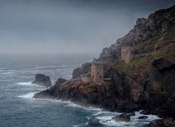
I think the shot is much more intimate/closer. The additional sky and water adds nothing to the image. In this crop, your eyes follow the contours of the mountain across the frame. It also fills the frame with the actual subject matter . The mood is perfect, the colors are soft that adds to the mood/emotion.
May 24, 2016 11:30:17 #
magnetoman wrote:
.......What about the general attempt to depict a colder place than the first post of The Crowns...
I'd say you have achieved your objective. Both versions are valid.
May 24, 2016 12:38:33 #
Mark7829 wrote:
I think the shot is much more intimate/closer. The additional sky and water adds nothing to the image. In this crop, your eyes follow the contours of the mountain across the frame. It also fills the frame with the actual subject matter . The mood is perfect, the colors are soft that adds to the mood/emotion.
Thanks for commenting Mark - it's interesting that your suggestion for crop more or less matches that of my original post (with a brighter look), and some responders liked it , some suggested more sea to the left, hence when posting a second time I went for more sea! I personally prefer more sea as it adds context to the shot - makes one realise what a harsh environment the miners worked in, but there's a case for both crops I think.
If you want to reply, then register here. Registration is free and your account is created instantly, so you can post right away.