Posts for: R.G.
Jul 6, 2016 15:15:23 #
Jul 6, 2016 12:41:39 #
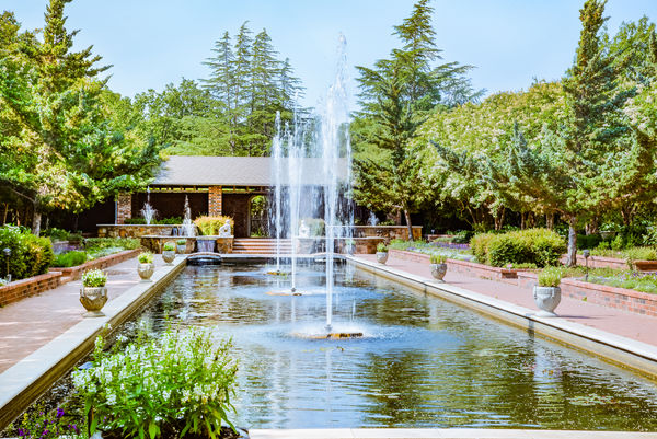
Good choice of subject. With this type of shot (mainly geometrical) it's essential that the horizontals are right. My personal preference would be for it to be centred more accurately. The imbalance shows up more than it would with a less shape-oriented shot. And if it was mine I'd ease off on the vignette a bit.
Jul 6, 2016 10:57:53 #
As before, you've done a good job of capturing the better side of your subject. Where politicians are concerned, in most cases there's no shortage of less-than-flattering photos of them. I get the impression that in each case you spent some time choosing your starting image.
Jul 6, 2016 10:50:58 #
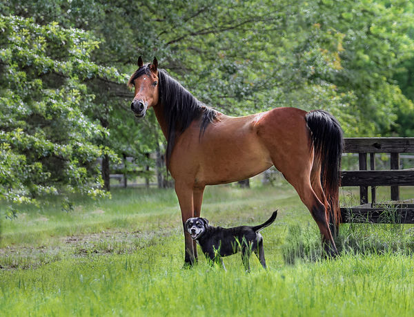
To my eye the main issue was space. The tree trunk was crowding the subjects, so it had to go. Removing the tree trunk enabled a more conventional kind of crop.
-
-
Jul 5, 2016 13:14:05 #
White founts falling in the courts of the sun. Those obstinate shadows needed a fair bit of coaxing.
-
-
Jul 2, 2016 12:52:30 #
It might be worth trying that earlier on in the workflow. When you use a lot of Dehaze the darks get darker - it might be worth pushing it more than you normally would with the Dehaze then compensating by lifting the Blacks and Shadows a touch. Too much sharpening can spoil a shot's look so it's good to have a technique that ramps up the detail without producing those unwanted sharpening side-effects  .
.
.Jul 2, 2016 07:34:33 #
mffox wrote:
You're right. I guess I got carried away with the beauty of the place overall. By the way, the scene is from Scotland, just north of Hadrian's wall, and I was standing in England.
Sorry - didn't recognise it
 . I must be more used to the view in the other direction .
 I think you were probably caught out by the way the eye/brain processes scenes like this. When you view a scene like this, your eye compensates for the brighter and darker areas, equalising them somewhat. When you saw the picture on your computer you were probably surprised by how dark the area below the horizon was. Seeing it with your eye, it probably didn't look particularly dark, and the foreground probably didn't look particularly bright. And viewing the scene first-hand, your attention probably zoomed in to the horizon and the area below the horizon, whereas your camera wouldn't do that unless you told it to. The brain does a lot of that sort of processing automatically without us being aware of it most of the time. That probably explains why much of the time we don't get the picture we were expecting until we do some cropping.
PS - If you use "Quote Reply" ( just to the right of "Reply" ), we'll know which post you're responding to.
Jul 1, 2016 13:02:56 #
The brightest part of the image is the foreground - which is empty and unengaging. The part which would have made the image interesting (the area below the horizon) is dark and too distant. The sky's not bad, but on its own it doesn't make the shot, and by the time the viewer's eye gets there the viewer will have lost interest.
Put all of these things together and you have what looks like a beginner's snap of a rather uninteresting bit of countryside. A bit of cropping or zooming might have lifted it to another level.
Put all of these things together and you have what looks like a beginner's snap of a rather uninteresting bit of countryside. A bit of cropping or zooming might have lifted it to another level.
Jul 1, 2016 12:53:54 #
The shadow from the eyebrow accentuates the no-nonsense frown, and it's a consequence of the direction of the light. If that was planned it was a good move.
I'd be tempted to try a slightly tighter crop at the bottom (and maybe a skim off the top too). There's a lot of darkness there that isn't adding to the composition. That intense gaze is what the shot's all about.
I'd be tempted to try a slightly tighter crop at the bottom (and maybe a skim off the top too). There's a lot of darkness there that isn't adding to the composition. That intense gaze is what the shot's all about.
Jul 1, 2016 01:18:03 #
Jun 30, 2016 12:14:48 #
Jun 27, 2016 15:23:14 #
Jun 27, 2016 15:19:18 #
Got out my step ladder for this one. The RAW file's huge so it can take a bit of stretching.
-
-
Jun 25, 2016 05:34:31 #
Jun 24, 2016 14:49:27 #
I suppose the degree of softening for the yellow would depend on the individual's level of tolerance for the mustard look (I did say I'd prefer a radical departure from the captured reality ). This edit is brighter and more contrasty, which may be a move away from your intentions for it.
Whatever your opinion of this edit, I recommend that you try lowering the blacks a bit and see if you like what that does. It's a step towards the more contrasty look, but well-contained and moderate.
-
). This edit is brighter and more contrasty, which may be a move away from your intentions for it. Whatever your opinion of this edit, I recommend that you try lowering the blacks a bit and see if you like what that does. It's a step towards the more contrasty look, but well-contained and moderate.
-